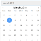
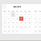
LC DatePicker
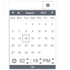
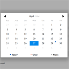
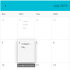
Pure Angular date and time picker component.
Demo
Description
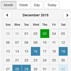
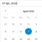
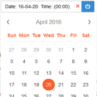
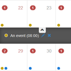
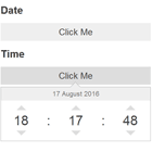
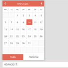
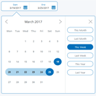
- LC DatePicker is an Angular component that generates a datepicker calendar on your input element
- Compatible with Angular 2+ up to Angular v6.0.0
- Only dependencies are RxJS, MomentJS and Font Awesome
- Customizable date format and language
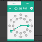
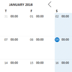
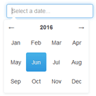
- Can be configured as time, date-time, date, month or year picker
Tested with
- Firefox (latest)
- Chrome (latest)
- Chromium (latest)
- Edge
- IE11
Installing / Getting started
npm install @libusoftcicom/lc-datepickerskip this if SystemJS is not used as module loader:
System.config({ paths: { 'npm:': 'node_modules/' }, map: { '@libusoftcicom/lc-datepicker' : 'npm:@libusoftcicom/lc-datepicker/bundles/lc-datepicker.umd' } })Use the following snippet inside your app module:
import {LcDatePickerModule} from '@libusoftcicom/lc-datepicker'; @NgModule({ declarations: [ ... ], imports: [ ... ,LcDatePickerModule ], providers: [ ... ], bootstrap: [...] }) export class AppModule {}Use the following snippet inside your component:
import {DatePickerConfig, ECalendarType} from '@libusoftcicom/lc-datepicker'; @Component({ ... }) export class AppComponent { private dateValue: string = null; public config = new DatePickerConfig(); public CalendarOpened: boolean = false; constructor() { // configuration is optional this.config.CalendarType = ECalendarType.Date; this.config.Localization = 'en'; ... } public get Date() { return this.dateValue; } public set Date(value: string) { this.dateValue = value; } }Use the following snippet inside your template for date-picker:
<lc-datepicker [(opened)]="CalendarOpened" [config]="config" [(date)]="Date"></lc-datepicker>Use the following snippet inside your template for date-range-picker:
<lc-date-range-picker [(opened)]="CalendarOpened" [config]="config" [(date)]="Date"></lc-date-range-picker>DatePicker config parameters
- CalendarType: ECalendarType
- Localization: String
- MaxYear: Number
- MinYear: Number
- MaxMonth: Number
- MinMonth: Number
- MaxDay: Number
- MinDay: Number
- ConfirmLabel: String
- PrimaryColor: String
- FontColor: String
- Format: Moment.MomentInput
- setDisabledDates( Array<Moment.MomentInput> )
- addDisabledTimeRange( start<Moment.MomentInput>, stop<Moment.MomentInput> )
Developing
Built With:
- Angular
- MomentJS
- Font Awesome
Setting up Dev
This project was generated with Angular CLI version 6.0.2.
Angular CLI must be installed before building LC DatePicker component.
npm install -g @angular/cligit clone https://github.com/LibusoftCicom/lc-datepicker.git cd lc-datepicker/ npm install npm run startOpen "http://localhost:4200" in browser
Building
This project was generated with Angular CLI version 6.0.2.
Angular CLI must be installed before building LC DatePicker component.
npm install -g @angular/cligit clone https://github.com/LibusoftCicom/lc-datepicker.git cd lc-datepicker/ npm install npm run buildVersioning
We use SemVer for versioning. For the versions available, see the link to tags on this repository.
Tests
This project was generated with Angular CLI version 6.0.2.
Angular CLI must be installed before building LC DatePicker component.
npm install -g @angular/cligit clone https://github.com/LibusoftCicom/lc-datepicker.git cd lc-datepicker/ npm install npm run testContributing
Want to help?
Want to file a bug, contribute some code, or improve documentation? Excellent! Read up on our contributing guide and code of conduct and then check out one of our issues.
Licensing
LC DatePicker is freely distributable under the terms of the MIT license.
