ks-vue-fullpage

A simple, flexible and easy to use Vue plugin to create fullscreen scrolling websites (also known as single page websites or onepage sites). No jQuery needed, pure Vanilla js.
Try it in this fiddle .

- x-axis or y-axis animations
- w/without subtle parallax animations (on both axis)
- multiple events triggered by the plugin on every components, listenable using vm.$ksvuefp
Inspired by the awesome jQuery plugin "FullPage.js" , created by @Alvarotrigo
Getting Started
The plugin only works with 2nd version of Vue.js. Also, you'll need to include Velocity and hammerjs in your bundle (or directly in your html page if you choose the good old script tag method).
npm i --save ks-vue-fullpageUsage
With Webpack
import KsVueFullpage from 'ks-vue-fullpage' Vue.use(KsVueFullpage)With Nuxt
Create a ksvuefp.js files in yur plugins folder, and add it to yout nuxt.config.js files with ssr: false option
ksvuefp.js
import KsVueFullpage from 'ks-vue-fullpage' Vue.use(KsVueFullpage)nuxt.config.js
{ ... plugins: [{ src: '~/plugins/ksvuefp', ssr: false }] ... }With a script tag
<link rel="stylesheet" href="/dist/ks-vue-fullpage.min.css"></link> <script src="/dist/ks-vue-fullpage.min.js"></script> Ks-vue-fullpage registers 2 new components:
- "ksvuefp", which is the wrapper for our sections
- "ksvuefp-section", which is the single section wrapper you'll use with v-for
and add $ksvuefp property to every components, available at vm.$ksvuefp
vm.$ksvuefp returns the following datas object
{ options: [], // Default options (see below) merged with your prop options fpLoaded: false, // true when the plugin and his components are totally loaded currentIndex: 0, // the index currently shown slidingActive: false, // true if sections transition is occuring sliderDirection: 'down', // one of 'up' or 'down' wWidth: 0, // Integer. current screen width wHeight: 0 // Integer. current screen height }Example code
... <ksvuefp :options="options" :sections="sections"> // Where options is an object of options, and sections an array containing our sections datas <ksvuefp-section class="whatever" v-for="(s,index) in sections" :section="s" :key="s.id" :section-index="index" :background-image="'url('+ s.img_url +')'" :background-color="'#123456'" > <h2> {{any_data}} </h2> </ksvuefp-section> </ksvuefp> ... <script> ... data(){ return { sections: [ { id: 1, any_data: "I'm section 1", img_url: './images/whatever01.jpg' }, { id: 2, any_data: "I'm section 2", img_url: './images/whatever02.jpg' }, { id: 3, any_data: "I'm section 3", img_url: './images/whatever03.jpg' } ], // See below for a list of default options options: { duration: 800, easing: [1, 0, 0, 1], loopBottom: true } } } ... </script>Default options
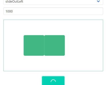
export default { /** * Html params * @property {String} sectionTag - The tag used to wrap each vsvuefp-section component. */ sectionTag: 'div', /** * Animation params * @property {String} animationType - Transition effect between 2 screens. Should be one of 'slideY', 'slideX', or 'fade' * @property {Number} duration - Duration of transition between 2 screens, in ms * @property {String} easing - Easing of the transition between 2 screens. Can be all easings supported by Velocity, including bezier curves. ex: [0.2, 0.5, 0.2, 0.5] * @property {Number} animDelay - Content animation delay. Help you define timing between screens transition and content animations */ animationType: 'slideY', duration: 1000, easing: 'easeInOutQuad', animDelay: 0, /** * Preloading params * @property {Boolean} preloaderEnabled - Add a fullscreen preloading overlay with loading animation * @property {String} preloaderBgColor - Background color for the preloader overlay. * @property {String} preloaderColor - Preloader icon and text color * @property {String} preloaderText - The text that will appear under the icon animation during loading * @property {Boolean} waitForBackgrounds - Wait for sections background images to be fully loaded before triggering $ksvuefp-ready event */ preloaderEnabled: true, preloaderBgColor: '#fff', preloaderColor: '#212121', preloaderText: 'Loading...', waitForBackgrounds: true, /** * Navigation params * @property {Boolean} dotNavEnabled - Add a dot navigation * @property {String} dotNavPosition - Change dotNav position. Should be one of top, bottom, left or right * @property {String} dotNavColor - Change dotNav color * @property {Boolean} loopBottom - Go to first section on scroll down while watching last section * @property {Boolean} loopTop - Go to last section on scroll up while watching first section */ dotNavEnabled: true, dotNavPosition: 'right', dotNavColor: '#fff', loopBottom: false, loopTop: false, /** * Design params * @property {Boolean - String} overlay - Insert a fullsize div between background and content, and set its background property. Must be a valid css background rule * @property {Boolean} parallax - Enable parallax effect on section's background * @property {Float} parallaxOffset - Parallax offset amount, default to 0.5. Should be between 0 and 1. 0 gives no parallax effect, 1 gives a "stacking effect" (the old section remains fixed during transition while the next one slides above it). */ overlay: 'rgba(0, 0, 0, 0.2)', parallax: false, parallaxOffset: 0.5 }Available Properties
ksvuefp component
| Name | Data type | Default value | Description |
|---|---|---|---|
| options | object | - | custom options (cf example above) |
| sections | array | - | sections list (cf example above) |
ksvuefp-section component
| Name | Data type | Default value | Description |
|---|---|---|---|
| section | object, string | - | the single section datas issued from v-for loop (cf example above) |
| key | int | - | A unique identifier for this item |
| section-index | int | - | must be the section's index issued from v-for loop (cf example above) |
| background-image | string | - | must be a valid css background rule. |
| background-color | string | - | must be a valid css background rule. |
Available Events
You can listen to this events on all components using vm.$ksvuefp.$on :
| Name | Datas | Description |
|---|---|---|
| ksvuefp-ready | - | Triggered when the plugin is fully loaded |
| ksvuefp-change-begin | nextIndex, oldIndex, direction | Triggered when the animation between 2 sections begins |
| ksvuefp-change-done | - | Triggered when the animation between 2 sections finishes |
| ksvuefp-resized | - | Triggered on window.resize |
You can emit this event from all components using vm.$ksvuefp.$emit :
| Name | Datas | Description |
|---|---|---|
| ksvuefp-nav-click | nextIndex | Changes the current index to nextIndex |
For example, if you want to create a custom navigation:
<ul> <li v-for="(s,index) in sections"> <a href="#" @click.prevent="$ksvuefp.$emit('ksvuefp-nav-click', {nextIndex: index})"> Section {{ index + 1 }} // The first index is 0 </a> </li> </ul>Remaining tasks
- Add parallax effect on both axis
- Make it Nuxt compatible
- Create demos (in progress)
- Add delay option, to enable content animations before sliding
- Add better responsive features
Contribution
I'm just a lowly frontend developer trying to master ES6, so suggestions are more than welcome, not only for feature requests but also for coding style improvements.


