vue-svg-transition
Create 2-state, SVG-powered animated icons

inspired by Icon Transition Generator

Quick start
npm install --save vue-svg-transition import Vue from 'vue'; import SvgTransition from 'vue-svg-transition'; Vue.use(SvgTransition);Template Example
It is recommended to use vue-svg-loader so we can import our SVGs from external files. But it's possible to use inline SVG as well.
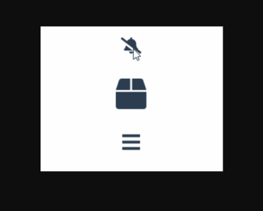
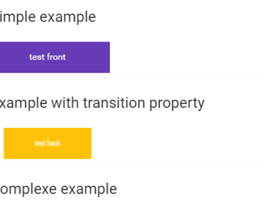
<template> <svg-transition :size="size"> <MyIcon slot="initial" /> <MyOtherIcon /> </svg-transition> </template> <script> import MyIcon from "./assets/MyIcon.svg"; import MyOtherIcon from "./assets/MyOtherIcon.svg"; export default { components: { MyIcon, MyOtherIcon } data() { return { size: { width: 48, height: 48 } } } } </script>Trigger programmatically via ref
<svg-transition ref="transition" trigger="none"> <!-- your icons --> </svg-transition> <script> export default { mounted() { this.$refs.transition.performTransition(); } } </script>Documentation
Props
size
The size of the SVG viewbox.
- type:
Object - default:
{ width: 32, height: 32 }
duration
The duration of the transition in ms
- type:
Number - default:
200
trigger
The action that triggers the transition. Can be click, hover or none (if you want to trigger it programmatically).
- type:
String - default:
click
Slots
initial
The SVG that will be initially displayed
default
The other SVG that will be transitioned to


