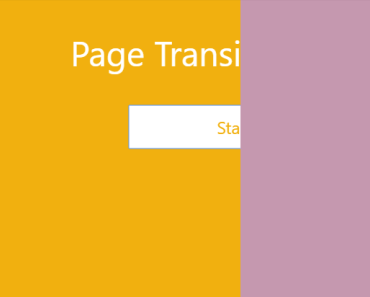
vue2-transitions
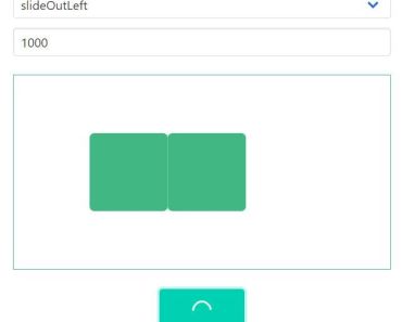
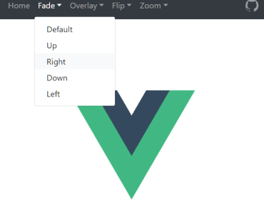
Demo
Codesandbox


Why ❓
-
Brings only the code that you need. Many alternative solutions import the whole animate.css library. Vue2-transitions is minimalistic and lets you import only the transitions that you need in your app
Each transition component has ~2kb (non-minified js+css or ~400 bytes gzipped) and you can import only the ones you really need.
-
Configurable. You can configure animation enter and leave durations as well as all the props of the native Vue
transitioncomponents through props -
Easy to use. No extra classes
Install ☕️
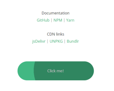
npm i vue2-transitions yarn add vue2-transitionsCDN: UNPKG | jsDelivr (available as window.Vue2Transitions)
Usage 🚀
<template> <fade-transition> <div class="box" v-show="show"> <p>Fade transition</p> </div> </fade-transition> </template> <script> import {FadeTransition} from 'vue2-transitions' export default { components: { FadeTransition } } </script>Global usage
import Transitions from 'vue2-transitions' Vue.use(Transitions)List of available transitions
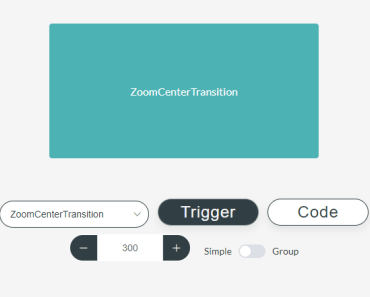
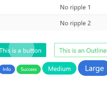
- FadeTransition
- ZoomCenterTransition
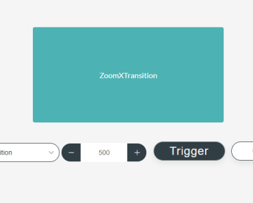
- ZoomXTransition
- ZoomYTransition
- CollapseTransition
- ScaleTransition
- SlideXLeftTransition
- SlideXRightTransition
- SlideYUpTransition
- SlideYDownTransition
Props
props: { /** * Transition duration. Number for specifying the same duration for enter/leave transitions * Object style {enter: 300, leave: 300} for specifying explicit durations for enter/leave */ duration: { type: [Number, Object], default: 300 }, /** * Whether the component should be a `transition-group` component. */ group: Boolean, /** * Transition tag, in case the component is a `transition-group` */ tag: { type: String, default: 'span' }, /** * Transform origin property https://tympanus.net/codrops/css_reference/transform-origin/. * Can be specified with styles as well but it's shorter with this prop */ origin: { type: String, default: '' }, /** * Element styles that are applied during transition. These styles are applied on @beforeEnter and @beforeLeave hooks */ styles: { type: Object, default: () => { return { animationFillMode: 'both', animationTimingFunction: 'ease-out' } } } }Group transitions
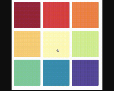
Each transition can be used as a transition-group by adding the group prop to one of the desired transitions.
<fade-transition group> <!--keyed children here--> </fade-transition>Gotchas/things to watch:
- Elements inside
grouptransitions should havedisplay: inline-blockor must be placed in a flex context: Vue.js docs reference - Each transition has a
moveclass move class docs. Unfortunately the duration for the move transition cannot be configured through props. By default each transition has amoveclass associated with.3stransition duration:
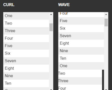
- Zoom
.zoom-move{ transition: transform .3s ease-out; }
- Slide
.slide-move{ transition: transform .3s ease-out; }
- Scale
.scale-move{ transition: transform .3s cubic-bezier(.25,.8,.50,1); }
- Fade
.fade-move{ transition: transform .3s ease-out; }
If you want to configure the duration, just redefine the class for the transition you use with the desired duration.
Contribution
Defining a new transition
The codebase is fairly simple and contains mostly .vue components. If you want to add a new transition to the collection follow these steps:
- Fork the repo.
- Create a new branch.
- Create a new
.vuefile (together with a folder if necessary) - Define the transition.
<template> <component :is="componentType" v-bind="$attrs" v-on="hooks" enter-active-class="enterAnimationClassHere" move-class="move-class" leave-active-class="leaveAnimationClassHere"> <slot></slot> </component> </template> <script> import {baseTransition} from '../mixins/index.js' export default { name: 'transition-name-here', mixins: [baseTransition] } </script> <style> // Your styles for animations here. </style>
- Import the transition in
src/index.jsand place it in theexport defaultobject. - Add the name of the new transition (camelCase) in the
transitionOptionsarray insideexample/App.vue
Besides the properties described above, you can pass in any other Transition props or events Note Overriding hooks (especially beforeEnter or beforeLeave) may cause unwanted effects.
License
MIT © cristijora
Special thanks to
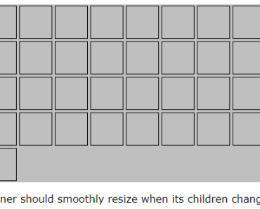
@euvl (The UI for list transitions in the demo is inspired by vue-js-grid demo )


