vue-particle-effect-buttons (demo)
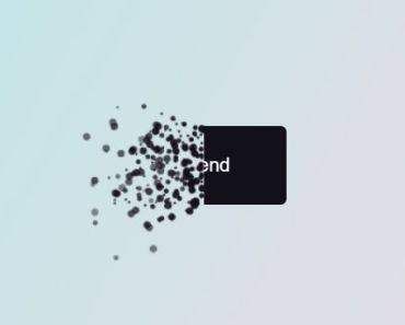
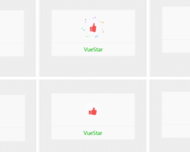
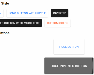
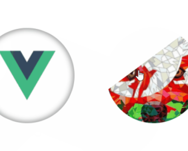
Bursting particle effect buttons for Vue.
This library is a Vue portal of an awesome Codrops Article by Luis Manuel (original source).
Install
npm install --save animejs vue-particle-effect-buttonsUsage
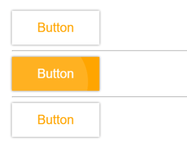
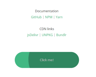
Check out the Demo to see it in action.
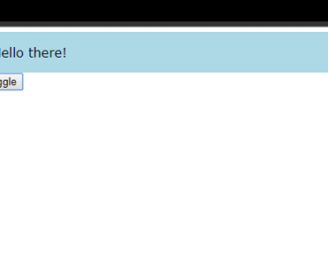
<template> <ParticleBtn :visible.sync="btnOps.visible" :animating.sync="btnOps.animating" :options="btnOps" cls="btn-cls" > hello eveybody! </ParticleBtn> <h2>animating:{{btnOps.animating}}</h2> <h2>visible:{{btnOps.visible}}</h2> <button @click="btnOps.visible=!btnOps.visible">toggle</button> </div> </template> <script> import ParticleEffectButton from "vue-particle-effect-buttons" export default { data() { return { btnOps: { type: "triangle", easing: "easeOutQuart", size: 6, particlesAmountCoefficient: 4, oscillationCoefficient: 2, color: function () { return Math.random() < 0.5 ? "#000000" : "#ffffff"; }, onComplete: () => { console.log("complete"); }, onBegin: () => { console.log("begin"); }, visible: true, animating: false }, } }, components: { ParticleEffectButton } }; </script>Note that children can be anything, The children should represent the button's contents.
You change the visible boolean prop to kick-off an animation, typically as a result of a click on the button's contents. If visible changes to false, the button will perform a disintegrating animation. If visible changes to true, it will reverse and reintegrate the original content.
Props
| Property | Type | Default | Description |
|---|---|---|---|
visible | boolean | true | Whether button should be hidden or visible. Changing this prop starts an animation. support .sync modifier |
animating | boolean | false | Get the current status of animating or end of the animation. support .sync modifier |
cls | string/Object/Arrar | noop | The class to change the default button styles |
duration | number | 1000 | Animation duration in milliseconds. |
easing | string | 'easeInOutCubic' | Animation easing. |
type | string | circle | 'circle' or 'rectangle' or 'triangle' |
style | string | fill | 'fill' or 'stroke' |
direction | string | 'left' | 'left' or 'right' or 'top' or 'bottom' |
canvasPadding | number | 150 | Amount of extra padding to add to the canvas since the animation will overflow the content's bounds |
size | number | func | random(4) |
speed | number | func | random(4) |
particlesAmountCoefficient | number | 3 | Increases or decreases the relative number of particles |
oscillationCoefficient | number | 20 | Increases or decreases the relative curvature of particles |
onBegin | func | noop | Callback to be notified once an animation starts. |
onComplete | func | noop | Callback to be notified once an animation completes. |
I tried to keep the properties exactly the same as in the original codrops version.
Slots
| Property | Type | Default | Description |
|---|---|---|---|
default | slot | the string of 'content' | the content of the button |
Related
- anime.js - Underlying animation engine.
- ParticleEffectsButtons - Original source this library is based on.
- Codrops Article - Original article this library is based on.
Contributors
Thanks goes to these wonderful people (emoji key):
Vincent Guo |
This project follows the all-contributors specification. Contributions of any kind welcome!
