VueStar
查看中文文档,请移步至 这里
demo
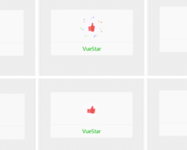
For a better demonstration, please use the phone scan the following two-dimensional code view demo,or click this link http://web-oysun.cn/VueStar/
API
Props
| Option | Type | Description |
|---|---|---|
| animate | String | To activate the animation of the like button |
| color | String | Activate the like button, the color of the button. (note to must be hex or RGB color code) |
Slot
| SlotName | Description |
|---|---|
| icon | Set up the like button |
Detailed instructions
Props
animate
animateSpecify the like button animation, the default is no animation, you can add animation CSS class, of course, can also introduce CSS animation library, such as animate.css
color
colorActivate the button when the button color changes, the default is not. Note: The value of this parameter must be filled in hex or rgb color code, rather than the css class
Slot
icon
iconTo the slot inside fill in any content you want, it is the carrier of the like button
abuout event
Events should be bound in the slot
<template> <vue-star animate="animated rubberBand" color="#F05654"> <a slot="icon" class="fa fa-heart" @click="handleClick"></a> </vue-star> </template> </script> export default { methods: { handleClick () { //do something } } } </script>Simple example
<vue-star animate="yourAnimateCssClass" color="rgb(152, 138, 222)"> <img slot="icon" src="./yourImgPlace/yourImg.png" /> </vue-star> <!--use animate.css and font-awesome --> <vue-star animate="animated bounceIn" color="#F05654"> <i slot="icon" class="fa fa-heart"></i> </vue-star>Installation and use
npm install vue-star- If used as a global component
//In the project entry file import Vue from 'vue' import VueStar from 'vue-star' Vue.component('VueStar', VueStar)- If as a local component
//In a component import VueStar from 'vue-star' export default { components: { VueStar } }Bug and suggestions
If you encounter problems or suggestions in the use, welcome to issues
LICENSE
MIT
