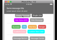
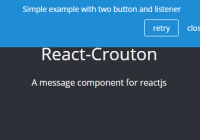
Toast Notifications for React.js. 


Installation
The recommended way to include this sdk into your project is by using npm. Install it into your project as a dependency with
$ npm install react-notify-toast --saveHow to use
To include the modules in the browser context use a bundler tool like Browserify or Webpack.
Import into your project
To include this project you need to require the module by using CommonJS syntax or ES6 Modules Syntax (recommended).
// ES6 import Notifications, {notify} from 'react-notify-toast'; /* Notifications is the default export. It represents the React Component that contains the notifications. You can give the default export any name but in this example it will be referenced as Notifications */ For best results, render the Notifications component in the higher DOM node possible, such as:
// react's app render function render() { return ( <div className='main'> <Notifications /> ... </div> ) } Then just call a notification with notify.show()
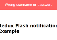
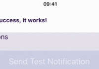
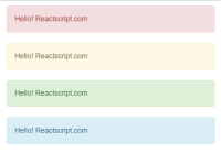
notify.show('Toasty!'); Options
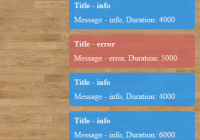
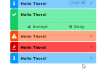
The toast notification function notify.show() supports message, type and timeout attributes in the following way.
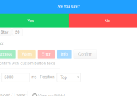
notify.show(message, type, timeout, color)
message is the content of the toast notification.
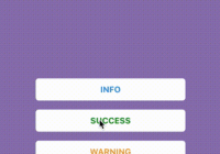
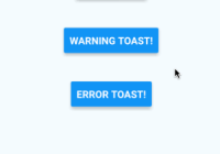
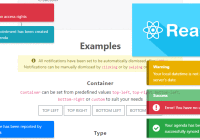
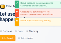
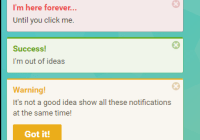
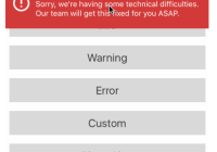
type consists of three variants:
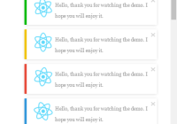
successto render a success notification.warningto render a warning notification.errorto render an error notification.customto render user defined colors for the notification.
if type is not set, it will render a neutral notification.
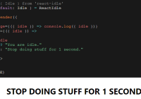
timeout is the time (in milliseconds) the toast will remain on screen. if it's not set, it will display for the default 5000ms time. You can also pass -1 to cause the notification to display persistently.
color is for the background as well as the text of the notification. It accepts an object with the following properties
let myColor = { background: '#0E1717', text: "#FFFFFF" }; notify.show("this is sample text", "custom", 5000, myColor);Manual closing
The notification can be programmatically closed using the hide function, for example, in the click handler of a button in the notification:
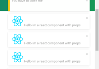
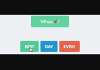
notify.show( <div> this wont close until you click <button onClick={notify.hide}>close</button> </div>, "error", -1 );Overriding Defaults
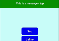
The <Notification/> component can receive an options property, which can override any value in src/defaults.js
This is usually useful to modify the zIndex to ensure the toast notifications are displayed on top of other elements with crazy z-index™
If overwritten, these options will be the default for all subsequent notifications
Supported Options:
wrapperIdHTMLidproperty added to the notification containeranimationDurationtime (in milliseconds) used for the hide and show transitionstimeouttime (in milliseconds) the toast will remain on screenzIndexsets z-index for notification containertopsets vertical offset from top of viewport (in any CSS units)colorsobject that contains supported styles for notifications (can be replaced to support custom color schemes)
Example:
// Will display the notifications at z-index: 200, and with a vertical offset of 50px <Notification options={{zIndex: 200, top: '50px'}} />Note:
Keep in mind that it can only override topmost values, and not nested values. (i.e. not a deep merge, but a shallow assign).
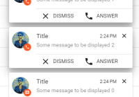
Queued Notifications
A notification queue can be created using the createShowQueue function, for example, in the constructor of a component:
constructor() { super(); this.show = notify.createShowQueue(); }This queue can then be used with the same API as the notify.show function:
this.show('Toasty!');The createShowQueue function has two optional arguments:
-
initialRecallDelayis how long (in ms) to wait if the first attempt at showing a notification fails (because a non-queued notification was already being shown). Default: 500ms -
recallDelayIncrementis a time (in ms) added to the recallDelay after each failed attempt. This is to mitigate numerous rapidly-repeated calls in the case of a non-queued notification being shown without a timeout. Default 500ms