react-redux-toastr demo
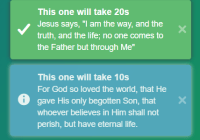
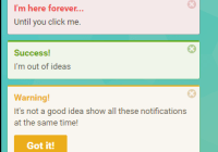
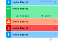
react-redux-toastr is a React toastr message implemented with Redux, primary consists of three things: a reducer, toastr emitter and a React component.
The reducer listens to dispatched actions from the component to maintain the toastr state in Redux.
Implementation Guide
1. Installation
npm install --save react-redux-toastr
2. Add the styles
-
import the scss file into to your project.
@import 'react-redux-toastr/src/styles/index';
-
or import the css file.
import 'react-redux-toastr/lib/css/react-redux-toastr.min.css'- or include the css file from the demo site (NOTE: This file can be changed anytime)
<link href="https://diegoddox.github.io/react-redux-toastr/7.1/react-redux-toastr.min.css" rel="stylesheet" type="text/css">3. Add the reducer.
import {createStore, combineReducers} from 'redux' import {reducer as toastrReducer} from 'react-redux-toastr' const reducers = { // ... other reducers ... toastr: toastrReducer // <- Mounted at toastr. } const reducer = combineReducers(reducers) const store = createStore(reducer)NOTE: The default mount point for react-redux-toastr is toastr.
4. Add the component into an app root
import {Provider} from 'react-redux' import ReduxToastr from 'react-redux-toastr' <Provider store={store}> <div> ... other things like router ... // props are not required <ReduxToastr timeOut={4000} newestOnTop={false} preventDuplicates position="top-left" transitionIn="fadeIn" transitionOut="fadeOut" progressBar closeOnToastrClick/> </div> </Provider>The default configuration is:
{ timeOut: 5000, newestOnTop: true, position: 'top-right', transitionIn: 'bounceIn', transitionOut: 'bounceOut', progressBar: false, closeOnToastrClick: false, }NOTE: transitionIn and transitionOut will affect the confirm animation as well
Here is the full list of available configurations:
-
position:
top-lefttop-centertop-rightbottom-leftbottom-centerandbottom-right -
transitionIn:
bounceInbounceInDownandfadeIn -
transitionOut:
bounceOutbounceOutUpandfadeOut
5. Use the emitter
The toastr method use eventemitter3 to dispatch the actions
import React, {Component} from 'react' import {toastr} from 'react-redux-toastr' export class YourComponent extends Component { render() { return ( <div> <button onClick={() => toastr.success('The title', 'The message')} type="button">Toastr Success</button> </div> ) } }Or you can bind the actions to your component if you prefer.
import {bindActionCreators} from 'redux' import {actions as toastrActions} from 'react-redux-toastr' // In your React component constructor(props) { super(props); // Bind the react-redux-toastr actions to the component this.toastr = bindActionCreators(toastrActions, this.props.dispatch) this.toastr.add({ id: 'mycustomid', // If not provided we will add one. type: 'success', title: 'your title', position: 'top-left', // This will override the global props position. attention: true, // This will add a shadow like the confirm method. onAttentionClick: (id) => {}, //override default behavior of 'attention' background click. message: 'message', options: {} }); this.toastr.remove('toastrId'); }Toastr methods
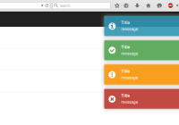
Toastr accepts the following methods: success info warning light error confirm message, remove and removeByType
Toastr: success info warning light error remove and removeByType
Each of these methods can take up to three arguments the title a message and options.
In options you can specify timeOut icon onShowComplete onHideComplete className component removeOnHover,removeOnHoverTimeOut,showCloseButton, onCloseButtonClick, onToastrClick, progressBar, transitionIn, position, attention, onAttentionClick, transitionOut and closeOnToastrClick.
import {toastr} from 'react-redux-toastr' const toastrOptions = { timeOut: 3000, // by setting to 0 it will prevent the auto close icon: (<myCustomIconOrAvatar />), // You can add any component you want but note that the width and height are 70px ;) onShowComplete: () => console.log('SHOW: animation is done'), onHideComplete: () => console.log('HIDE: animation is done'), onCloseButtonClick: () => console.log('Close button was clicked'), onToastrClick: () => console.log('Toastr was clicked'), showCloseButton: true, // false by default closeOnToastrClick: true, // false by default, this will close the toastr when user clicks on it component: ( // this option will give you a func 'remove' as props <MyCustomComponent myProp="myValue"> <span>Hello, World!</span> </MyCustomComponent> ) } toastr.success('Title', 'Message', toastrOptions) toastr.info('The message', toastrOptions) toastr.warning('The title', 'The message') toastr.error('The message') toastr.removeByType('error') // Remove all toastrs with the type error. toastr.remove('123') // Removes toastr with id '123'Toastr methods light
The light method is like the other toastr except that the background-color is white and you can add a top border on top of the toastr by passing the status option
icon can be one of the following:
'success''info''warning''error'
import {toastr} from 'react-redux-toastr' const toastrType = 'warning'; const toastrOptions = { icon: toastrType, status: toastrType } toastr.light('The title', 'The message', toastrOptions)Toastr: message
Use this one if you wanna show a large amount of information. Unlike the other methods above, it would not close automatically unless you provide a timeout in the message options.
const toastrMessageOptions = { timeOut: 3000, // Default value is 0 onShowComplete: () => console.log('SHOW: animation is done'), onHideComplete: () => console.log('HIDE: animation is done'), removeOnHover: false, // Default value is false removeOnHoverTimeOut: 1000, // Default value is 1000 component: React.Component }; toastr.message('Title', toastrMessageOptions)Toastr: confirm
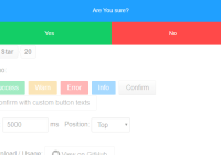
The confirm method takes two arguments. The first one is the message and the second one is an object where you can specify what will happen when the user clicks on ok or on the cancel buttons or on keypress enter/esc.
NOTE: You can only have one confirm toastr at the same time. If you have one confirm and you fire another it will be ignored.
const toastrConfirmOptions = { onOk: () => console.log('OK: clicked'), onCancel: () => console.log('CANCEL: clicked') }; toastr.confirm('Are you sure about that!', toastrConfirmOptions);You can add a manually specified CSS ID selector to the confirmation wrapper element by:
- Including an
idprop in thetoasterConfirmOptionsobject:
const toastrConfirmOptions = { ... id: 'my-custom-id' }; toastr.confirm('Are you sure about that!', toastrConfirmOptions);You can change the ok and cancel texts by:
- Passing
confirmOptionsto theReduxToastrcomponent:
<!-- please define both keys as this will override default okText & cancelText --> const options = { okText: 'confirm text', cancelText: 'cancel text' }; <ReduxToastr confirmOptions={options}/>- Passing
okTextandcancelTextin thetoasterConfirmOptionsobject:
const toastrConfirmOptions = { ... okText: 'confirm text', cancelText: 'cancel text' }; toastr.confirm('Are you sure about that!', toastrConfirmOptions);You can make it so ok is the only button by:
- Passing
disableCancelin thetoasterConfirmOptionsobject:
const toastrConfirmOptions = { ... disableCancel: true }; toastr.confirm('You have timed out! Please log back in.', toastrConfirmOptions);You can add custom buttons by:
-
Passing
buttonsin thetoasterConfirmOptionsobject.The buttons are inserted after the OK and the cancel buttons.
Each button config can have a
text,handlerand aclassNameproperty.If you want to move the original OK or cancel buttons to a different postiion, just insert a an object with a single boolean flag:
okorcancelto the desired position inside buttons. (note that all other properties are ignored in this case).
The following config leads to 3 buttons in the following order:
- "Apply" (original OK button)
- "Do not apply" (our custom button)
- "Cancel" (original cancel button)
const toastrConfirmOptions = { ... okText: 'Apply', buttons: [{ text: 'Do not apply', className: 'do-not-apply-btn', handler: () => console.log('do-not-apply clicked') }, { cancel: true // move the cancel button to the end }] }; toastr.confirm('Your changes are applicable to 5 more records.', toastrConfirmOptions);You can render your custom message component instead of the simple string message by:
- Passing the
componentprop to thetoasterConfirmOptionsobject:
const toastrConfirmOptions = { ... component: () => ( <MyCustomComponent myProp="myValue"> <span>Hello, World!</span> </MyCustomComponent> ) }; toastr.confirm(null, toastrConfirmOptions); // pass null for messageAvatar: in case you wanna use the same avatar as in the example
Run a local demo
git clone https://github.com/diegoddox/react-redux-toastr.git cd react-redux-toastr npm install npm start open your browser at http://localhost:3000
License
MIT. Copyright (c) 2016 Diego Oliveira.
