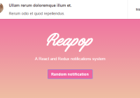
react-native-flash-message
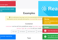
Flash Message it is a React Native module to help you with easily and highly customizable flashbars, top notifications or alerts (with iPhone X, XR, XS and XS Max "notch" support).


Installation
Since the library is a JS-based solution, to install the latest version of react-native-flash-message you only need to run:
npm install --save react-native-flash-messageor
yarn add react-native-flash-messageTry it out
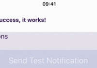
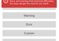
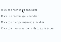
You can try out the Flash Message Playground app to get a tease of the functionalities of this lib.
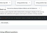
Basic Usage
The FlashMessage component it's build to a global use, so you have to instance this component once in your main app screen always as a last inserted component:
import React from "react"; import { View } from "react-native"; import FlashMessage from "react-native-flash-message"; export default class App extends React.Component { render() { return ( <View style={{ flex: 1 }}> <View ref={"otherView1"} /> <View ref={"otherView2"} /> <View ref={"otherView3"} /> {/* GLOBAL FLASH MESSAGE COMPONENT INSTANCE */} <FlashMessage position="top" /> {/* <--- here as last component */} </View> ); } }After that you only need to call showMessage or hideMessage methods from anywhere in your app.
If you don't need a global use for (e.g. will use only in one screen) you can instance your FlashMessage Component with a ref ID (or other capture ref method):
<View style={{ flex: 1 }}> <YourMainApp /> <FlashMessage ref="myLocalFlashMessage" /> {/* <--- here as last component always with `ref` */} <View>Show some message
Now that you already instantiated the global FlashMessage component, when you need to show some message in your app you could use the showMessage method in any screen or view. This is a global method that receive a message object with your message detail:
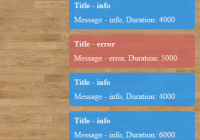
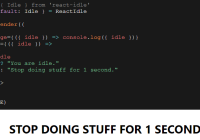
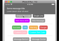
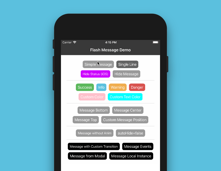
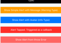
import React from "react"; import { View, Button } from "react-native"; import { showMessage, hideMessage } from "react-native-flash-message"; class MyScreen extends React.Component { render() { return ( <View style={{ flex: 1 }}> <Button onPress={() => { /* HERE WE GONE SHOW OUR FIRST MESSAGE */ showMessage({ message: "Simple message", type: "info", }); }} title="Request Details" color="#841584" /> </View> ); } }The message object obligatorily requires some message attribute. If you need to show a message with two lines (title and more details) you could use message attr for title and description attr for details line:
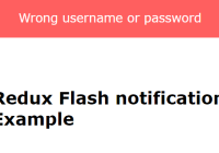
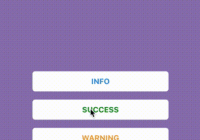
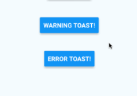
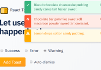
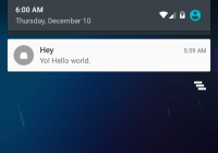
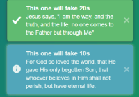
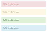
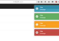
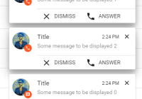
showMessage({ message: "Hello World", description: "This is our second message", type: "success", });The type attribute set the type and color of your flash message, default options are "success" (green), "warning" (orange), "danger" (red), "info" (blue) and "default" (gray).
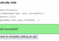
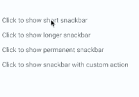
By default all of the messages will be displayed with transitions and with autoHide after 1850 ms enabled. If you need to programmatically hide some message, you can call hideMessage() .
Other message object attributes will be detailed below.
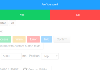
Props
| Property | Default | In Message Object | Description |
|---|---|---|---|
| hideOnPress | true | Yes | Controls if the flash message can be closed on press |
| onPress | none | Yes | onPress callback for flash message press |
| animated | true | Yes | Controls if the flash message will be shown with animation or not |
| animationDuration | 225 | Yes | Animations duration/speed |
| autoHide | true | Yes | Controls if the flash message can hide itself after some duration time |
| duration | 1850 | Yes | How many milliseconds the flash message will be shown if the autoHide it's true |
| hideStatusBar | false | Yes | Controls if the flash message will auto hide the native status bar. Note: Works OK in iOS, not all Android versions support this. |
| floating | false | Yes | The floating prop unstick the message from the edges and applying some border radius to component |
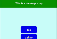
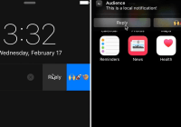
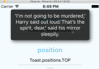
| position | top | Yes | The position prop set the position of a flash message. Expected options: "top" (default), "bottom", "center" or a custom object with { top, left, right, bottom } position |
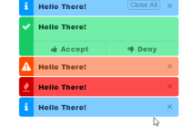
| icon | none | Yes | The icon prop set the graphical icon of a flash message. Expected options: "none" (default), "auto" (guided by type), "success", "info", "warning", "danger" or a custom object with icon type/name and position (left or right) attributes, e.g.: { icon: "success", position: "right" } |
| renderCustomContent | none | No | Render custom JSX below title in flash message. |
| renderFlashMessageIcon | renderFlashMessageIcon | No | Set a custom render function for inside message icons |
| transitionConfig | FlashMessageTransition | No | Set the transition config function used in shown/hide anim interpolations |
| canRegisterAsDefault | true | No | Use to handle if the instance can be registed as default/global instance |
| MessageComponent | DefaultFlash | No | Set the default flash message render component used to show all the messages |
Message Object
When you call showMessage method you need pass a message object to show your message. In this call you could pass some custom attributes to customize your message. Most of the FlashMessage Component props can be passed in runtime calls of showMessage. This common props/attributes are identified in Props table as In Message Object.
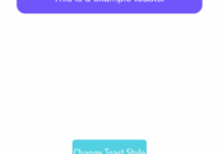
If you need to customize de background color or text color of your message beyond the default types (success, warning, info and danger) you could use the backgroundColor or/and color attributes in your message object:
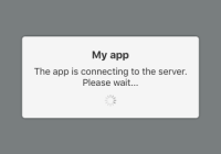
showMessage({ message: "My message title", description: "My message description", type: "default", backgroundColor: "purple", // background color color: "#606060", // text color });If you need to handle the press/touch event in your message, you could use the onPress attribute to take some action:
showMessage({ message: "My message title", description: "My message description", type: "success", onPress: () => { /* THIS FUNC/CB WILL BE CALLED AFTER MESSAGE PRESS */ }, });iPhone X
The main MessageComponent (responsible for render the messages) it's DefaultFlash. This component it's wrapped in other component called FlashMessageWrapper that handles device orientations, statusbar heights and principal wheater or not include the iPhone X "noch" inset padding:


Documentation
More details and usages will coming soon.
