
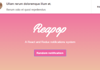
react-redux-notify
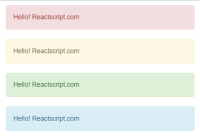
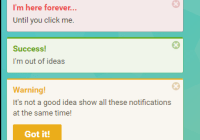
A simple and flexible notifications component built with and for React and Redux, inspired by Atom Editor's Notifications.

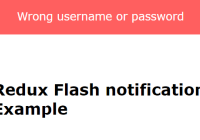
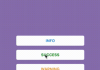
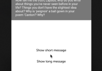
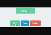
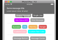
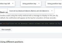
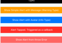
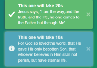
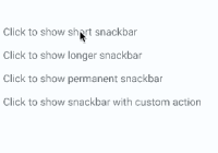
Demo
Live demo: deep-c.github.io/react-redux-notify
Overview and Install
React redux notify is a simple yet flexible component for displaying notifications. You can simply include the component within your app and use the default settings or you can choose to customize it in many different ways. Easiest way to get up and running is to install it via npm.
npm install react-redux-notify --saveNOTE :Version ^4.0.0 requires react@^16.0.0, versions 3.x.x and below supports react@>=15.3.0 but has no portal support.
After which you can import the component and the default styles for use:
import 'react-redux-notify/dist/ReactReduxNotify.css';The styles only need to imported once into your project, usually at the highest level component in which you wish to use Notify.
You can also use the standalone build by including the following css and js files (both minified and unminified exist). You will need to ensure that you have react, redux, react-redux dependecies also included externally.
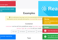
<script src="https://unpkg.com/react-redux-notify/dist/ReactReduxNotify.min.js"></script> <link rel="stylesheet" href="https://unpkg.com/react-redux-notify/dist/ReactReduxNotify.min.css">Demo and Example
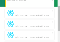
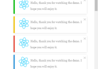
An example can be seen by opening the examples/index.html file in your browser.
Usage
Import the reducer, which is the default export from the library, and add it to your redux store as key notifications.
import notifyReducer from 'react-redux-notify'; const reducers = combineReducers({ notifications: notifyReducer }); const store = createStore(reducers);Add the Notify component to your application. There are a number of props you can pass into the Notify component that allow you to customize it (see Options below).
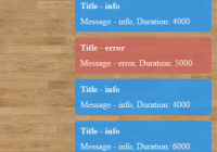
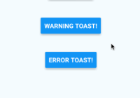
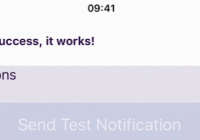
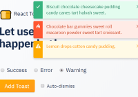
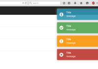
import { Notify } from 'react-redux-notify'; <Notify />To create a notification import the createNotification action creator and dispatch it with your notification configuration obejct. The notification configuration object is just a plain object whose keys are passed along to the Notification component. By default there are 4 types of notifications SUCCESS, WARNING, ERROR and INFO.
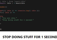
import { connect } from 'react-redux'; import {createNotification, NOTIFICATION_TYPE_SUCCESS} from 'react-redux-notify'; const mySuccessNotification = { message: 'You have been logged in!', type: NOTIFICATION_TYPE_SUCCESS, duration: 0, canDismiss: true, icon: <i className="fa fa-check" /> } class MyComponent extends React.Component { handleClick(){ const {createNotification} = this.props; createNotification(mySuccessNotification); } render(){ return ( <div> <Notify /> <button onClick={this.handleClick.bind(this)}>Dispatch Notification!</button> </div> ) } } const mapDispatchToProps = dispatch => ({ createNotification: (config) => { dispatch(createNotification(config)) }, }) export default connect(null, mapDispatchToProps)(MyComponent)Options
There are a number of options that can be used to change the look and behaviour of both the Notify component as well as the Notification component itself.
Notify Container Component
| Property | Type | Default | Default Options | Description |
|---|---|---|---|---|
| customStyles | object | A custom styles object that gets merged into the default styles and allows for the overriding or creation of individual styles using your own classes. | ||
| notificationComponent | func | (see Notification Component below) | A custom notification you want to use as the default Notification component to render. | |
| transitionDurations | object | { enter : 160, leave: 400 } | React CSS Transition Group timeout values for enter and leave events. If you change the transition classes then you can use these to change the timeout values for your animation. | |
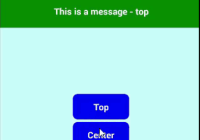
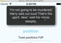
| position | string | 'TopRight' | 'TopRight', 'BottomRight', 'BottomLeft', 'TopLeft' | Default options for where the Notify container will be positioned to render you components. Again this can be extended/customised through your own classes and this prop. |
| forceClose | boolean | 'false' | If set to true will remove all notifications regardless of the notification's canDismiss value. | |
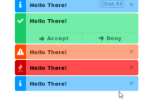
| localization | object | { closeAllBtnText: 'Close All', acceptBtnText: 'Accept', denyBtnText: 'Deny' } | Text that shows for the mentioned buttons. | |
| node | domNode | document.createElement('div') appended to document.body | The portal node into which the notification component will get rendered into. | |
| showCloseAllBtn | boolean | 'true' | If set to false the first notification wont ever show the 'Close All' btn. |
Notify Component Styles
This is the default style mapping created. You can choose to override these with your own classes using the customStyles prop explained above. You can view what these CSS classes do by default in the src/components/Notify/ folder for react-redux-notify in the node_modules directory.
{ containerTopLeft: containerTopRight: containerBottomLeft: containerBottomRight: wrapper: enter: leave: notification-show: notification-hide: notification-shrink: }Furthermore since the positioning of the Notify component is done purely through css and the class is dynamically generated based on the container${position} props value, you can create your own unique position simply.
.CustomBottomPosition { .... .... }import {Notify} from 'react-redux-notify'; const myCustomStyles = { containerCustomBottomPosition: 'CustomBottomPosition' } <Notify customStyles={myCustomStyles} position={'CustomBottomPosition'}/>Action creators
There are 3 action creators available which are all able to be imported from react-redux-notify.
| Action | Args | Description |
|---|---|---|
| createNotification | Takes a single object as its only argument. (see Notification Component below) | The action creator to use when creating a new notification. |
| removeNotification | Takes a number as its only argument. | Removes the notification with the corresponding ID. |
| removeAllNotifications | Takes a boolean value as its only argument. | Removes all notifications where canDimiss is true. If a truthy value is passed then it will forcefully remove all notifications. |
Notification Component
The default notification component has the following configuration options which get passed as props when creating your notification object.
| Property | Type | Default | Can Set | Description |
|---|---|---|---|---|
| id | number | Date.now() | No | The unique identifier for each notification which is generated by the action creator. |
| message | node | Yes | The main content body for the notification. | |
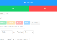
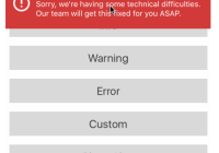
| type | string | Yes | A string that describes the type of notification to be created. By default there are 4 types which can be used SUCCESS, ERROR, WARNING, INFO. These can be imported as constants NOTIFICATION_TYPE_${TYPE}. | |
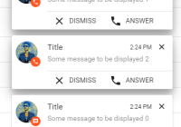
| canDismiss | boolean | true | Yes | Whether the notification allows the user to close the notification. |
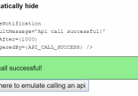
| duration | number | 2000 | Yes | Duration until the notification automatically closes. |
| icon | node | Yes | A node to be rendered as the notification icon. | |
| customStyles | object | Yes | A custom styles object that can be used to replace default styles. | |
| customComponent | element | Yes | A custom component that will be used as the Notification. It will get passed all these props as well as any custom object properties you choose to add to the notification configuration object. | |
| acceptBtn, denyBtn | object : { handler: function(event, object), icon: node,title: node } | Yes | handler must be a function, it gets passed the event as well as an object containing all these notification props.icon is optional and if passed as a string will be used as the button's icon's className else if type is anything else it will get rendered as is.title is rendered as is.note: canDismiss must be false in order for the accept and deny options to be rendered. | |
| isFirst | boolean | false | No | Indicates whether the notification is the first. |
| handleDismiss | function | bound to removeNotification | No | A function bound to removeNotification that is used to dismiss a notification. |
| handleDismissAll | function | bound to removeAllNotifications | No | A function bound to removeAllNotifications that is used to dismiss all notifications. |
| showCloseAllBtn | boolean | 'true' | If set to false this notification specifically wont ever show the 'Close All' btn. |
Notification Component Styles
This is the default style mapping created. You can choose to override these with your own classes using the customStyles prop explained above. You can view what these CSS classes do by default in the src/components/Notification/ folder for react-redux-notify in the node_modules directory.
{ actionBtn: close: close-all: content: has-close: has-close-all: has-close-all--noDismiss: icon: item: item__btnBar: item__message: no-close: notification--error: notification--info: notification--success: notification--warning: }Contributing and Development
Changes and new ideas are always welcome.
git clone git@github.com:deep-c/react-redux-notify.git cd react-redux-notify npm install npm start# Uncomment these two lines from `./examples/index.html` <!-- <link rel="stylesheet" href="../dist/ReactReduxNotify.css" /> --> <!-- <script src="../dist/ReactReduxNotify.js"></script> --> # Comment out these two lines from `./examples/index.html` <link rel="stylesheet" href="https://unpkg.com/react-redux-notify/dist/ReactReduxNotify.min.css" /> <script src="https://unpkg.com/react-redux-notify/dist/ReactReduxNotify.min.js"></script>To Do
- Test browser compatibility.
- Allow mounting reducer at custom key.
Have an online demo page.Complete tests for Notify Component (awaiting react 15.4.0 see react issue).Support for use of inline styles. (Ive decided to not go ahead with this. If you think this is bad decision please feel free to open an issue for discussion, create a PR or use a custom notification component. )
License
MIT Copyright (c) 2016 Deeptesh Chagan