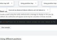
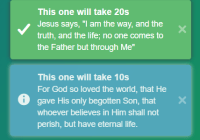
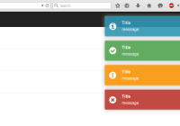
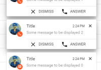
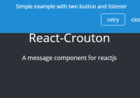
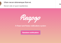
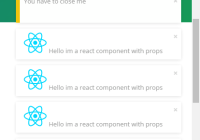
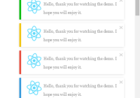
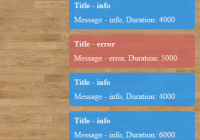
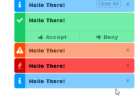
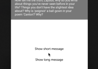
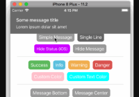
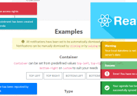
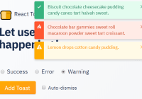
A simple but flexible implementation of toast style notifications for React extracted from Sancho UI.
View the demo and documentation.
Features
- An imperative API. This means that you don't need to set component state or render elements to trigger notifications. Instead, just call a function.
- Render whatever you want. Utilize the render callback to create entirely custom notifications.
- Functional default styles. Import the provided css for some nice styling defaults or write your own styles.
Install:
yarn add toasted-notes Example
import toaster from 'toasted-notes'; import 'toasted-notes/src/styles.css'; // optional styles const HelloWorld = () => ( <button onClick={() => { toaster.notify('Hello world', { duration: 2000 }) }}> Say hello </button> )API
The notify function accepts either a string, a react node, or a render callback.
// using a string toaster.notify('With a simple string') // using jsx toaster.notify(<div>Hi there</div>) // using a render callback toaster.notify(({ onClose }) => ( <div> <span>My custom toaster</span> <button onClick={onClose}>Close me please</button> </div> ))It also accepts options.
toaster.notify('Hello world', { position: 'bottom-left', // top-left, top, top-right, bottom-left, bottom, bottom-right duration: null // This notification will not automatically close })Using Context
One downside to the current API is that render callbacks and custom nodes won't get access to any application context, such as theming variables provided by styled-components. To ensure that render callbacks have access to the necessary context, you'll need to supply that context to the callback.
const CustomNotification = ({ title }) => { const theme = useTheme() return <div style={{ color: theme.primary }}>{title}</div> } const CustomNotificationWithTheme = withTheme(CustomNotification) toaster.notify(() => <CustomNotificationWithTheme title="I am pretty" />)Contributors
License
MIT
Prior art
Way back, this was originally based on the wonderful implementation of notifications in evergreen.
