
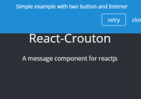
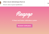
React Toast Notifications
A configurable, composable, toast notification system for react.
https://jossmac.github.io/react-toast-notifications
Install
yarn add react-toast-notificationsUse
Wrap your app in the ToastProvider, which provides context for the Toast descendants.
import { ToastProvider, useToasts } from 'react-toast-notifications' const FormWithToasts = () => { const { addToast } = useToasts() const onSubmit = async value => { const { error } = await dataPersistenceLayer(value) if (error) { addToast(error.message, { appearance: 'error' }) } else { addToast('Saved Successfully', { appearance: 'success' }) } } return <form onSubmit={onSubmit}>...</form> } const App = () => ( <ToastProvider> <FormWithToasts /> </ToastProvider> )ToastProvider Props
For brevity:
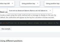
PlacementTypeis equal to'bottom-left' | 'bottom-center' | 'bottom-right' | 'top-left' | 'top-center' | 'top-right'.TransitionStateis equal to'entering' | 'entered' | 'exiting' | 'exited'.
| Property | Description |
|---|---|
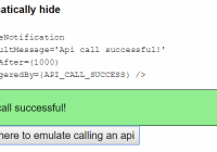
autoDismissTimeout number | Default 5000. The time until a toast will be dismissed automatically, in milliseconds. |
children Node | Required. Your app content. |
components { ToastContainer, Toast } | Replace the underlying components. |
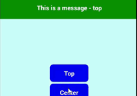
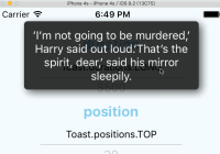
placement PlacementType | Default top-right. Where, in relation to the viewport, to place the toasts. |
transitionDuration number | Default 220. The duration of the CSS transition on the Toast component. |
Toast Props
| Property | Description |
|---|---|
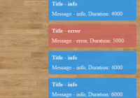
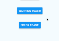
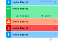
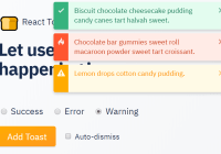
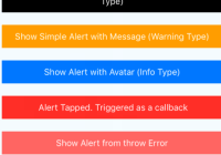
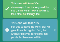
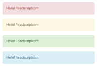
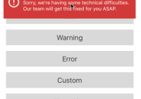
| appearance | Required. One of success, error, warning, info |
| children | Required. The content of the toast notification. |
autoDismiss boolean | Default: false. Whether or not to dismiss the toast automatically after a timeout. |
autoDismissTimeout number | Inherited from ToastProvider. |
onDismiss: Id => void | Passed in dynamically. |
pauseOnHover: boolean | Default: false. Whether or not to pause the timeout when hovered. |
placement PlacementType | Inherited from ToastProvider. |
transitionDuration number | Inherited from ToastProvider. |
transitionState: TransitionState | Passed in dynamically. |
Hook
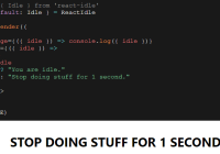
The useToast hook has the following signature:
const { addToast, removeToast, toastStack } = useToasts();The addToast method has three arguments:
- The first is the content of the toast, which can be any renderable
Node. - The second is the
Optionsobject, which can take any shape you like.Options.appearanceis required when using theDefaultToast. When departing from the default shape, you must provide an alternative, compliantToastcomponent. - The third is an optional callback, which is passed the added toast
ID.
The removeToast method has two arguments:
- The first is the
IDof the toast to remove. - The second is an optional callback.
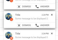
The toastStack is an array of objects representing the current toasts, e.g.
[ { content: 'Something went wrong', id: 'generated-string', appearance: 'error' }, { content: 'Item saved', id: 'generated-string', appearance: 'success' } ]Replaceable Components
To bring each toast notification inline with your app, you can provide alternative components to the ToastProvider:
import { ToastProvider } from 'react-toast-notifications'; const MyCustomToast = ({ appearance, children }) => ( <div style={{ background: appearance === 'error' ? 'red' : 'green' }}> {children} </div> ); const App = () => ( <ToastProvider components={{ Toast: MyCustomToast }}>...</ToastProvider> );To customize the existing component instead of creating a new one, you may import DefaultToast:
import { DefaultToast } from 'react-toast-notifications'; export const MyCustomToast = ({ children, ...props }) => ( <DefaultToast {...props}> <SomethingSpecial>{children}</SomethingSpecial> </DefaultToast> );Alternatives
This library may not meet your needs. Here are some alternative I came across whilst searching for this solution:
