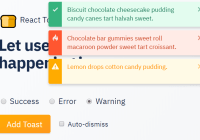
react-native-message-bar
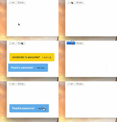
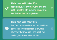
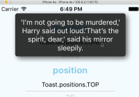
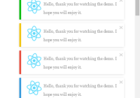
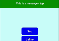
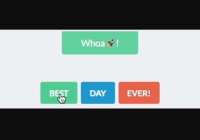
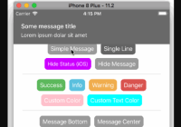
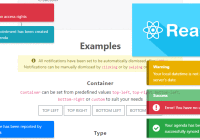
A message bar notification component displayed at the top of the screen for React Native (Android and iOS) projects.
Content
- Features
- Installation
- Basic Usage
- Hide the Message Bar Alert
- Customize Alert Type
- Customize Alert Content
- Customize View Layout
- Customize Position and Animation, Twitter Style!
- Properties
- Contributing
- TODOS
- Apps using this library
- License
Features
- Android and iOS capable
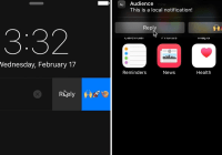
- Animated alert with Title, Message and Icon/Avatar (from a local or a remote image file)
- Top or Bottom display
- 4 Slides Animation Types (Alert is shown from top, from bottom, from left or from right)
- Auto-hide after x seconds (customizable and/or can be disabled)
- Auto-hide current alert to display a newer one, if context requires to do so
- Support hide on tap (can be disabled)
- 4 pre-configured customizable styles + 1 extra
- Customizable texts, styles, durations, positions and animation
- Callbacks on alert show, hide and tap
- Orientation supported
- Children component support Show/Hide alert
Installation
Make sure that you are in your React Native project directory and run:
$ npm install react-native-message-bar --saveBasic Usage
-
- Import the
react-native-message-barpackage
- Import the
var MessageBarAlert = require('react-native-message-bar').MessageBar; var MessageBarManager = require('react-native-message-bar').MessageBarManager;-
- Add the
MessageBarAlertto your render function Note: Add it at the very end of your render function, the alert will then be displayed over any component of the view
- Add the
// Within your render function. // Include the MessageBar once within your top View element // Make sure you add the MessageBar at the very bottom of your master component, then it will be displayed over all other components <MessageBarAlert ref="alert" />-
- Register and Release your Message Bar as the current main alert
componentDidMount() { // Register the alert located on this master page // This MessageBar will be accessible from the current (same) component, and from its child component // The MessageBar is then declared only once, in your main component. MessageBarManager.registerMessageBar(this.refs.alert); } componentWillUnmount() { // Remove the alert located on this master page from the manager MessageBarManager.unregisterMessageBar(); }-
- Display the Message Bar Alert on demand
// Call this method after registering your MessageBar as the current alert // By calling this method the registered alert will be displayed // This is useful to show the alert from your current page or a child component MessageBarManager.showAlert({ title: 'Your alert title goes here', message: 'Your alert message goes here', alertType: 'success', // See Properties section for full customization // Or check `index.ios.js` or `index.android.js` for a complete example });Please note, if you do not provide a alertType, the info one will be chosen for you.
The normal duration of the notification is 3 seconds (3000 ms), you can override it. After this time, the notification is going to be hidden
See a full Example in index.ios.js or index.android.js.
Hide the Message Bar Alert
// You can force the current alert to be hidden through the Manager MessageBarManager.hideAlert();Customize Alert Type
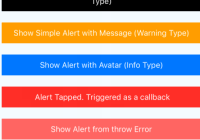
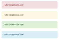
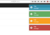
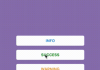
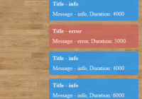
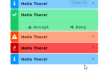
The Message Bar Alert comes with 4 pre-configured alert style and 1 undefined extra. These alert styles defined the background color of the alert and the line stroke color. The 4 pre-configured alert styles are:
infodefined blue colorssuccessdefined green colorswarningdefined orange colorserrordefined red colors
The extra alert type allows you to use another 5th type.
MessageBarManager.showAlert({ ... alertType: 'info', // Alert Type: you can select one of 'success', 'error', 'warning', 'error', or 'custom' (use custom if you use a 5th stylesheet, all are customizable). Default is 'info' /* Customize the stylesheets and/or provide an additional one 'extra' */ stylesheetInfo : {{ backgroundColor : '#007bff', strokeColor : '#006acd' }}, // Default are blue colors stylesheetSuccess : {{ backgroundColor : 'darkgreen', strokeColor : '#b40000' }}, // Default are Green colors stylesheetWarning : {{ backgroundColor : '#ff9c00', strokeColor : '#f29400' }}, // Default are orange colors stylesheetError : {{ backgroundColor : '#ff3232', strokeColor : '#FF0000' }}, // Default are red colors stylesheetExtra : {{ backgroundColor : 'black', strokeColor : 'gray' }}, // Default are blue colors, same as info ... });Customize Alert Content
You can customize the style of the Title, Message and Icon/Avatar.
MessageBarManager.showAlert({ ... title: "John Doe", // Title of the alert message: "Hello, any suggestions?", // Message of the alert avatar: "<URL/require('<path>') of your icon/avatar>", // Avatar/Icon <URL> of the alert or enter require('LOCALPATH') for local image /* Number of Lines for Title and Message */ titleNumberOfLines: 1, messageNumberOfLines: 0, // Unlimited number of lines /* Style for the text elements and the */ titleStyle: {{ color: 'white', fontSize: 18, fontWeight: 'bold' }}, messageStyle: {{ color: 'white', fontSize: 16 }}, avatarStyle: {{ height: 40, width: 40, borderRadius: 20 }}, ... });Customize Message Bar Alert Layout
You can customize the inset (padding) and the offset of the alert.
MessageBarManager.showAlert({ ... /* Offset of the View, useful if you have a navigation bar or if you want the alert be shown below another component instead of the top of the screen */ viewTopOffset : 0, // Default is 0 viewLeftOffset : 0, // Default is 0 viewRightOffset : 0, // Default is 0 /* Inset of the view, useful if you want to apply a padding at your alert content */ viewTopInset : 15, // Default is 0 viewLeftInset : 0, // Default is 0 viewRightInset : 0, // Default is 0 ... });Customize Position and Animation, Twitter Style!
You can choose the position (topor bottom) of the alert. You can choose the way the alert is shown (SlideFromTop, SlideFromBottom, SlideFromLeft or SlideFromRight).
MessageBarManager.showAlert({ ... /* Position of the alert and Animation Type the alert is shown */ position: 'bottom', animationType: 'SlideFromLeft', ... });Properties
| Prop | Type | Default | Description |
|---|---|---|---|
| title | String | Title of the alert | |
| message | String | Message of the alert | |
| avatar | String | Avatar/Icon source/URL of the alert. Use for a remote image file (eg avatar: 'http://mywebsite.com/myimage.jpg') or use avatar: require('<path/to/my/local/image.extension>') for a remote image file | |
| alertType | String | info | Alert Type: you can select one of 'success', 'error', 'warning', 'error', or 'custom' (use custom if you use a 5th stylesheet, all are customizable). |
| duration | Number | 3000 | Number of ms the alert is displayed |
| shouldHideAfterDelay | Bool | true | Tell the MessageBar whether or not it should hide after a delay defined in the duration property. If false, the MessageBar remain shown |
| shouldHideOnTap | Bool | true | Tell the MessageBar whether or not it should hide or not when the user tap the alert. If false, the MessageBar will not hide, but the onTapped function is triggered, if defined. In addition, if false, the onHide function will not be triggered. The property shouldHideAfterDelay take precedence over shouldHideOnTap. That means if shouldHideAfterDelay is false, the value of shouldHideOnTap is not taken into account, since the MessageBar will not ever be hidden |
| onTapped | Function | Callback function after alert is tapped | |
| onShow | Function | Callback function after alert is shown | |
| onHide | Function | Callback function after alert is hidden | |
| stylesheetInfo | Object | { backgroundColor: '#007bff', strokeColor: '#006acd' } | Background color and line stroke colors of the alert when alertType is equals to info |
| stylesheetSuccess | Object | { backgroundColor: 'darkgreen', strokeColor: '#b40000' } | Background color and line stroke colors of the alert when alertType is equals to success |
| stylesheetWarning | Object | { backgroundColor: '#ff9c00', strokeColor: '#f29400' } | Background color and line stroke colors of the alert when alertType is equals to warning |
| stylesheetError | Object | { backgroundColor: '#ff3232', strokeColor: '#FF0000' } | Background color and line stroke colors of the alert when alertType is equals to error |
| stylesheetExtra | Object | { backgroundColor: '#007bff', strokeColor: '#006acd' } | Background color and line stroke colors of the alert when alertType is equals to extra |
| durationToShow | Number | 350 | Duration of the animation to completely show the alert |
| durationToHide | Number | 350 | Duration of the animation to completely hide the alert |
| viewTopOffset | Number | 0 | Offset of the view from the top. That means the alert touch the top edge of the screen. |
| viewBottomOffset | Number | 0 | Offset of the view from the bottom. That means the alert touch the bottom edge of the screen |
| viewLeftOffset | Number | 0 | Offset of the view from the left. That means the alert touch the left edge of the screen |
| viewRightOffset | Number | 0 | Offset of the view from the right. That means the alert touch the right edge of the screen |
| viewTopInset | Number | 0 | Padding Top of the view |
| viewBottomInset | Number | 0 | Padding Bottom of the view |
| viewLeftInset | Number | 0 | Padding Left of the view |
| viewRightInset | Number | 0 | Padding Right of the view |
| titleNumberOfLines | Number | 1 | Number of lines of the title. 0 means unlimited |
| messageNumberOfLines | Number | 2 | Number of lines of the message. 0 means unlimited |
| avatarStyle | Style | { height: 40, width: 40, borderRadius: 20, alignSelf: 'center' } | Style of the icon/avatar |
| titleStyle | Style | { color: 'white', fontSize: 18, fontWeight: 'bold' } | Style of the title |
| messageStyle | Style | { color: 'white', fontSize: 16 } | Style of the message |
| position | String | top | Define the position of the alert, can be top or right |
| animationType | String | SlideFromTop | Define the way the alert is animated on the view, can be SlideFromTop, SlideFromBottom, SlideFromLeft or SlideFromRight. If no value is specified, the animation type is selected for you based on the position; SlideFromTop if position is equal to top, SlideFromBottom if position is equal to bottom. The alert will then be smoothly displayed |
Contributing
- Fork this Repo first
- Clone your Repo
- Install dependencies by $ npm install
- Checkout a feature branch
- Feel free to add your features
- Make sure your features are fully tested
- Publish your local branch, Open a pull request
- Enjoy hacking <3
TODOS
- Add Alert Queuing System
- Add Bottom Position
- Add Slide Animations Type (Slide from Top, Bottom, Left, Right)
- Add Other Animations Type (Fade-in, Elastic, etc.)
- Add customizable Animation (inject your configuration)
- Anything that can help to improve :) Thanks for contributions
Apps using this library
- Your App here...
License
React-Native-Message-Bar is released under MIT License. See LICENSE for details.
Copyright © 2016 KBLNY.
Please provide attribution, it is greatly appreciated.
