Butter Toast
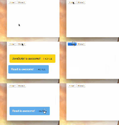
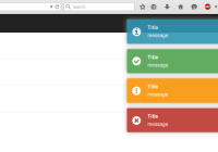
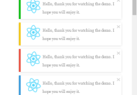
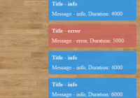
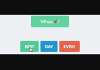
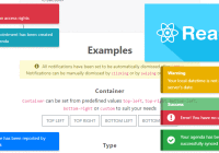
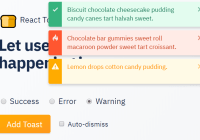
Butter Toast is a toast notification system for React apps that puts an emphasis on ease of use, customizability and butter-smooth transitions.
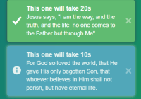
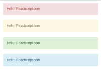
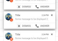
Butter Toast comes with a few built-in styles which you can apply, and you can also use any component for creating the notifications.
Basic usage
The following example code will show a toast whenever the ClickMe button gets clicked. You can read more about the functions and constants used in the docs below.
You can try this example as a live demo here;
import React, { Component } from 'react'; import ButterToast, { Cinnamon, POS_BOTTOM, POS_RIGHT } from 'butter-toast'; class App extends Component { onClickMe() { ButterToast.raise({ content: <Cinnamon.Crisp scheme={Cinnamon.Crisp.SCHEME_BLUE} content={() => <div>You can put basically anything here.</div>} title="ButterToast example"/> }); } render() { return ( <div> This is a simple butter toast example. <button onClick={this.onClickMe.bind(this)}>ClickMe</button> <ButterToast position={{vertical: POS_BOTTOM, horizontal: POS_RIGHT}}/> </div> ) } }V3 update
V3 is a near-complete re-write of butter-toast. It brings with it a simpler API and overall more stability (plus, better ie11 support), moreover - it better supports addign features in the future. IT IS INCOMPATIBLE WITH V2. If you are currently a happy V2 user, there is no need to rush for an upgrade - new features will only be added to V3, though.
Terminology:
- Toast: A single notification in the stack.
- Tray: The containing element of a stack of toasts.
- Raise: The action of showing a toast of the screen.
- Dismiss: The action of removing a toast from the screen.
- Cinnamon: Styles library bundled with butter-toast
Content
Features
- Any component can be a toast. You can use whatever you like.
- Rendering the toast-notifications globally right under body to prevent stacking-context collision.
- Rendering the toast notifications in-context, for positioning relative to parent component.
- Multiple notification tray support, they can be namespaced for separate controls.
- Emitting notifications from every part of your application, not just from the container component.
- Multiple built-in themes.
- Sticky toast notifications.
- Custom on-dismiss and on-click callbacks.
- Custom timeouts for toasts.
- Toasts pause on hover.
- dismissAll at once.
Installation
npm install --save butter-toast Controlling the bundle size
By default ButterToast comes with a few built-in toast styles. For these styles, it uses Styled Components which adds to the overall bundle size. If you do not intend to use the built-in styles, you can use the lean bundle, which only exposes core stacking behavior, and is only ~4Kb gzipped.
import ButterToast from 'butter-toast/dist/lean.min.js';Usage
Creating a notification tray
To use Butter Toast you first need to instantiate a notification tray. You do this by rendering the <ButterToast/> Component. By default it will append your current tray directly under body unless you pass the renderInContext prop read more.
ButterToast props:
| Prop | Type | Default | Optional | Description |
|---|---|---|---|---|
renderInContext | boolean | true | Y | Determines whether the tray should be renderd relative to body or to its parent component. |
className | string | Y | Adds a class to the tray for custom styling | |
namespace | string | Y | Scopes the tray under a namespace, useful when multiple trays are present on the page. | |
position | object | null | { horizontal: 'POS_RIGHT', vertical: 'POS_TOP' } | Y |
timeout | number | 6000 | Y | The default time in ms for toasts in the tray. Can be overridden individually. |
spacing | number | 10 | Y | The distance in pixels between each toast in the tray. |
style | Object | undefined | Y | Custom style object for the tray, eases custom positioning |
import React, { Component } from 'react'; import ButterToast from 'butter-toast'; class MyComponent extends Component { render() { return ( <div> <ButterToast/> </div> ); } }Understanding renderInContext
By default, a tray gets rendered as a top-level element, appended to the <body> of your html page. The reason this happens is that your toasts appear in an as-high-as-possible stacking context and that nothing shows on top of them. If you need your toasts to be aligned to the content of your react app, or positioned relative to it, use the renderInContext prop that will treat your tray as a regular react component and render it as a descendant of its parent component.
When using renderInContext you will not be able to use ButterToasts positioning, you will need to manually specify the position for the tray using CSS.
To determine the direction in which the toasts stack, you can still use the position.vertical prop. Setting it to POS_TOP will make them stack from the top-down, and using POS_BOTTOM will make them stack from the bottom-up.
Positioning the tray
By default a tray can be aligned to any of the four corners of the screen, and to the top-center, and bottom-center. You can of course use any positioning you would like via css, or a custom style prop to the tray.
If you use renderInContext, no positioning will be applied to your tray - css will need to be used.
ButterToast exposes five constants that let you determine the position of the tray on the scree:
import ButterToast, { POS_TOP, POS_BOTTOM, POS_LEFT, POS_RIGHT, POS_CENTER } from 'butter-toast';With these you can specify the vertical and horizontal position of the tray. You need to create an object containing the keys horizontal and vertical to specify where the tray should appear, and pass it down as the position prop:
import React, { Component } from 'react'; import ButterToast, { POS_TOP, POS_CENTER } from 'butter-toast'; class MyComponent extends Component { render() { const position = { vertical: POS_TOP, horizontal: POS_CENTER }; return ( <div> <ButterToast position={position}/> </div> ); } }If you want to manually set the position via css, set position to null and no positioning will apply:
import React, { Component } from 'react'; import ButterToast from 'butter-toast'; class MyComponent extends Component { render() { return ( <div> <ButterToast position={null}/> </div> ); } }Using the style prop
If you deal with a more complex scenario in which you need some more customized styling over existing - such as displaiyng your notifications below your sticky header - you can add a style property to your tray and it will override Butter-Toast's styles with yours.
So for example:
<ButterToast position={{vertical: POS_TOP, horizontal: POS_CENTER}} style={{ top: '50px' }}>Will override POS_TOP's default 10px with 50px.
Raising (emitting) a toast
To emit a toast, you need to use Butter Toast's raise method. Raise accepts the toast and its configuration, and returns its id. The id can later be used to dismiss the toast.
Raise params:
The raise method accepts an object containing the content of your toast, and configuration for it:
| Prop | Type | Default | Optional | Description |
|---|---|---|---|---|
content | node | | N | The actual content being rendered. Could be a react component, a function returning JSX or a string of text. |
namespace | string | Y | The named trays to which the toast should apply | |
timeout | number / Infinity | | Y | Overrides the tray's default timeout for the current toast. When Infinity, sets sticky to true. |
sticky | boolean | false | Y | Makes the toast ignore its timeout and not dismiss until dismiss gets called on it. |
dismiss | function | | Y | A custom dismiss function, passing it will require manually calling dismiss. The function will be passed down as a prop to content |
onClick | function | | Y | onClick handler. The function will be passed down as a prop to content. |
pauseOnHover | boolean | true | Y | By default, a toast that's being hovered will pause and not dismiss until released. Setting this to false will override this behavior. |
Toast's Content props:
toastId: the toast's iddismiss: either the native, or the custom dismiss handleronClick: if passed, the onClick handler.-
- any other prop passed to
raise
- any other prop passed to
Using the Custom dismiss and onClick handlers:
Using a custom dismiss handler will override the default dismiss handler passed down to the component. This means that you will need to call the native dismiss handler manually.
Both dismiss and onClick recieve the following params:
e: the event that triggered the function (i.e.:click)toast: The full toast object, containing its component and iddismiss: The native dismiss handler that needs to be called when manually dismissing the toast.
Accessing raise:
The raise method is accessible in two ways:
- A static method accessible via
ButterToast: This is extremely useful if you wish notifications to your tray from different locations in your app, or even from outside of React.
If you have multiple trays in the page, using raise this way will emit the toast from all tray, unless you use the tray's namespace.
import ButterToast from 'butter-toast'; import `MyToast` from './MyToast'; import React from 'react'; ButterToast.raise({ namespace: 'my-tray', content: MyToast, onClick: ({ toastId, dismiss }) => { console.log('dismissing!'); dismiss(); } }); ButterToast.raise({ content: ({ toastId, dismiss }) => <div onClick={dismiss}>woohoo!</div> }); ButterToast.raise({ content: 'this is pretty awesome' });- An instance method accessible via
refThis works exactly like the static method (option 1), only that you do not need to specify the namespapce of the tray as it is pre-linked.
import React, { Component } from 'react'; import ButterToast from 'butter-toast'; import MyToast from './MyToast'; class MyComponent extends Component { emitNotification = () => { this.tray.raise({ content: MyToast }); } render() { return ( <div> <ButterToast ref={tray => this.tray = tray} position={null}/> </div> ); } }Dismissing toasts
Sometimes you would want to dismiss a toast from the outside the toast itself. Similarly raise, Butter Toast exposes the dismiss and dismissAll methods. Just like raise, they can be exposed either as ButterToast static functions (ButterToast.dismiss / ButterToast.dismissAll) or as instance methods (this.tray.dismiss / this.tray.dismissAll).
dismiss accepts the toast's id, and it will dismiss only it, if present in the tray specified.
import ButterToast, { dismiss } from 'butter-toast'; const toast = ButterToast.raise({ ... }); ButterToast.dismiss(toast);dismissAll takes no arguments. If used on a ref, it will dismiss all toasts in the tray, otherwise, it will remove all toasts on the screen.
import React, { Component } from 'react'; import ButterToast from 'butter-toast'; import MyToast from './MyToast'; class MyComponent extends Component { dismissAll = () => { this.tray.dismissAll(); } render() { return ( <div> <ButterToast ref={tray => this.tray = tray} position={null}/> </div> ); } }Using the built in styles (Sprinkle some cinnamon on top)
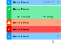
For your convenience, Butter toast comes with a few built in Components for quick styling.
You can import them via the cinnamon export.
import ButterToast, { Cinnamon } from 'butter-toast'; ButterToast.raise({ content: <Cinnamon.Crisp title="exciting stuff" content="some words" scheme={Cinnamon.Crisp.SCHEME_RED}/> });The included styles are:
- Crisp
- Crunch
- Slim
Each style comes with its own color schemes, and have a few more props the can further customize them.
All components' content props can be a node. This means that you can pass down a component, a function that returns JSX or a string of text.
The schemes can be accessed as an export of the component itself:
import ButterToast, { Cinnamon } from 'butter-toast'; Cinnamon.Crisp.SCHEME_BLUE; Cinnamon.Crunch.SCHEME_ORANGE; Cinnamon.Slim.SCHEME_DARK;Crisp
Crisp exposes the following color schemes: SCHEME_GREY, SCHEME_RED, SCHEME_ORANGE, SCHEME_PURPLE, SCHEME_GREEN, SCHEME_BLUE.
Crisp props:
| Prop | Type | Default | Optional | Description |
|---|---|---|---|---|
dismissible | boolean | true | Y | Determines whether the x button should be visible. |
title | node | null | Y | A component or a string containing the title of the toast. |
content | node | null | Y | A component or a string containing the content of the toast. |
icon | node | null | Y | A component or a string containing the icon of the toast. |
scheme | string | SCHEME_GREY | Y | The color scheme for the toast. |
Crunch
Crunch exposes the following color schemes: SCHEME_GREY, SCHEME_RED, SCHEME_ORANGE, SCHEME_GREEN, SCHEME_BLUE.
Crunch props:
| Prop | Type | Default | Optional | Description |
|---|---|---|---|---|
dismissible | boolean | true | Y | Determines whether the x button should be visible. |
title | node | null | Y | A component or a string containing the title of the toast. |
content | node | null | Y | A component or a string containing the content of the toast. |
icon | node | null | Y | A component or a string containing the icon of the toast. |
scheme | string | SCHEME_GREY | Y | The color scheme for the toast. |
Slim
Crunch exposes the following color schemes: SCHEME_DARK, SCHEME_LIGHT.
Crunch props:
| Prop | Type | Default | Optional | Description |
|---|---|---|---|---|
content | node | null | Y | A component or a string containing the content of the toast. |
scheme | string | SCHEME_GREY | Y | The color scheme for the toast. |


