React Notification System
A complete and totally customizable component for notifications in React.
Initially built for Eterpret @ Scalable Path.
Installing
This component is available as CommonJS and UMD module. Install via NPM running:
npm install react-notification-system Important
For React ^0.14.x or React ^15.x.x, use version 0.2.x:
npm install [email protected] For React 0.13.x, use version 0.1.x:
npm install [email protected] Using
For optimal appearance, this component must be rendered on a top level HTML element in your application to avoid position conflicts.
Here is a basic example. For a more advanced usage, please see the example code.
Class-based components can also be used as follows
var React = require('react'); var ReactDOM = require('react-dom'); var NotificationSystem = require('react-notification-system'); var MyComponent = React.createClass({ _notificationSystem: null, _addNotification: function(event) { event.preventDefault(); this._notificationSystem.addNotification({ message: 'Notification message', level: 'success' }); }, componentDidMount: function() { this._notificationSystem = this.refs.notificationSystem; }, render: function() { return ( <div> <button onClick={this._addNotification}>Add notification</button> <NotificationSystem ref="notificationSystem" /> </div> ); } }); ReactDOM.render( React.createElement(MyComponent), document.getElementById('app') );import React from 'react'; import ReactDOM from 'react-dom'; import NotificationSystem from 'react-notification-system'; export default class MyComponent extends React.Component { notificationSystem: React.createRef(); addNotification = event => { event.preventDefault(); const notification = this.notificationSystem.current; notification.addNotification({ message: 'Notification message', level: 'success' }); }; render() { return ( <div> <button onClick={this.addNotification}>Add notification</button> <NotificationSystem ref={this.notificationSystem} /> </div> ); } } ReactDOM.render( React.createElement(MyComponent), document.getElementById('app') );Methods
addNotification(notification)
Add a notification object. This displays the notification based on the object you passed.
Returns the notification object to be used to programmatically dismiss a notification.
removeNotification(notification)
Remove a notification programmatically. You can pass an object returned by addNotification() or by onAdd() callback. If passing an object, you need to make sure it must contain the uid property. You can pass only the uid too: removeNotification(uid).
editNotification(notification, newProperties)
Edit a notification programmatically. You can pass an object previously returned by addNotification() or by onAdd() callback as notification. If passing an object as notification, you need to make sure it must contain the uid property. You can pass only the uid too: editNotification(uid, newProperties).
clearNotifications()
Removes ALL notifications programatically.
Creating a notification
The notification object has the following properties:
| Name | Type | Default | Description |
|---|---|---|---|
| title | string | null | Title of the notification |
| message | string | null | Message of the notification |
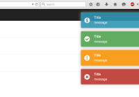
| level | string | null | Level of the notification. Available: success, error, warning and info |
| position | string | tr | Position of the notification. Available: tr (top right), tl (top left), tc (top center), br (bottom right), bl (bottom left), bc (bottom center) |
| autoDismiss | integer | 5 | Delay in seconds for the notification go away. Set this to 0 to not auto-dismiss the notification |
| dismissible | string | both | Settings controlling how the user can dismiss the notification and whether the dismiss button is visible. Available: both (The disable button is visible and the user can click anywhere on the notification to dismiss), click (The disable button is NOT visible and the user can click anywhere on the notification to dismiss), button (The user can click on the disable button to dismiss the notifiction), none (None See more) |
| action | object | null | Add a button with label and callback function (callback is optional). See more |
| children | element,string | null | Adds custom content, and overrides action (if defined) See more |
| onAdd | function | null | A callback function that will be called when the notification is successfully added. The first argument is the original notification e.g. function (notification) { console.log(notification.title + 'was added'); } |
| onRemove | function | null | A callback function that will be called when the notification is about to be removed. The first argument is the original notification e.g. function (notification) { console.log(notification.title + 'was removed'); } |
| uid | integer/string | null | Overrides the internal uid. Useful if you are managing your notifications id. Notifications with same uid won't be displayed. |
Dismissible
If set to 'none', the button will only be dismissible programmatically or after autoDismiss timeout. See more
Action
Add a button and a callback function to the notification. If this button is clicked, the callback function is called (if provided) and the notification is dismissed.
notification = { [...], action: { label: 'Button name', callback: function() { console.log('Notification button clicked!'); } } } Children
Add custom content / react elements
notification = { [...], children: ( <div> <h2>Hello World</h2> <a>Anchor</a> </div> ) } Styles
This component was made to work as plug and play. For that, a handcrafted style was added to it and is used as inline CSS.
You can change this style by overriding the default inline styles or disable all inline styles and use your own styles.
Overriding
For this, use the style prop to pass an object with your styles. Your object must be something like this:
var style = { NotificationItem: { // Override the notification item DefaultStyle: { // Applied to every notification, regardless of the notification level margin: '10px 5px 2px 1px' }, success: { // Applied only to the success notification item color: 'red' } } } <NotificationSystem ref="notificationSystem" style={style} /> Refer to this file to see what can you override.
Disabling inline styles
To disable all inline styles, just pass false to the prop style.
<NotificationSystem ref="notificationSystem" style={false} />Here is the notification HTML:
<div class="notifications-wrapper"> <div class="notifications-{position}"> <!-- '{position}' can be one of the positions available: ex: notifications-tr --> <div class="notification notification-{level} notification-{state} {notification-not-dismissible}"> <!-- '{level}' can be: success | error | warning | info. '{state}' can be: visible | hidden. {notification-not-dismissible} is present if notification is not dismissible by user --> <h4 class="notification-title">Default title</h4> <div class="notification-message">Default message</div> <span class="notification-dismiss">×</span> <div class="notification-action-wrapper"> <button class="notification-action-button">Action button</button> </div> </div> </div> </div> Important
Using this method you have to take care of every style, from containers positions to animations. To control animations, use the classes notification-visible and notification-hidden. If your CSS styles will not handle any animation (transition), you need to set the prop noAnimation to true when adding the Notification System component:
<NotificationSystem ref="notificationSystem" noAnimation={true} />See #74 for more details.
Roadmap
- Improve tests and coverage
- Improve performance
Contributions
Clone this repo by running:
git clone [email protected]:igorprado/react-notification-system.git Enter the project folder and install the dependencies:
npm install To start a development server and use the example app to load the component, type:
npm start Open http://localhost:8000.
Run the tests:
npm test You can find the coverage details under coverage/ folder.
After that, just edit the files under src/ and example/src/app.js. It uses React hot reload.
This component is under construction. I will add more guidelines to who wants to contribute.


