SearchAreaControl
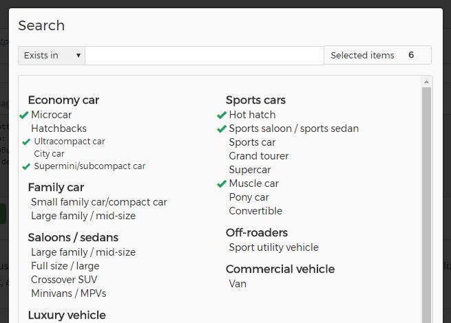
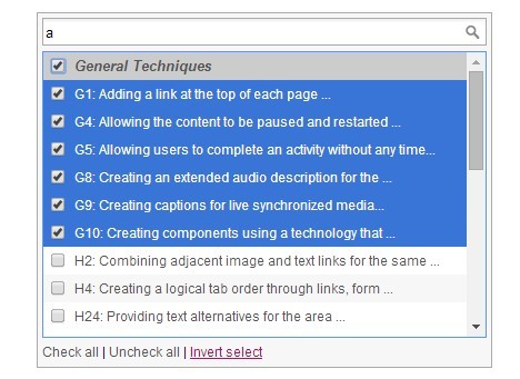
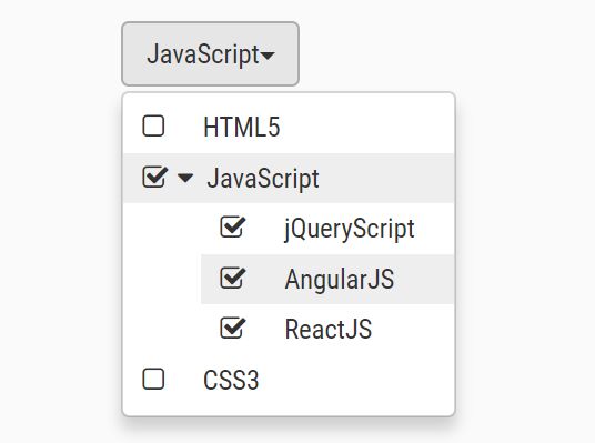
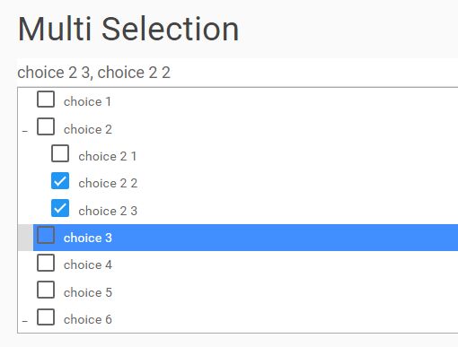
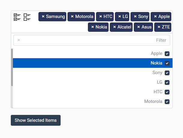
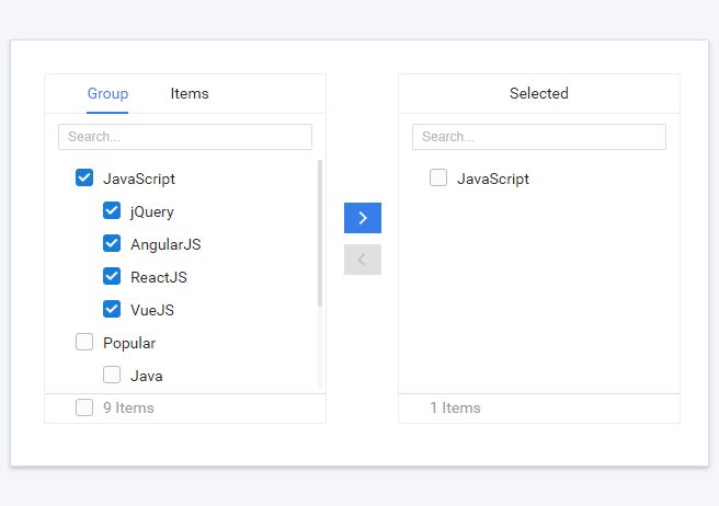
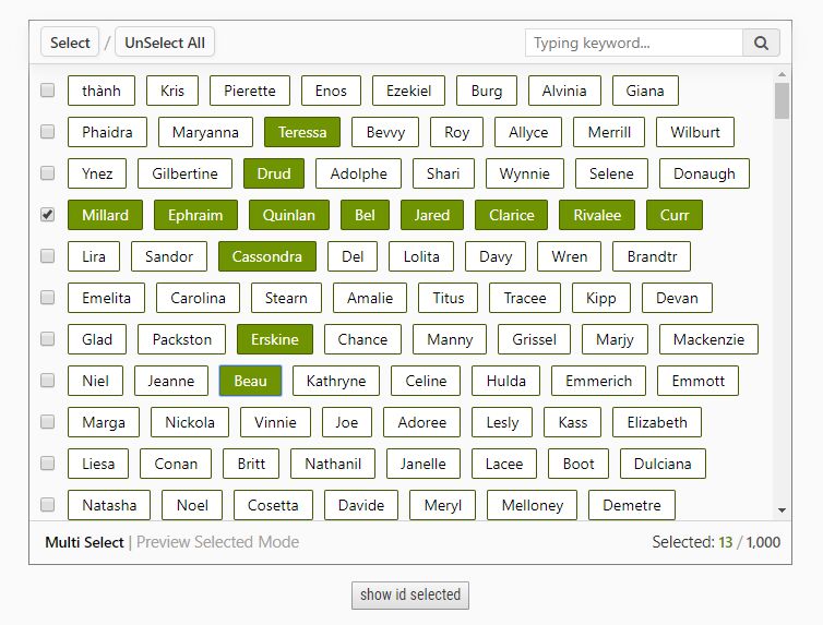
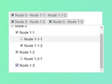
SearchAreaControl is a complete jQuery plugin that let's you display, search and select multiple items of a tree data structure.
Github repo
Visit the demo page here
Table Of Contents
Dependencies
In order to start using SearchAreaControl you have to include jQuery first.
Installation
Include the .css and .js file and you're ready to use it!
CSS
<link rel="stylesheet" href="path-to-plugin-folder/css/sac-style.css" /> jQuery
<script src="path-to-plugin-folder/searchAreaControl.js"></script> NPM
You can install SearchAreaControl via npm like this:
npm install searchareacontrol Typescript
Typescript declaration file is included in the package and it will be automatically available after npm install.
Initialization
All you need to do in order to initialize the SearchAreaControl plugin is a simple HTML element (button, span, div or anything):
HTML
<button id="myButton" type="button" /> jQuery
$('#myButton').searchAreaControl(); Options
You can pass a variety of options in order to customize the behaviour and appearance of the control like this:
$('#myButton').searchAreaControl({ multiSelect: false }); The available options are listed bellow
data
Provides the data that are going to be displayed.
- Type:
array- Deafult: An empty array
You have to pass an array of objects of type IData:
interface IData { code?: string, name: string, attributes?: IDataAttributes, nodeExpanded?: boolean, nodeSelected?: boolean, children?: IData[] } code: If provided, it will be appended before the node's name followed by a dot (code.name)name: The node's nameattributes: An object of typeIDataAttributes({ [key: string]: any })nodeExpanded: Set it tofalseif you want the specific node to be collapsed (hidden children)nodeSelected: Set it totrueif you want to set this node asselectedon loadchildren: An array of objects of typeIData
multiSelect
Set to false if you want to be able to select only one item at time
- Type:
boolean- Default:
true
collapseNodes
Set to true if you want the user to be able to expand or collapse every node that has one or more children nodes
- Type:
boolean- Default:
false
allNodesExpanded
Set to false if you want the nodes to be collapsed on load (You have to set collapseNodes: true in order for this option to take effect)
- Type:
boolean- Default:
true
columns
Set the number of columns that the data will be rendered.
- Type:
number- Default:
2
selectionByAttribute
Set the attribute that you want to select upon. The plugin will search for this attribute to match with the provided search string to filter all the items of the data array.
- Type:
string- Deafult:
'data-id'
allNodesSelected
Set all nodes to be selected on load. Nodes are not selected by default.
- Type:
boolean- Default:
false
selectedNodes
Set pre-selected nodes providing array of attributes values. The plugin will try to select nodes found by attribute provided by selectionByAttribute option. So, if no selectionByAttribute option is provided, and the developer sets selectedNodes: ['10'], the plugin will try to find the node that has the default attribute data-id equal to '10' and select it.
- Type:
array- Default: An empty array
locales
Set the localization key to use in order to display localized text
- Type:
string- Default:
'en'
localeData
Provide additional localization keys to support other languages or to customize an existing one
- Type:
object|array- Default:
null
In order to customize the 'Search' key for the English translation:
$('#myButton').searchAreaControl({ localeData: { 'el': { 'Search': 'Custom search text' } } }); Currently, the plugin supports the following languages by default:
- English (
en) - Greek (
el) - Portuguese-Brazillian (
ptbr)
modallHeader.text
The text that is going to be displayed in the modal header.
- Type:
string- Deafult:
'Search'
modallHeader.className
An optional custom class name for the modal header element.
- Type:
string- Deafult:
empty string
modallHeader.visible
Show or hide the modal header element.
- Type:
boolean- Deafult:
true
searchBox.enabled
Enable or disable the seacrbox functionality.
- Type:
boolean- Deafult:
true
searchBox.minCharactersSearch
Set the minimum characters typed in the searchbox without start searching for matches.
- Type:
number- Deafult:
2
searchBox.searchBoxClass
An optional custom class name for the searchbox element.
- Type:
string- Deafult:
empty string
searchBox.searchBoxPlaceholder
The placeholder to be displayed in the searchbox.
- Type:
string- Deafult:
empty string
searchBox.showSelectedItemsBox
Show the number of selected items.
- Type:
boolean- Deafult:
true
searchBox.selectedItemsLabelVisible
Show or hide the selected items number element.
- Type:
boolean- Deafult:
true
searchBox.selectedItemsLabelText
Set the label text to be displayed before the selected items number. (You have to set searchBox.selectedItemsLabelVisible to true)
- Type:
string- Deafult:
'Selected items'
searchBox.hideNotFound
If true, the items that do not match the searching criteria are going to be hidden.
- Type:
boolean- Deafult:
true
searchBox.searchType
This option receives an object with 3 properties, startsWith, existsIn and regExp. These are the 3 different options that the user can select to perform the search functionality.
If startsWith is selected, the plugin will try to find only those items that their description starts with the search term.
If existsIn is selected, the plugin will try to find any item that it's description contains the search term.
If regExp is selected, the plugin will try to match all the nodes with the provided regular expression.
All these options accept an object with two properties, text and selected.
This is the default object (existsIn is the default selected option) the plugin will use unless user provides anything different.
searchType: { startsWith: { text: 'Starts with', selected: false }, existsIn: { text: 'Exists in', selected: true }, regExp: { text: 'Regular expression', selected: false } } searchBox.searchType.startsWith
This property sets the text and selected state of the starts with filter option
searchBox.searchType.startsWith.text
Set the text of the startsWith option.
- Type:
string,- Default:
'Starts with'
searchBox.searchType.startsWith.selected
If true, this option is loaded as the selected option.
- Type:
boolean,- Default:
false
searchBox.searchType.existsIn
This property sets the text and selected state of the exists in filter option
searchBox.searchType.existsIn.text
Set the text of the existsIn option.
- Type:
string,- Default:
'Exists in'
searchBox.searchType.existsIn.selected
If true, this option is loaded as the selected option.
- Type:
boolean,- Default:
true
searchBox.searchType.regExp
This property sets the text and selected state of the regExp filter option
searchBox.searchType.regExp.text
Set the text of the regExp option.
- Type:
string,- Default:
'Regular expression'
searchBox.searchType.regExp.selected
If true, this option is loaded as the selected option.
- Type:
boolean,- Default:
false
popupDimensions
This option sets the modal element dimensions and accepts an array of objects with the following properties:
width
Set the modal width. Provide a valid css value.
- Type:
string- Default:
700px
left
Set the modal left css rule. Provide a valid css value.
- Type:
string- Default:
50%
marginLeft
Set the modal margin-left css rule. Provide a valid css value.
- Type:
string- Default:
-350px
The default dimensions object provides one window width breakpoint. This means that, up to 768px, the popup width will be 95% of the window width. For window width, greater than 768px, the popup width becomes 700px.
Feel free to provide your own breakpoints. Just remember to provide an object for max key.
popupDimensions: { 768: { width: '95%', left: '2.5%', marginLeft: '0' }, 'max': { width: '700px', left: '50%', marginLeft: '-350px' } } mainButton
Control the main button behaviour by providing an object with the following properties:
mainButton.defaultText
Set the default button text.
- Type:
string- Default:
'Items'
mainButton.className
Set custom class name to main button
- Type:
string- Default:
empty string
mainButton.defaultNoneText
Set the default button text to be displayed when no item is selected.
- Type:
string- Default:
'None'
mainButton.defaultAllText
Set the default button text to be displayed when all items are selected.
- Type:
string- Default:
'All'
mainButton.showAllText
If true, show the defaultAllText if all items are selected.
- Type:
boolean- Default:
true
mainButton.maxSelectedViewText
Each time the user selects an item, the plugin updates main button's text with the selected items descriptions. Set the maximum number of selected items you want to display as text.
- Type:
number- Default:
1
popupButtons
This option controls the modal buttons appearance and behaviour. It accepts an object of type IPopupButtonsCollection representing the popup buttons:
interface IPopupButtonsCollection { selectAll?: IPopupButton, diselectAll?: IPopupButton, invertSelection?: IPopupButton, close?: IPopupButton, cancel?: IPopupButton } SelectAll button
Selects all available nodes in the popup.
- Default text:
'Select all'- Default class:
'btn btn-success'- Visible by default:
true- Default callback:
null,- Default index:
0
DiselectAll button
Diselects all available nodes in the popup.
- Default text:
'Diselect all'- Default class:
'btn btn-default'- Visible by default:
true- Default callback:
null,- Default index:
1
InvertSelection button
Inverts the current selection for each node in the popup.
- Default text:
'Invert selection'- Default class:
'btn btn-default'- Visible by default:
true- Default callback:
null,- Default index:
2
Close button
Closes the popup applying the new selection.
- Default text:
'Close'- Default class:
'btn btn-default'- Visible by default:
true- Default callback:
null,- Default index:
3
Cancel button
Closes the popup without applying the new selection.
- Default text:
'Cancel'- Default class:
'btn btn-default'- Visible by default:
false- Default callback:
null,- Default index:
4
Select highlighted button
Selects all elements found after a search. If no element is found (highlighted), the button is not visible.
- Default text:
'Select highlighted'- Default class:
'btn btn-default'- Visible by default:
false- Default callback:
null,- Default index:
5
Each button is an object of type IPopupButton
interface IPopupButton { text?: string, className?: string, visible?: boolean, callback?: any, index?: number } IPopupButton.text
Set the button text
- Type:
string
IPopupButton.className
Set the button class name (Bootstrap classes by default)
IPopupButton.visible
Set the visibility of the button
- Type:
boolean
IPopupButton.callback
Provide an optional function name to call on button click
- Type:`function'
IPopupButton.index
Provide an optional function name to call on button click
Note that, if you decide to change a button's index, you have to change other buttons' indexes too, in order not to end up with multiple buttons with the same index.
Methods
SearchAreaControl provides a set of usefull methods to call.
You can call a method like this:
elem.searchAreaControl('methodName'[,parameters]) getData()
Get the control's datasource object (array).
- Parameters:
none- Returns:
array
setSelectedNodes(allSelected,collection,byAttribute)
Provide a collection of attributes (selectionByAttribute) to be selected, or set allSelected to true to select all available items. Provide an optional byAttribute parameter to indicate the attribute to select. If not provided, the plugin will try to search selectionByAttribute option value.
- Parameters:
allSelected [boolean],collection [array],byAttribute [string] Optional- Returns:
void
clearSelection()
Clear selected items.
- Parameters:
none- Returns:
void
getSelectedNodes()
Get an object with two properties, selectedAll (boolean: All items are selected) and selectedNodes (array: Array of selected objects)
- Parameters:
none- Returns:
object
getSelectedByAttribute("attributeName")
Get an array of specific attribute values of the selected items. If attributeName is not provided, the plugin will try to search selected node by selectionByAttribute option.
- Parameters:
attributeName [string]Optional- Returns:
array
setDisabledNodes(collection,diselectDisabled,byAttribute)
Set disabled nodes specifying a collection of node attribute values (by default selectionByAttribute attribute). Set diselectDisabled to true if you want to diselect the nodes to be disabled. Provide an optional byAttribute parameter to indicate the attribute to select. If not provided, the plugin will try to search selectionByAttribute option value.
- Parameters:
collection [array],diselectDisabled [boolean]byAttribute [string] Optional- Returns:
void
enableAllNodes()
Enable all nodes
- Parameters:
none- Returns:
void
disableAllNodes()
Disable all nodes
- Parameters:
none- Returns:
void
getDisabled()
Get disabled state of main button
- Parameters:
none- Returns:
boolean
setDisabled(disable)
Toggle main button disabled state
- Parameters:
disable [boolean]- Returns:
void
getPopup()
Get the popup jQuery object
- Parameters:
none- Returns:
jQuery object
updateDatasource(data)
Update the datasource
- Parameters:
data [object]- Returns:
void
setLocale(locale)
Update the selected localization key and re-initialize the plugin
- Parameters:
locale [string]- Returns:
void
destroy()
Destroy the plugin instance
- Parameters:
none- Returns:
void
Examples
Call setSelectedNodes() method
Let's say you want to select the items (nodes) that have the selectionByAttribute attribute equal to 1 or 2:
elem.searchAreaControl('setSelectedNodes', false, [1,2]); If you wanted to select all items:
elem.searchAreaControl('setSelectedNodes', true, null); Events
There is a list of useful custom events that get triggered during the plugin lifecycle. Every custom event has the prefix searchareacontrol on its name.
You can listen to any of these custom events like this:
$(document).on('<event_name>', function(event, data) { console.log(data); }); searchareacontrol.beforeinit
Gets raised before initialization process starts. Returns the target element as parameter.
searchareacontrol.afterinit
Gets raised as soon as the initialization process gets finished. Returns the target element as parameter.
searchareacontrol.beforebuildpopup
Gets raised before the popup window starts get built. Returns the target element as parameter.
searchareacontrol.beforeinitsearcharea
Gets raised before the search area starts get built. Returns the target element as parameter.
searchareacontrol.popup.beforeshow
Gets raised before the popup window strats to open. Returns an object with two properties:
{ element: <the target element>, popup: <the popup window> } searchareacontrol.popup.beforehide
Gets raised before the popup window strats to hide. Returns an object with two properties:
{ element: <the target element>, popup: <the popup window> } searchareacontrol.popup.shown
Gets raised after the popup window is shown. Returns an object with two properties:
{ element: <the target element>, popup: <the popup window> } searchareacontrol.popup.hidden
Gets raised when the popup window gets hidden. Returns the same object as searchareacontrol.popup.shown does.
searchareacontrol.button.click
Gets raised on any popup button click. Returns an object with two properties:
{ element: <the target element>, buttonKey: <the button name> } searchareacontrol.selectedNodesChanged
Gets raised every time the selection gets changed. Returns an object with 3 properties:
{ element: <the target element>, selectedAll: <boolean>, selectedNodes: <Array of nodes> } Contributing
If you would like to contribute, please check the CONTRIBUTING file
Changelog
Checkout the CHANGELOG file
