DashboardCode Multiselect plugin for Bootstrap 4
https://dashboardcode.github.io/BsMultiSelect/
JSFiddle: https://jsfiddle.net/u2xf6bew/3/ Use it for bug reporting.
There are many similar plugins but this is small and clear since reuses maximum of bootrap 4 styles and code (BsMultiSelect size is 15KB+2KB js+css minified).
In many cases it can be adjusted for your theme without editing CSS. Optionally you can adjust some theme parameters in JS or you can copy ./scss/BsMultiSelect.scss to your SASS project (it utilize bootstrap variables).
Plugin follows Bootstrap 4 conventions and use the same instruments (babel, sass, rollup) so pretend to represent a BS team's modern plugin's boilerplate.

Install
npm install @dashboardcode/bsmultiselect
Architecture
Instead of using BS4 Dropdown component (it is not possible since BS Dropdown requires presence of toggle-buttons https://github.com/twbs/bootstrap/issues/26420) the plugin uses popper.js directly.
Inspite of this the plugin utilize dropdown-menu class. Menu items contains BS4 Custom checkboxes.
Other BS4 classes were used:
-
form-controlclass - it is applied toulthat emulatesinput -
badgeclass - selected items, each item contains BS4closebutton
This plugin doesn't aim to bring its own styles. This was a clear design goal but unfortunatly it can be achived only by a trick. Not all bootstrap styles varibales can be accessed from a plugin as classes, therefore we need to setup them in javascript. Those variables are:
-
$input-height - we need it for DIV
form-control's min-height; default value is "calc(2.25rem + 2px)", -
$input-disabled-bg - we need it to "disable" DIV
form-control- set background color; default value is "#e9ecef" -
$input-color - we need to make DIV color the same as
inputcolor (color of text you are typing); default value is "#495057" -
focus for
isvalid, focus forisinvalideffects (mixins)
If your theme changes those variables, you need to update them on the plugin initialization.
$("select[multiple='multiple']").bsMultiSelect({ selectedPanelDefMinHeight: 'calc(2.25rem + 2px)', // default size selectedPanelLgMinHeight: 'calc(2.875rem + 2px)', // LG size selectedPanelSmMinHeight: 'calc(1.8125rem + 2px)', // SM size selectedPanelDisabledBackgroundColor: '#e9ecef', // disabled background selectedPanelFocusBorderColor: '#80bdff', // focus border selectedPanelFocusBoxShadow: '0 0 0 0.2rem rgba(0, 123, 255, 0.25)', // foxus shadow selectedPanelFocusValidBoxShadow: '0 0 0 0.2rem rgba(40, 167, 69, 0.25)', // valid foxus shadow selectedPanelFocusInvalidBoxShadow: '0 0 0 0.2rem rgba(220, 53, 69, 0.25)', // invalid foxus shadow inputColor: '#495057', // color of keyboard entered text selectedItemContentDisabledOpacity: '.65' // btn disabled opacity used }); Features
multiline: input can grow vertically;
disabled / readonly select: although there is difference between those two attributes for input, the HTML 5.2 support only disabled for select element. Readonly attribute on original select will be ignored;
<option disabled selected>: option that is disabled and selected at the same time can be deselected but can't be selected again (just as it is in HTML select and unlike chosen.js);
<option hidden>: options with hidden property are ... hidden. You can't deselect them either. This is exactly how HTML5.2 works, but many other plugins show hidden options;
change event: subscribe to original select change event;
<label>: Click on the label puts focus on input and opens the dropdown;
<optgroup label=".." > grouped options will be flatten; there is no sense mixing "Browse Tree" and "Autosuggest popup" UI expirience. Even if it is possible, I consider this as true: "code that don't exist is infinitely performant and extremely easy to maintain and document." (c) Heydon Pickering;
CSS and SCSS: you can copy BsMultiSelect.css (included to distribution) and update values manually for your theme. Or you can use ./scss/BsMultiSelect.scss copy it to your project and update reference to your custom BS variables in yout theme); these requires such configuration:
$("select[multiple='multiple']").bsMultiSelect({ useCss: true }); Also useCss: true allows you to go to heavy styling (and even use plugin without bootstrap). Those additional options are available (you see default values):
$("select[multiple='multiple']").bsMultiSelect({ useCss: true, containerClass: 'dashboardcode-bsmultiselect', dropDownMenuClass: 'dropdown-menu', dropDownItemClass: 'px-2', dropDownItemHoverClass: 'text-primary bg-light', selectedPanelClass: 'form-control', selectedItemClass: 'badge', removeSelectedItemButtonClass: 'close', filterInputItemClass: '', filterInputClass: '' selectedPanelFocusClass : 'focus', selectedPanelDisabledClass: 'disabled', selectedItemContentDisabledClass: 'disabled' }); With them you can change classes of generated HTML elements. Default generated HTML (for useCss: true) looks like:
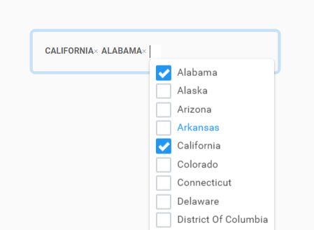
<div class="dashboardcode-bsmultiselect"> <ul class="form-control focus" style=".."> <li class="badge"><span>California</span><button class="close">..</button></li> <li class="badge"><span class="disabled">Pennsylvania</span><button class="close">..</button></li> <li><input id=".." style=".." ..></li> </ul> <ul class="dropdown-menu" style=".." ..> <li class="px-2 text-primary bg-light"> <div class="custom-control custom-checkbox"> <input type="checkbox" .. > <label ..>Alabama</label> </div> </li> <li class="px-2"> <div class="custom-control custom-checkbox"> <input type="checkbox" ..> <label ..>Alaska</label> </div> </li> </ul> </div> Proposal to Bootstrap
It would be very nice if Bootstrap could provide those SASS variables as classes :
.h-input{ min-height: $input-height; // support sm and lg form-controls also } .bg-disabled{ background-color: $input-disabled-bg !important; } .text-input{ color: $input-color !important; } Vote there: https://github.com/twbs/bootstrap/issues/26412
Note, BS allready provide classes like: h-25, bg-light, text-primary that make many variables available as classes so the proposal is just an improovement of theirs class system.
Known issues
-
Tested only for IE11, Chrome 66, Edge 42/17; Browser should support 'display':'flex' (IE 9 doesn't);
-
it was not tested on bootstrap dialog
-
no 'smart tracking' of dynamic changes in options - do detach/attach at the end of changes (this is actally not a issue, but desing feature)
-
no placeholder support (
data-placeholderor smth like this) -
<fieldset disabled>not supported; -
no rtl (right to left) - as the whole Boostrap 4;
-
no max selected, no "no result" message on empty filter, no ajax or json as source
-
no smart disabling on mobile devices (do it manually)
-
Usually you still need css to patch some plugin element's styles to fix unexpected theme effects (e.g. in dark themes BS close button could be made white by theme, when you not expect it, then
.badge > close {color:black;}fix the problem ); -
Memory leaks: as I see there is soemthing like several KB memory leak (that can be ignored since as I know every jquery plugin "attach/detach" have same effects) on each attach/detach (compiled objects, not nodes) but I can't identify its source (jquery, bootstrap utilities?). If you have knowledge to solve this puzzle: try yourself and experiment with attach/detach and memory snapshots there https://dashboardcode.github.io/BsMultiSelect/
-
autosuggestions's list could be too long if your filter is weak (and items number in it is not configurable)
Future development
It should be ready for BS 5 that means for "no jquery". Biggest analytical problem : should it be splitted to several npm packages. Please contact me if you want to discuss it.
Alternatives:
BsMultiSelect was created because at the moment when bootstrap 4 was released all existed multi select plugins had strange side effects. It was just simpler to try to combine several BS 4 tools together: form-control, dropdown-menu, close button, badge then trying to understand internals of mature projects.
-
Chosen.js: https://harvesthq.github.io/chosen/ - (ver 1.8.5), strange multiple "Consider marking event handler as 'passive' to make the page more responsive" warnings to console, not integrated to bootstrap theme (30KB+10KB js+css minified);
-
Select2: https://select2.org/appearance - (ver 3.5.3) strange or broken backspace handling (at least in my Chrome 66), not integrated to bootstrap theme (66KB+14KB js+css minified);
-
Bootstrap multiselect: http://davidstutz.de/bootstrap-multiselect/ - (ver. 0.9.15) BS 4 was not supported, also no SCSS, selected options looks as plain text (not as badges, no backspace key handling (67KB+1KB js+css NOT minified);
-
Bootstrap-select: https://silviomoreto.github.io/bootstrap-select/ - (ver. 1.12.4) BS 4 supported, but SCSS is not integrated with BS4 variables, also badges line can't be multiline (33KB+7KB js+css minified)
Other Bootstrap extension ideas: https://github.com/trumbitta/bootstrap-css-utils https://github.com/tarkhov/postboot
Used tools: VS Code https://code.visualstudio.com/


