field-validator.js
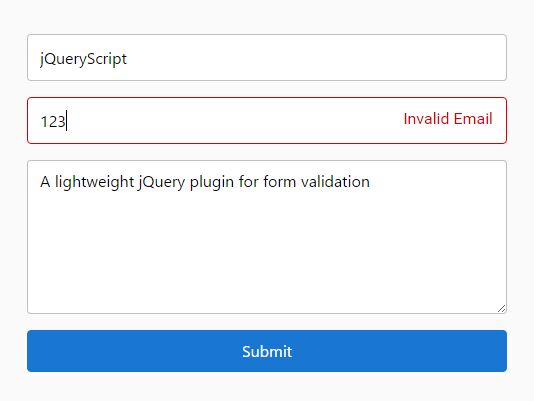
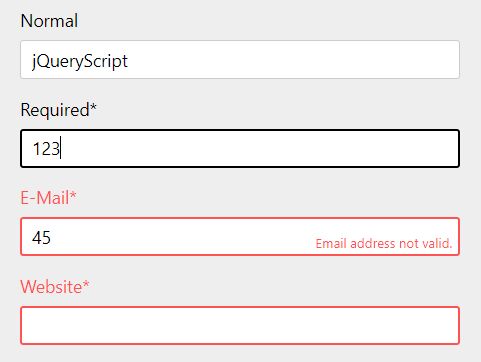
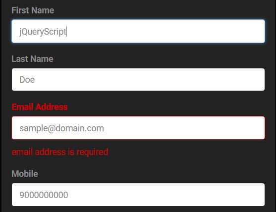
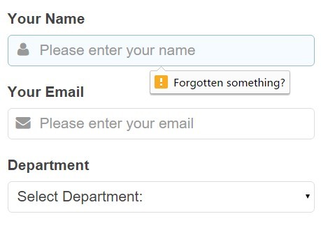
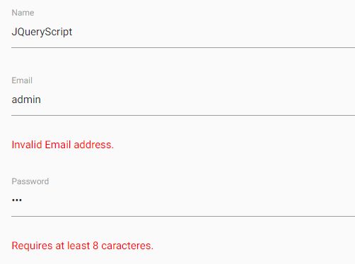
A slick, responsive form validator for jQuery that checks a field when the user stops typing or moves on to the next field. When a field is valid the text fades to blue, when invalid the text and border change to red and an error message can be displayed, these effects are removed when the user starts typing again. It uses the html required and pattern attributes. There is also support for declaring fields that are only required when a related field has a value. The library automatically finds all the inputs on the page, including any that are added to the page dynamically at any time.
Options
fieldValidator.option = "new value"; fieldSelector: the selector that will find the fields on the page that should be validated, default is ".form-control"
errorSelector: the selector that will find a sibling element that shows an error message, default is".form-error"
inputDelay: how long to wait for the user to stop typing before validating, in milliseconds, default is: 2000
animDelay: how long to animate the status color changes, in milliseconds, default is: 500
colorValid: the color to make the text when it's valid, default: "blue"
colorInvalid: the color to make the text when it's not valid, default: "red"
borderValid: the color to make the input border when it's valid, by default this is whatever color the input border was originally.
borderInvalid: the color to make the input border when it's not valid, default: "red"
backgroundValid: the color to make the input background when it's valid, this is not set by default.
backgroundInvalid: the color to make the input background when it's not valid, this is not set by default.
Validation
Basic Example:
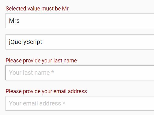
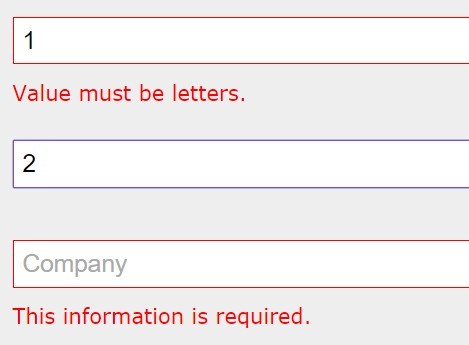
<input type="text" class="form-control" required pattern="^[0-9]$" />Built in complex validators:
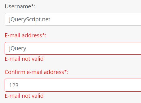
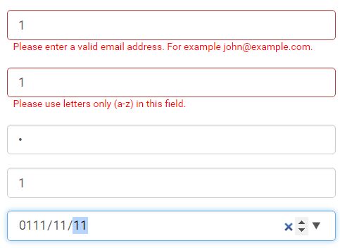
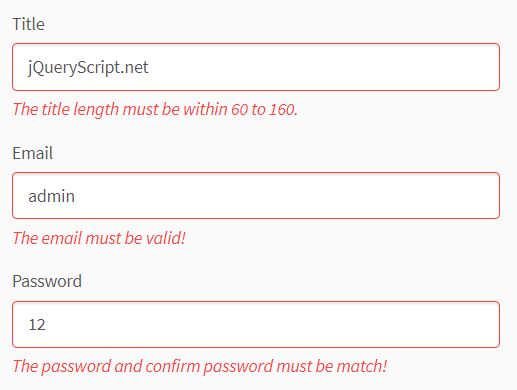
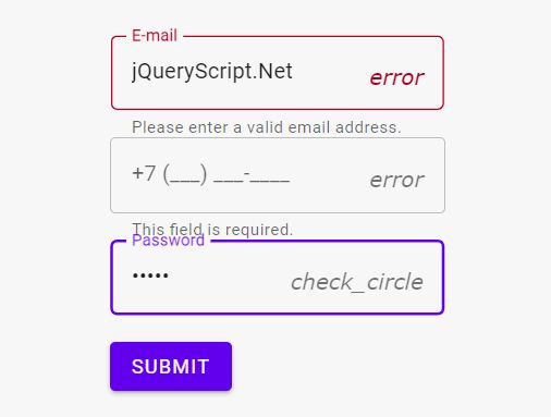
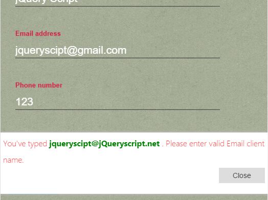
<input type="text" class="form-control" data-type="email" />Valid email address.
<input type="text" class="form-control" data-type="money" />Takes in a valid amount as money, allows but removes spaces & commas and adds .00 to amounts without cents.
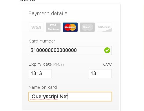
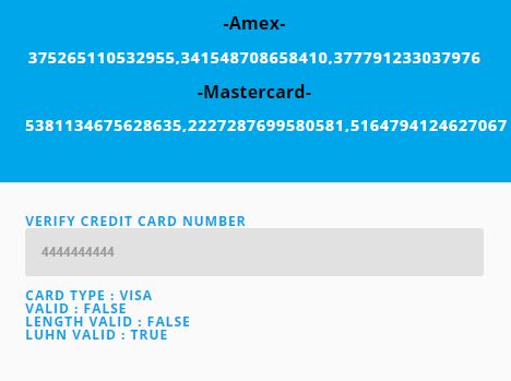
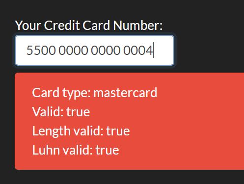
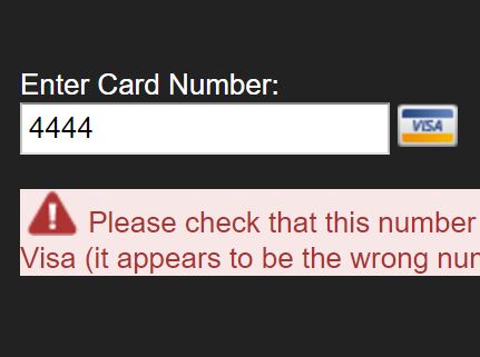
<input type="text" class="form-control" data-type="creditcard" data-cardicons="on" data-discover="on" data-amex="on" />Currently allows for Visa, MasterCard, AMEX and Discover. Uses the luhn algorithm to validate that it's a valid card number. AMEX and Discover can be turned off (they reject). Can optionaly show the icon of the card type at the right side of the input field.
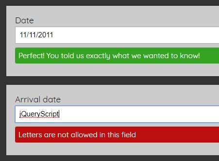
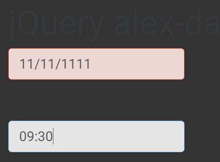
<input type="text" class="form-control" data-type="date" />Can interpret a fair amount of typed dates, color goes blue if the date is understood, or red if not. It converts the result to MM/DD/YYYY when the user leaves the field. Valid examples: 12/01/1990, dec 4 80, 12 4 2000.
Normalization
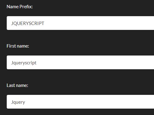
<input type="text" class="form-control" data-format="titlecase" />Also available are uppercase and lowercase.
<input type="text" class="form-control" data-pad="4" />Would convert 4 to 0004.
<input type="text" class="form-control" data-pad="10" data-pad-with="X" />Converts HELLO to XXXXXHELLO.


