jQuery form validation
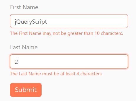
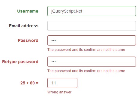
jQuery form validation is a library that helps you to validate your html form, it's completable with booth bootstrap 3 and bootstrap 4.
Installation
via npm
npm install jquery-form-validation direct download
https://raw.githubusercontent.com/bnabriss/jquery-form-validation/master/dist/jquery.form-validation.min.js How to use
Simple usage
html
<form> <div class="form-group"> <input class="form-control" data-validator="required|min:4|max:10"> </div> </form>javascript
$(document).on('blur', '[data-validator]', function () { new Validator($(this)); });add feedback message
update your html to add element with selector .form-control-feedback belongs to the parent .form-group , you also should set the input label to bind it to the error message by adding the attribute data-validator-label.
<form> <div class="form-group"> <input class="form-control" data-validator-label="First Name" data-validator="required|min:4|max:10"> <div class="form-control-feedback"></div> </div> </form>Customize options
You can pass your custom options as a second parameter to constructor.
$(document).on('blur', '[data-validator]', function () { new Validator($(this), {/* your options here*/}); });and here is a table of available options
| Tables | default | description |
|---|---|---|
| parentSelector | '.form-group' | you can set the parent selector for input, this used to set error/success classes and to search in it when search for feedback messages |
| feedbackSelector | '.form-control-feedback' | this selector used to specify when the error message should appear when error occurs, this should be inside the specified parent |
| inputSuccessClass | 'is-valid' | the class that should be given to the input when the input is valid |
| inputErrorClass | 'is-invalid' | the class that should be given to the input when the input is invalid |
| feedbackSuccessClass | 'valid-feedback' | the class that should be given to feedback element when the input is valid |
| feedbackErrorClass | 'invalid-feedback' | the class that should be given to feedback element when the input is invalid |
| parentErrorClass | 'has-error' | the class that should be given to the parent element when the input is invalid |
| parentWarningClass | 'has-warning' | the class that should be given to the parent element when the input is invalid when the rule specified as warning rule |
| parentSuccessClass | 'has-success' | the class that should be given to the parent element when the input is valid |
| rules | the data-validator value | this option will override the data-validator attribute value |
| validatorNameAttr | validator-label | specify the label attribute of the input |
warning errors
you can specify some rules as warning errors, this completable with bootstrap 3 (or your custom options) since it has has-warnig class for the parent .form-group
<form> <div class="form-group"> <input class="form-control" data-validator="required|min:4|max:10" data-validator-warnings="min"> </div> </form>Available Validation Rules
| Rule | example | description |
|---|---|---|
| required | required | The field under validation must be present in the input data and not empty |
| numeric | numeric | The field under validation must be numeric |
| integer | integer | The field under validation must be an integer |
| between_numeric | between_numeric:10,40 | The numeric field under validation must be between the given two values |
| max_numeric | max_numeric:60 | The numeric field under validation must less than or equal the given value |
| min_numeric | min_numeric:10 | The numeric field under validation must greater than or equal the given value |
| size_numeric | size_numeric:10 | The numeric field under validation must exactly equal the given value |
| between | between:2,10 | The field length must between the two given values |
| max | max:10 | The field length must less than or equal the given value |
| min | min:2 | The field length must greater than or equal the given value |
| size | size:6 | The field length must exactly equal the given value |
| date | date | The field must be valid date syntax (new Date()) |
| before | before:2015-01-01 | The date value must be older than the given value |
| before_or_equal | before_or_equal:2018-12-01 14:00:00 | The date value must be older than or equal the given value |
| after | after:2015-01-01 | The date value must be newer than the given value |
| after_or_equal | after_or_equal:2018-12-01 14:00:00 | The date value must be newer than or equal the given value |
email | The field under validation must be formatted as an e-mail address | |
| in | in:male,female,... | The field under validation must be included in the given list of values |
| not_in | not_in:foo,bar,... | The field under validation must not be included any of the given list of values |
| regex | regex:[A-Z0-9]{6} | The field under validation must match the given regular expression |
| different | different:old_password | The field under validation must have a different value than field with the given field name (attribute) |
| same | same:password | The field under validation must exactly the same value of the field with the given field name (attribute) |
| required_if | required_if:old_password | The field under validation must have a value if the field with the given name (attribute) is entered |
| required_if_val | required_if_val:password,123456 | The field under validation must have a value if the field with the given name (attribute) has exactly the given value |
| url | url | The field under validation must be a valid URL |
Custom errors
you can bind the Validator object with your custom check function.
Validator.prototype.valid_user_name = function (customLength) { if (this.val && customLength /*...*/){ // ... return true; } return false; };and to use it in your forms
<form> <div class="form-group"> <input class="form-control" data-validator="valid_user_name:8"> </div> </form>Existing error messages
The previous listed errors already has it's errors messages (English)
Validator.prototype.language = { numeric: 'The {label} must be a number.', integer: 'The {label} must be an integer.', between_numeric: 'The {label} must be between {param0} and {param1}.', max_numeric: 'The {label} may not be greater than {param0}.', min_numeric: 'The {label} must be at least {param0}.', size_numeric: 'The {label} must be {param0}.', between: 'The {label} must be between {param0} and {param1} characters.', max: 'The {label} may not be greater than {param0} characters.', min: 'The {label} must be at least {param0} characters.', size: 'The {label} must be {param0} characters.', date: 'The {label} must be a date after {param0}.', before: 'The {label} must be a date before {param0}.', before_or_equal: 'The {label} must be a date before or equal to {param0}.', after: 'The {label} must be a date after {param0}.', after_or_equal: 'The {label} must be a date after or equal to {param0}.', age: 'The age should be more than {param0}.', email: 'The {label} must be a valid email address.', in: 'The selected {label} is invalid.', not_in: 'The selected {label} is invalid.', different: 'The {label} and {otherLabel} must be different.', required: 'The {label} field is required..', required_if: 'The {label} field is required when {otherLabel} is filled.', required_if_val: 'The {label} field is required when {otherLabel} is {param0}', same: 'The {label} and {otherLabel} must match.', url: 'The {label} format is invalid.', regex: 'The {label} format is invalid.' }Bind error message
you can simply override the given messages using prototype object, and note that the key of the message is exactly the same of the function name, so when you add your custom validator you should add the suitable key language if you want to show the error
Validator.prototype.language = {/* your custom error messages */}or you can merge exiting errors with additional messages using options parameter in the constructor
$(document).on('blur', '[data-validator]', function () { new Validator($(this), { language : { valid_user_name : 'The {label} should have a valid user name with length of {param0}' } }); });