Bootstrap Form Validation with jQuery
bsValidate is a lightweight jQuery Plugin that provides basic validation of Twitter Bootstrap (v3) forms. Current validation capabilities include:
- Required fields
- Email formatting
- Character limit
- Compare two fields
- Regular Expression
- Custom function
I plan to build on this list and offer more validation options in the future, so stay tuned!
Prerequisites
JS
- jQuery
CSS
- Bootstrap (not a requirement if you plan to include your own styles that use the same classes)
Installation
With Bower
bower install bsvalidate With Git
git clone https://github.com/matthewjmink/bsValidate.git Use
After your reference to jQuery, add a reference to the jquery.bsvalidate.min.js file within your project:
<script src="https://ajax.googleapis.com/ajax/libs/jquery/1.11.2/jquery.min.js"></script> <script src="/path/to/js/jquery.bsvalidate.min.js"></script>Basic Use
The basic use of the plugin is intended to enforce required fields only. Required fields are indicated with the .required class, or the [required] attribute.
HTML
<form id="theForm"> <!-- Fields need to be wrapped in a .field-group to ensure proper display of error messages --> <div class="form-group"> <!-- A label should be included, either with the <label> tag or an element given the .label class --> <label class="control-label">Name</label> <!-- This field will be required, because it uses the .required class --> <input type="text" name="name" class="form-control required" /> </div> <div class="form-group"> <label class="control-label">Email</label> <!-- This field will also be required, because it uses the [required] attribute --> <input type="text" name="email" class="form-control" required /> </div> <div class="form-group"> <label class="control-label">Message</label> <!-- No validation will be applied to this field --> <textarea name="message" class="form-control" rows="8"></textarea> </div> <div class="form-group"> <input type="submit" class="btn btn-primary" value="Submit" /> </div> </form>JavaScript
$('#theForm').bsValidate();Advanced Use
Alternatively, a fields object can be specified in place of (or in addition to) element attributes to list the fields that should be validated, along with the validation requirements. The [name] attribute is used as the key name for each field, unless the formGroupSelector property is specified.
HTML
<form id="theForm"> <div class="form-group"> <label class="control-label">Name</label> <input type="text" name="name" class="form-control" /> </div> <div class="form-group"> <label class="control-label">Email</label> <input type="text" name="email" class="form-control" /> </div> <div class="form-group"> <label class="control-label">Message</label> <textarea name="message" class="form-control" rows="8"></textarea> </div> <div class="form-group"> <input type="submit" class="btn btn-primary" value="Submit" /> </div> </form>JavaScript
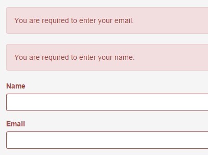
/* * This has the same effect as the basic example, * except custom messages have been included. */ $('#theForm').bsValidate({ fields: { name: { required: { helpText: "Please enter your name.", alert: "Oops! You forgot to tell us your name. Please enter it below." } }, email: { required: { helpText: "Please enter your email.", alert: "We hate to pry, but could we get your email address please? We'll need one to write back." } } } });Available Options
{ // A list of fields, using the [name] attributes as key names (see example above). Each indicated field // should include the necessary validation options (see below). // DEFAULT: {} (OBJECT) fields: {}, // The DOM element into which the alerts should be prepended when validation errors occur. // DEFAULT: this (JQUERY OBJECT) alertTarget: $(element), // A jQuery selector used to determine which fields should be required. // DEFAULT: "input.required,textarea.required,select.required,[required]" (STRING) requiredSelector: "", // Determines which attribute should be used to identify the form elements from the {fields} object. // DEFAULT: "name" (STRING) attrAsKey: "", // A jQuery selector used to identify the parent element for each field. // DEFAULT: ".form-group" (STRING) formGroupSelector: "", // For <select> fields, change what the plugin considers as "blank" (i.e. "-- Select --") // DEFAULT: "" (STRING) blankSelectValue: "", // Combine alerts into a single alert box, rather than separate boxes for each message, as an unordered // list. Optionally, the unordered list can be replaced with a single message if {alertMessage} is set // to something other than null (see below). // DEFAULT: false (BOOLEAN) mergeAlerts: false, // Use a single, general alert message rather than individual messages for each validation error. // If {mergeAlerts} is set to TRUE, this message will replace the list of validation messages. // DEFAULT: null (STRING) alertMessage: null, // Help text only shows on field change by default. Set this to TRUE to display help text for // fields on form submission as well. // DEFAULT: false (BOOLEAN) toggleHelpTextOnSubmit: false, // If a field has a dependency, changing the value of the parent field will trigger validation on the child. // Set this property to FALSE if you do not want this behavior. // DEFAULT: true (BOOLEAN) triggerDependentValidationOnChange: true, // Automatically scroll the page on form submission so the alerts are in view. // DEFAULT: true (BOOLEAN) autoScrollToAlerts: true, // Set {novalidate} to false to use browser validation for fields with the [required] attribute (browser // validation is overriden by default). // DEFAULT: false (BOOLEAN) novalidate: true, // Callback function that fires after form submission, but before any validation takes place. // Could be used to clear out existing error message from server-side validation prior to displaying bsValidate messages. // DEFAULT: function(){} (FUNCTION) before: function(){}, // Callback function that fires after all fields pass validation, but before the form submits. // In case you want to submit your form with JavaScript (Ajax) or run more JavaScript before submitting, // an event parameter is passed to the function, and event.preventDefault() can be used. // DEFAULT: function(e){} (FUNCTION) success: function(e){}, // Callback function that fires if one or more fields fail validation. By default, the form is prevented // from submitting. // DEFAULT: function(e){ e.preventDefault(); } (FUNCTION) fail: function(e){} }Validation options
{ // Require the field required: { helpText: "Custom required help text.", alert: "Custom alert for required field.", // If this field depends on others, you can set validation conditions. // NOTE: The fields referenced in this property need to be registered // in the {fields} object, even if no validation is desired for the // referenced field. Setting the field to an empty object {} will // register it without enforcing validation. dependency: { // Use the [name] attribute of the field(s) we're checking against. isBlank: 'fieldName', // Dependencies can be a comma-separated list of field names isNotBlank: 'fieldName2,fieldName3' } }, // Make sure it looks like an email address email: { helpText: "Custom email address help text.", alert: "Custom alert for an email address field." }, // Limit the number of characters characters: { limit: 140, helpText: "Custom character limit help text.", alert: "Custom alert for a field with a character limit (probably a <textarea> field)." }, // Compare the field value against a regular expression pattern regex: { pattern: /^(https?:\/\/)?([\da-z\.-]+)\.([a-z\.]{2,6})([\/\w \.-]*)*\/?$/g, helpText: "This example checks for a URL.", alert: "But you can put any valid regex pattern here" }, // Compare the field value against the value of another field match: { field: "fieldName", helpText: "Use the [name] attribute of the field we're checking against.", alert: "This compares the literal string values of the two fields. So '0.1' and '.10' do not match and will not validate." } // Use a custom validation function to evaluate a field value. custom: { fn: function(inputElem){ return inputElem.val() !== 'desired value'; }, helpText: "The input element (jQuery object) is passed into the function." alert: "This can be used for more complex scenarios than the standard options can accommodate. The function needs to return a Boolean value. An expression that evaluates to TRUE will trigger the validation.", } }


