Validator
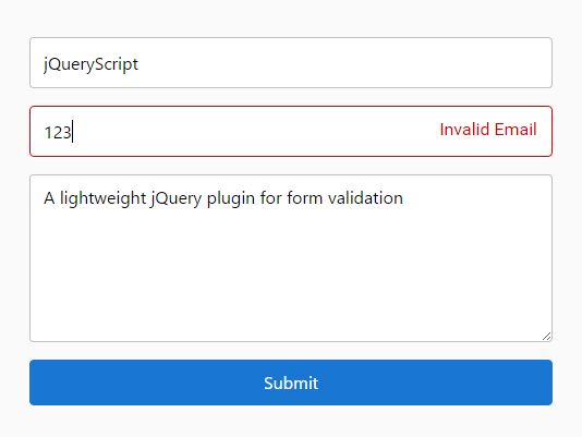
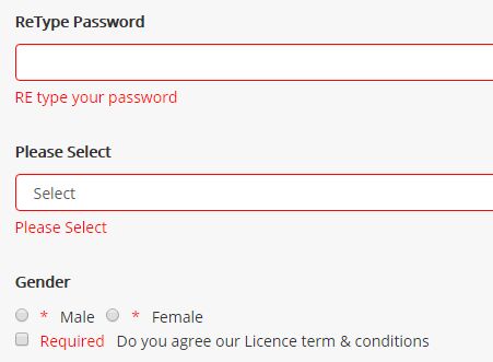
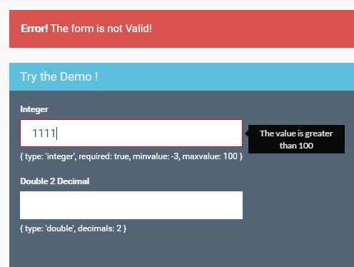
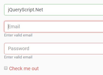
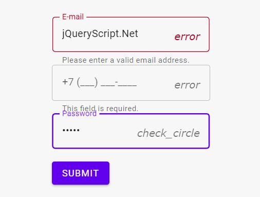
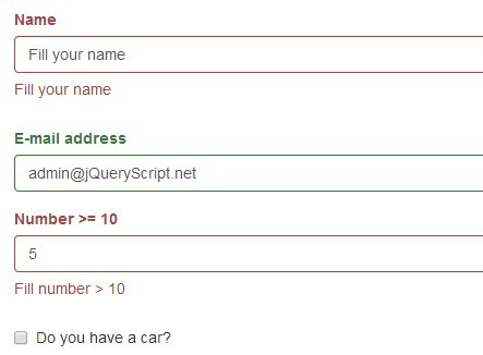
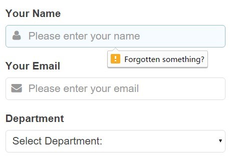
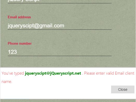
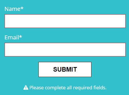
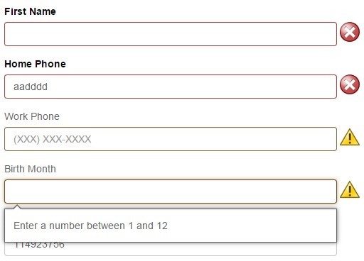
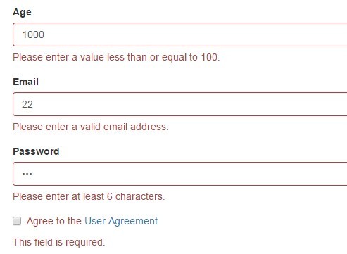
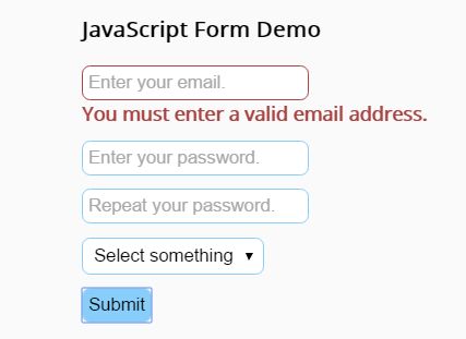
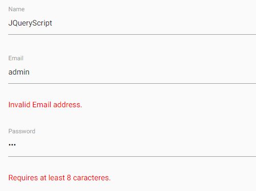
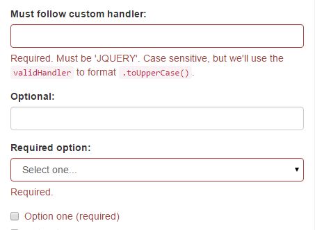
Validator is a JQuery validation plugin for forms. It can validate text, textarea, password, checkbox and select elements. With these different elements Validator supports: required, dependency on checkbox, min/max length, email, number, digits and some positioning of error messages. You can see a demo here.
Usage
include in head:
<script src="jquery-1.11.0.min.js"></script> <script src="fm.validator.jquery.js"></script>plugin activation:
By default when initialized, the plugin will look for any form that contains the class validator, add itself to the submit event of the form, and then look for validator html5 data attributes that indicate what and how the elements in the form should be validated. But you can also validate a form manually, by running the Validator.validate function. Here is an example:
if (Validator.validate('#someForm')) { alert('The form is valid, awesome!'); return true; } else { alert('The form is NOT valid!'); return false; }html5 data attributes:
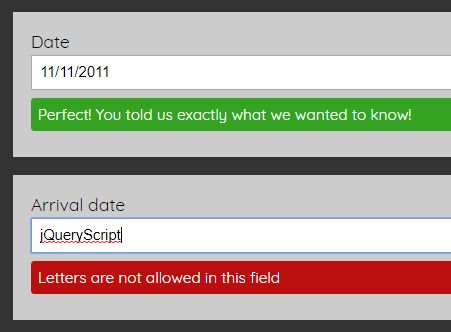
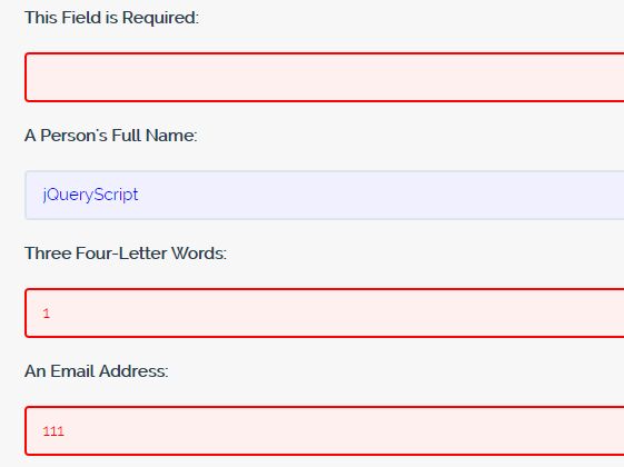
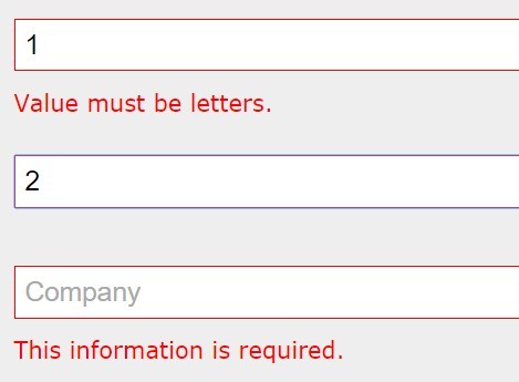
Here is an example of a textbox being required and the content being required to be between 3 and 12 characters.
<form method="post" class="validator"> <input type="text" data-required data-min="3" data-max="12"> </form>Global options
Global options like language, elementErrorClass and language translations, can be set in the global options.
Here is an example. Setting language to danish, and changing the name of the error class applied to the input elements:
Validator.language = 'da'; Validator.elementErrorClass = 'fejl';Supported validations
Text inputs:
| Attribute | Valid values | Description |
|---|---|---|
| data-required | no value | If this is set, then the input will require some content |
| data-required-if | element id | If set to an id of an element, then it will only be required if said element is checked or has the value of data-required-if-value |
| data-required-if-value | element value | If data-required-if is set to an element id, then it will only be required if said element has said value |
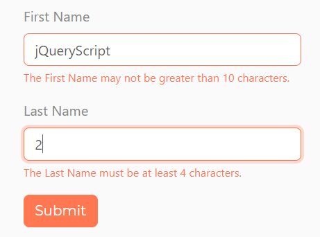
| data-min=0-9 | 0-9 | The minimum length of the input |
| data-max=0-9 | 0-9 | The maximum length of the input |
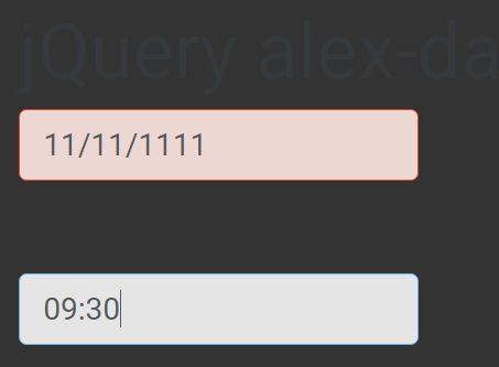
| data-type | email, url, number, digits | email and url are self explanatory, number are the characters 0-9 + - . ,, digits are the characters 0-9 only |
| data-error-position | before, after, before {selector}, after {selector} | By default the error messages will appear before the input element in the DOM, but you can also set it to appear after. If needed then you can also set it to be before or after the closest parent matching the jQuery selector specified after the space |
Password inputs:
| Attribute | Valid values | Description |
|---|---|---|
| data-required | no value | If this is set, then the input will require some content |
| data-required-if | element id | If set to an id of an element, then it will only validate if said element is checked or has the value of data-required-if-value |
| data-required-if-value | element value | If data-required-if is set to an element id, then it will only validate if said element has said value |
| data-min=0-9 | 0-9 | The minimum length of the input |
| data-max=0-9 | 0-9 | The maximum length of the input |
| data-match | element id | If set to an id of another input element, it will match the contents against that element |
| data-error-position | before, after, before {selector}, after {selector} | By default the error messages will appear before the input element in the DOM, but you can also set it to appear after. If needed then you can also set it to be before or after the closest parent matching the jQuery selector specified after the space |
Checkbox inputs:
| Attribute | Valid values | Description |
|---|---|---|
| data-required | no value | If this is set, then the input will require some content |
| data-required-if | element id | If set to an id of an element, then it will only validate if said element is checked or has the value of data-required-if-value |
| data-required-if-value | element value | If data-required-if is set to an element id, then it will only validate if said element has said value |
| data-error-position | before, after, before {selector}, after {selector} | By default the error messages will appear before the input element in the DOM, but you can also set it to appear after. If needed then you can also set it to be before or after the closest parent matching the jQuery selector specified after the space e.g. `before label.title´ |
Select inputs:
| Attribute | Valid values | Description |
|---|---|---|
| data-required | no value | If this is set, then the input will require some content |
| data-required-if | element id | If set to an id of an element, then it will only validate if said element is checked or has the value of data-required-if-value |
| data-required-if-value | element value | If data-required-if is set to an element id, then it will only validate if said element has said value |
| data-error-position | before, after, before {selector}, after {selector} | By default the error messages will appear before the input element in the DOM, but you can also set it to appear after. If needed then you can also set it to be before or after the closest parent matching the jQuery selector specified after the space |
Textareas:
| Attribute | Valid values | Description |
|---|---|---|
| data-required | no value | If this is set, then the textarea will require some content |
| data-required-if | element id | If set to an id of an element, then it will only validate if said element is checked or has the value of data-required-if-value |
| data-required-if-value | element value | If data-required-if is set to an element id, then it will only validate if said element has said value |
| data-min=0-9 | 0-9 | The minimum length of the textarea |
| data-max=0-9 | 0-9 | The maximum length of the textarea |
| data-type | url | If type is set to url, then a valid url is required |
| data-error-position | before, after, before {selector}, after {selector} | By default the error messages will appear before the textarea element in the DOM, but you can also set it to appear after. If needed then you can also set it to be before or after the closest parent matching the jQuery selector specified after the space |
DOM mangling
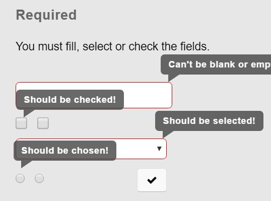
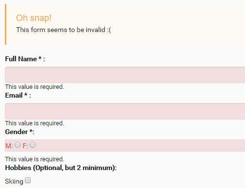
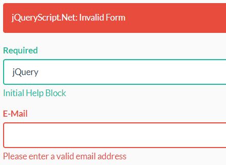
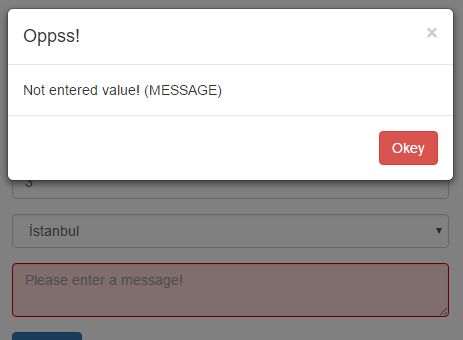
If there is a validation error, the plugin generates a div element before (or after) the input element, containing the error message in the chosen language, and also adds the class validator-error. Here is an example of what it would look like:
<form method="post" class="validator"> <div class="validator-error">Field is required</div> <input type="text" data-required data-min="3" data-max="12" class="error"> </form>As you can see, a class will also be added to the input element itself, which is error by default, but can be set in the global options.
Localization
You can also add a new language to the plugin at runtime:
Validator.languages.fr: { textbox: { required: 'Le field is le`required', min: '...', // and so on } } Validator.language = 'fr';Here is an example of a whole language translation
Validator.languages.en: { textbox: { required: 'This field is required', min: 'This field must contain at least {characters} characters', max: 'This field must not contain more than {characters} characters', email: 'Email is not valid', url: 'Website is not valid', number: 'Only numbers', digits: 'Only numbers' }, password: { required: 'This field is required', min: 'This field must contain at least {characters} characters', max: 'This field must not contain more than {characters} characters', match: 'The passwords do not match' }, radio: { }, checkbox: { required: 'This checkbox is required' }, select: { required: 'Choose a field from the list' }, textarea: { required: 'This field is required', min: 'This field must contain at least {characters} characters', max: 'This field must not contain more than {characters} characters', url: 'Website is not valid' } } Browser compatibility
- IE ???
- Chrome ???
- Firefox ???
- Safari ???
- Opera ???
Copyright and license
The MIT License (MIT)
Copyright (c) 2014 Qodio
Permission is hereby granted, free of charge, to any person obtaining a copy of this software and associated documentation files (the "Software"), to deal in the Software without restriction, including without limitation the rights to use, copy, modify, merge, publish, distribute, sublicense, and/or sell copies of the Software, and to permit persons to whom the Software is furnished to do so, subject to the following conditions:
The above copyright notice and this permission notice shall be included in all copies or substantial portions of the Software.
THE SOFTWARE IS PROVIDED "AS IS", WITHOUT WARRANTY OF ANY KIND, EXPRESS OR IMPLIED, INCLUDING BUT NOT LIMITED TO THE WARRANTIES OF MERCHANTABILITY, FITNESS FOR A PARTICULAR PURPOSE AND NONINFRINGEMENT. IN NO EVENT SHALL THE AUTHORS OR COPYRIGHT HOLDERS BE LIABLE FOR ANY CLAIM, DAMAGES OR OTHER LIABILITY, WHETHER IN AN ACTION OF CONTRACT, TORT OR OTHERWISE, ARISING FROM, OUT OF OR IN CONNECTION WITH THE SOFTWARE OR THE USE OR OTHER DEALINGS IN THE SOFTWARE.


