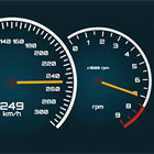
ng2-gauge
Gauge component for Angular
 |  Suitable for building virtual dashboards (initially designed for that). |

v1.2.0 | CHANGELOG
Installation
npm install ng2-gauge --save How to?
You should import the GaugeModule to your desired module:
import { NgModule } from '@angular/core'; import { Ng2GaugeModule } from 'ng2-gauge'; @NgModule({ imports : [CommonModule, Ng2GaugeModule, ...], }) export class SharedModule {}Then you can simply use the component in your template:
import { Component } from '@angular/core'; @Component({ selector: 'app-my-component', template: ` <nga-ng2-gauge [max]="9000" [input]="input" </nga-ng2-gauge>` }) export class MyComponent { input: number; }Options
The component provides a list of the following options:
max: number(required) - The maximal value of the gauge. It is suggested to use a number that is divisible by 100, 1000 and so on.input: number(required) - The current value of the gauge.unit: string- The unit of the gauge (i.e. mph, psi, etc.)size: number(in pixels; default 400) - Size/width of the gauge.start: number(in degrees; default 225) - The start/beginning of the scaleend: number(in degrees; default 135) - The end of the scaleshowDigital: boolean- Displays the current value as number inside the gaugelightTheme: boolean- Switches to the light themelight: number- Shows a red light when the specified limit is reachedsectors: Sectors[]- Defines the coloring of specified sectorsfactor: number(Not recommended) - Changes the scale factorconfig: GaugeConfig(Not recommended) - Alters the default configuration; This may lead to unexpected behavior; GaugeConfig
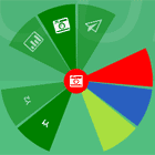
Sectors
Sectors are used for marking parts of the arc with a different color.
Example:
const max = 9000; const sectors = [{ from: 6500, to: 8000, color: 'orange' }, { from: 8000, to: 9000, color: 'red' }];Styling
The component provides two themes - light (default) and dark. Yet, you can easily alter the CSS through the parent component in order to fit your needs. The font used for the gauge is Orbitron (Google Fonts).