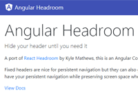
ngx-headroom


DEMO: https://typectrl.github.io/ngx-headroom/
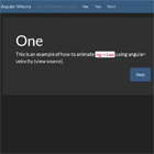
An Angular Component to hide/show your header on scroll. A port of of React Headroom by KyleAMathews which was based around headroom.js
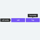
Fixed headers are nice for persistent navigation but they can also get in the way by taking up valuable vertical screen space. Using this component lets you have your persistent navigation while preserving screen space when the navigation is not needed.
Install
npm install @ctrl/ngx-headroomUsing Angular Headroom
Import the module. Requires @angular/animations
// requires BrowserAnimationsModule import { BrowserAnimationsModule } from '@angular/platform-browser/animations'; // import HeadroomModule import { HeadroomModule } from '@ctrl/ngx-headroom';Use the module
<ngx-headroom> <h1>You can put anything you'd like inside the Headroom Component</h1> </ngx-headroom>Overriding animation
The component is intended to be plug 'n play meaning it has sensible defaults for animating the header in and out. If you'd like to override the default animation.
Override animation defaults by passing your own values
<ngx-headroom duration="500" easing="ease-in-out"> <h1>You can put anything you'd like inside the Headroom Component</h1> </ngx-headroom>Inputs
duration— Duration of animation in mseasing— Easing of animationupTolerance— scroll tolerance in px when scrolling up before component is pinneddownTolerance— scroll tolerance in px when scrolling down before component is pinneddisable— disable pinning and unpinningwrapperStyle— pass styles for the wrapper div (this maintains the components vertical space at the top of the page).parent— provide a custom 'parent' element for scroll events.parentshould be a function which resolves to the desired element.pinStart— height in px where the header should start and stop pinning. Useful when you have another element above Headroom component.
Outputs
pin- emitted when header is pinnedunpin- emitted when header is unpinnedunfix- emitted when header position is no longer fixed