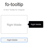
fo-tooltip
A nice tooltip
Install
$ bower install fo-tooltip --saveRequire
$ bower install beside --saveUsage
<link rel="stylesheet" href="bower_components/fo-tooltip/dist/css/fo-tooltip.css" /> <script src="bower_components/beside/dist/js/beside.js"></script> <script src="bower_components/fo-tooltip/dist/js/fo-tooltip.js"></script> angular.module('app', ['foTooltip']);Template-url
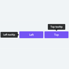
<div class="tooltip-demo" tooltip-position="top left" tooltip-class="hello" tooltip-template-url="tooltip-top-left.html" fo-tooltip > Top Left </div> <script id="tooltip-top-left.html" type="text/ng-template"> Top Left </script>Template-str
<div class="tooltip-demo" tooltip-position="top left" tooltip-class="hello" tooltip-template-str="tooltip show me" fo-tooltip > Top Left </div> Options
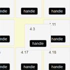
tooltip-positionset tooltip position- top left
- top center
- top center
- top left
- top right
- bottom center
- bottom left
- bottom right
- left center
- left top
- left bottom
- right center
- right top
- right bottom
tooltip-template-urluse template contenttooltip-template-struse string contenttooltip-offsetoffset base on tooltiptooltip-delaydelay after leave target or tooltipclick-hideclick target to hide tooltiptooltip-classclass for tooltip elementtooltip-idid for tooltip elementtooltip-onclosea function to be called when the tooltip is closed