


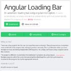
Flexible Angular Text Editor
Fate is a rich text editor (wysiwyg) natively written for angular (>= v2) in typescript with footprint and flexibility in mind. Its goal is to be very easy to customize and be as small as it can thanks to tree shaking. Bootstrap and Google Material styled version are included to fit in forms using those styles. To use the material one you will need to include Angular Material in your project.
Be warned that it's very early in the development of this module so many thing will change.
For a live demo of the editor you can go to the project's site.
Installation and usage
Use npm to download the module: npm install --save fate-editor. Then import the FateModule in your app:
import { FateModule } from 'fate-editor'; // ... @NgModule({ // ... imports: [ // ... FateModule ] // ... }) // ...Available Component
fate-input
This is the rich text input, it's a low level component that basically looks like a textbox. On it's own it doesn't have any UI to control the text but will respond to you system keyboard shortcut.
Properties
uiId
This is the id of the UI component that should target this input box. By default all inputs respond to all UIs which is normally not what you want. By specifying the uiIds you can choose which one to pair together.
row
This the number of row of text the input should show by default. This mimics the behaviour of the same property on textarea. Note that by default fate-input is resizable vertically so this only specifies the default height.
placeholder
This is the placeholder text that will show when the input is empty and nothing is selected.
ngModel
You can use ngModel like you would on any other input element and it will behave the same. The value that will be read and exported is dependent of the parser you've decided to inject, by default it's HTML.
fate-ui
This is the default UI for your input. It shows a bunch of buttons on a toolbar-like block. You can choose which buttons are available through the buttons property.
Properties
uiId
This allow you to choose which fate-input is targeted by this UI. For example you could do:
<fate-ui uiId="foo"></fate-ui> <fate-input uiId="foo" [(ngModel)]="someHtml"></fate-input>buttons
This is an array of strings that define which buttons should be shown in which order, you can add "separator" at any position to add a separator between two buttons.
fate-bootstrap
This is a all-in-one component that includes a UI and an input. It's mean to be a drop-in replacement to textarea in Bootstrap forms. Under the hood it's just using the two previously described components and styling them. You don't need to specify any uiId because they are generated automatically.
Properties
row
This the number of row of text the input should show by default. This mimics the behaviour of the same property on textarea. Note that by default fate-input is resizable vertically so this only specifies the default height.
placeholder
This is the placeholder text that will show when the input is empty and nothing is selected.
buttons
This is an array of strings that define which buttons should be shown in which order, you can add "separator" at any position to add a separator between two buttons.
ngModel
You can use ngModel like you would on any other input element and it will behave the same. The value that will be read and exported is dependent of the parser you've decided to inject, by default it's HTML.
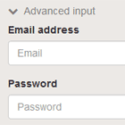
fate-material
This is a all-in-one component that includes a UI and an input. It's mean to be a drop-in replacement to textarea in Material forms. Under the hood it's just using the two previously described components and styling them. You don't need to specify any uiId because they are generated automatically.
This component is meant to be used like a normal input in material, that is it needs to be wrapped in a mat-form-field component like so:
<mat-form-field> <fate-material placeholder="Some text"></fate-material> </mat-form-field>Properties
You can use ngModel like you would on any other input element and it will behave the same. The value that will be read and exported is dependent of the parser you've decided to inject, by default it's HTML.
row
This the number of row of text the input should show by default. This mimics the behaviour of the same property on textarea. Note that by default fate-input is resizable vertically so this only specifies the default height.
placeholder
This is the placeholder text that will show when the input is empty and nothing is selected.
buttons
This is an array of strings that define which buttons should be shown in which order, you can add "separator" at any position to add a separator between two buttons.
ngModel
You can use ngModel like you would on any other input element and it will behave the same. The value that will be read and exported is dependent of the parser you've decided to inject, by default it's HTML.
Customizing Fate
Fate has been written to make it as easy as possible to extend and customize. This is done by subclassing one of its component or service and injecting it to replace the original.
Custom Icons
Creating a custom set of icons for your app is the simplest form of customization:
First create a implementation of the FateIconService service:
import { Injectable } from '@angular/core'; import { FateIconService } from 'fate-editor'; @Injectable() export class MyIconService extends FateIconService { }Then define how you want the icon to be rendered in a iconMapping object:
export class MyIconService extends FateIconService { protected iconMapping: any = { 'bold' : '<span>B<span>', 'italic' : '<span>I<span>', // ... }; }Finally instruct your app to use your service instead of the standard one:
@NgModule({ // ... providers: [ { provide: FateIconService, useClass: MyIconService } ], // ... })Custom UI Button
If you want to add you own custom action to the UI toolbar you can do it too, just follow the steps bellow. You can see the code in action in this Stackblitz
Register the action with the Fate controller
In you app component you can inject the fate controller and register the new action you want to implement with the registerAction method like so:
@Component({ //... }) export class AppComponent { constructor(fateControllerService: FateControllerService){ fateControllerService.registerAction('custom', { command: 'fontSize', // One of https://developer.mozilla.org/en-US/docs/Web/API/Document/execCommand value: '2', name: 'custom', label: 'C', // if you don't want to use icons }); }; }If you want to have a custom icon to represent you button you can have a look at the previous section.
Add the icon to your toolbar
In the template where your ui is included you can simply add the new custom button by it's name:
<fate-ui [buttons]="['custom']"></fate-ui>In this example we only show the new icon but you can include and existing icon too.