ng-tooltip
Clickable angular tooltip popup
Demo
Visit ng-tooltip working online demo here: https://angular-ng-tooltip-playground.stackblitz.io OR see more about the code via stackblitz: https://stackblitz.com/edit/angular-ng-tooltip-playground
Installation
Install ng-tooltip via npm by running this command:
$ npm install @independer/ng-tooltip --saveUsage
Add TooltipModule to your main app.module.ts
// app.module.ts import { TooltipModule } from '@independer/ng-tooltip'; ... @NgModule({ imports: [ ..., TooltipModle.forRoot() // This .forRoot() is necessary ], ... }) export class AppModule { }Add <ind-tooltip-container></ind-tooltip-container> into your app main template, app.component.html. This tooltip container will be the parent DOM element where all the tooltips will be appended inside.
<!--app.component.html --> <router-outlet></router-outlet> <ind-tooltip-container></ind-tooltip-container>Default tooltip
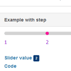
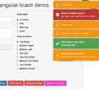
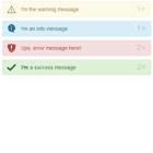
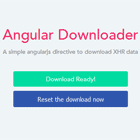
You can assign any element to be the tooltip trigger. If you don't, by default the tooltip trigger will be a question mark icon like this:

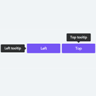
The icons are available in 3 different sizes sm, md, lg
Tooltip with icon lg <ind-tooltip content="This is a simple tooltip which uses content attribute" size="lg"></ind-tooltip\> Tooltip with icon md <ind-tooltip content="This is a simple tooltip which uses content attribute" size="md"></ind-tooltip\> Tooltip with icon sm (default) <ind-tooltip content="This is a simple tooltip which uses content attribute" size="sm"></ind-tooltip>Custom tooltip trigger
You can also specify any custom HTML element as the tooltip trigger and the trigger will not be the circle question mark icon anymore.
<ind-tooltip content="Tooltip without question mark"> <a>Click this link!</a> </ind-tooltip\>Tooltip with header and content
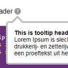
Inside the tooltip you can write optionally header and content separately.
<ind-tooltip header="This is tooltip header" content="Lorem Ipsum Lorem Ipsum Lorem Ipsum Lorem Ipsum."></ind-tooltip>Tooltip with HTML content
It is also possible to have custom HTML content inside the tooltip by declaring <ng-template #tooltipContentTemplate></ng-template> inside <ind-tooltip></ind-tooltip>. The hash tooltipContentTemplate will mark it as HTML content inside tooltip, so it msut be written exactly the same.
<ind-tooltip header="This is a tooltip with HTML elements"> <ng-template #tooltipContentTemplate> Lorem ipsum Lorem ipsum Lorem ipsum Lorem ipsum. <h4>And a button</h4\> <button>A button</button\> </ng-template> </ind-tooltip>