AngularJS 1.X slider directive with no external dependencies
Looking for an Angular version (> 1.X)? We got you covered: https://github.com/angular-slider/ng5-slider (Thanks @piotrdz
I'm looking for a maintainer for this project. I have lost my Open Source Stamina for this project and I will probably not push any code to this project anymore (unless, I find some motivation later). I will try to merge pull requests if some are submitted, but only if they are really clean.
Slider directive implementation for AngularJS 1.X, without any dependencies: http://angular-slider.github.io/angularjs-slider.
- Mobile friendly
- Fast
- Well documented
- Customizable
- Simple to use
- Keyboard support
- Compatibility with jQuery Lite, ie. with full jQuery ( Thanks Jusas! https://github.com/Jusas)
- Supports right to left
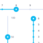
Horizontal
Vertical
Examples
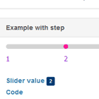
- Simple example for single slider: http://jsfiddle.net/ValentinH/qjvxn4fc/
- Simple example for double slider: http://jsfiddle.net/ValentinH/hnyL2axs/
- Various examples: http://angular-slider.github.io/angularjs-slider
- Same examples with live code: https://jsfiddle.net/ValentinH/954eve2L/
Reporting issues
Make sure the report is accompanied by a reproducible demo. The ideal demo is created by forking our standard jsFiddle, adding your own code and stripping it down to an absolute minimum needed to demonstrate the bug.
Common issues
My slider is not rendered correctly on load
If the slider's parent element is not visible during slider initialization, the slider can't know when its parent becomes visible. For instance, when displaying a slider inside an element which visibility is toggled using ng-show, you need to send an event to force it to redraw when you set your ng-show to true.
Here's an example of refreshSlider method that you should call whenever the slider becomes visible.
vm.refreshSlider = function() { $timeout(function() { $scope.$broadcast('rzSliderForceRender') }) }if you get some flickering issues, you can try to replace to $timeout call by $scope.$$postDigest as suggested by @maknapp in this issue.
ng-show-example: http://jsfiddle.net/ValentinH/nzL6ax43/
UI-Boostrap tabs example: http://jsfiddle.net/ValentinH/bo23er5w/
Decimal value can't be typed in an input field linked to the slider
By default, the slider value is always rounded to the nearest step. A side effect is that when a input field is linked to the slider in order to enable a user to directly type a value, the value is rounded when it doesn't match the step. Even worse, when using decimal values, when a user will type "0.", the . will directly be truncated since the value is rounded.
Solution: To avoid the value to be rounded, you need to use the enforceStep: false option. Thus, the value can be modified externally without taking care of the step. See #298.
Installation
NPM
npm i angularjs-slider or
yarn add angularjs-slider Typescript Support
Typescript definition files are provided with this project. To use them, be sure you have the angular type definition peer dependency installed.
npm i @types/angular or
Bower
$ bower install --save angularjs-slider or
CDNJS
Directly use (replace X.X.X by the version you want to use):
https://cdnjs.cloudflare.com/ajax/libs/angularjs-slider/X.X.X/rzslider.min.jshttps://cdnjs.cloudflare.com/ajax/libs/angularjs-slider/X.X.X/rzslider.min.css
Project integration
Imports
<link rel="stylesheet" type="text/css" href="/path/to/angular-slider/dist/rzslider.css"/> <script src="/path/to/angularjs/angular.min.js"></script> <script src="/path/to/angular-slider/dist/rzslider.min.js"></script>Module
angular.module('yourApp', ['rzSlider'])Single slider
// In your controller $scope.priceSlider = 150<div> <rzslider rz-slider-model="priceSlider"></rzslider> </div>Above example would render a slider from 0 to 150. If you need floor and ceiling values use rz-slider-options attribute and provide an object with floorand ceil.
<div> <rzslider rz-slider-model="slider.value" rz-slider-options="slider.options"></rzslider> </div>$scope.slider = { value: 150, options: { floor: 0, ceil: 450, }, }If you don't want to bother with an object set in your javascript file, you can pass an anonymous object literal to the slider options:
<div> <rzslider rz-slider-model="value" rz-slider-options="{floor: 0, ceil: 450}"></rzslider> </div>$scope.value = 150Range slider
// In your controller $scope.slider = { min: 100, max: 180, options: { floor: 0, ceil: 450, }, }<rzslider rz-slider-model="slider.min" rz-slider-high="slider.max" rz-slider-options="slider.options"></rzslider>Directive attributes
rz-slider-model
Model for low value slider. If only rz-slider-model is provided single slider will be rendered.
rz-slider-high
Model for high value slider. Providing both rz-slider-model and rz-slider-high will render range slider.
rz-slider-tpl-url
If you need to use a custom template, you can do so by providing a template URL to the
rz-slider-tpl-urlattribute. The default template is this one.
The following variables are available in the template as scope variables.
floorLabel: The value set tofloorinrz-slider-optionsceilLabel: The value set toceilinrz-slider-optionsmodelLabel: The value set torz-slider-modelhighLabel: The value set torz-slider-highcmbLabel: The text shown when the two handlers are close to each other. (e.g. "30-40")
The library replaces the HTML contents of label elements in the template by default, if you want to stop this behaviour and tweak label HTML on your own, you need to set no-label-injection class on the elements you're customizing.
See the Custom template to use angular directive for label for an example.
rz-slider-options
An object with all the other options of the slider. Each option can be updated at runtime and the slider will automatically be re-rendered.
The default options are:
{ floor: 0, ceil: null, //defaults to rz-slider-model step: 1, precision: 0, minLimit: null, maxLimit: null, restrictedRange: null, minRange: null, maxRange: null, pushRange: false, id: null, translate: null, getLegend: null, stepsArray: null, bindIndexForStepsArray: false, draggableRange: false, draggableRangeOnly: false, showSelectionBar: false, showSelectionBarEnd: false, showOuterSelectionBars: false, showSelectionBarFromValue: null, hidePointerLabels: false, hideLimitLabels: false, autoHideLimitLabels: true, readOnly: false, disabled: false, interval: 350, showTicks: false, showTicksValues: false, ticksArray: null, ticksTooltip: null, ticksValuesTooltip: null, vertical: false, getSelectionBarColor: null, getTickColor: null, getPointerColor: null, keyboardSupport: true, scale: 1, enforceStep: true, enforceRange: false, noSwitching: false, onlyBindHandles: false, onStart: null, onChange: null, onEnd: null, rightToLeft: false, reversedControls: false, boundPointerLabels: true, mergeRangeLabelsIfSame: false, labelOverlapSeparator: ' - ', customTemplateScope: null, logScale: false, customValueToPosition: null, customPositionToValue: null, selectionBarGradient: null, ariaLabel: null, ariaLabelledBy: null, ariaLabelHigh: null, ariaLabelledByHigh: null, disableAnimation: false }floor - Number (defaults to 0): Minimum value for a slider.
ceil - Number (defaults to rz-slider-modelvalue): Maximum value for a slider.
step - Number (defaults to 1): Step between each value.
precision - Number (defaults to 0): The precision to display values with (number of decimals to be displayed). The toFixed() is used internally for this.
minLimit - Number (defaults to null): The minimum value authorized on the slider.
maxLimit - Number (defaults to null): The maximum value authorized on the slider.
restrictedRange - Object (defaults to null): Has two Number properties, from and to that determine the bounds of an area that is not authorized for values. Applies to range slider only.
minRange - Number (defaults to null): The minimum range authorized on the slider. Applies to range slider only.
maxRange - Number (defaults to null): The maximum range authorized on the slider. Applies to range slider only.
pushRange - Boolean (defaults to false): Set to true to have a push behavior. When the min handle goes above the max, the max is moved as well (and vice-versa). The range between min and max is defined by the step option (defaults to 1) and can also be override by the minRange option. Applies to range slider only.
translate - Function(value, sliderId, label): Custom translate function. Use this if you want to translate values displayed on the slider. sliderId can be used to determine the slider for which we are translating the value. label is a string that can take the following values:
- 'model': the model label
- 'high': the high label
- 'floor': the floor label
- 'ceil': the ceil label
- 'tick-value': the ticks labels
For example if you want to display dollar amounts instead of just numbers:
<div> <rzslider rz-slider-model="slider.value" rz-slider-options="slider.options"></rzslider> </div>$scope.slider = { value: 0, options: { floor: 0, ceil: 100, translate: function(value) { return '$' + value }, }, }getLegend - Function(value, sliderId): Use to display legend under ticks (thus, it needs to be used along with showTicks or showTicksValues). The function will be called with each tick value and returned content will be displayed under the tick as a legend. If the returned value is null, then no legend is displayed under the corresponding tick.You can also directly provide the legend values in the stepsArray option.
In order to get enough space to display legends under the slider, you need to add the
with-legendclass to the slider component. The default margin-bottom is then 40px which is enough for legends that are displayed on 2 lines. If you need more, simply override the style for the class.
id - Any (defaults to null): If you want to use the same translate function for several sliders, just set the id to anything you want, and it will be passed to the translate(value, sliderId) function as a second argument.
stepsArray - Array: If you want to display a slider with non linear/number steps. Just pass an array with each slider value and that's it; the floor, ceil and step settings of the slider will be computed automatically. By default, the rz-slider-model and rz-slider-high values will be the value of the selected item in the stepsArray. They can also be bound to the index of the selected item by setting the bindIndexForStepsArray option to true.
stepsArray can also be an array of objects or Dates like:
;[ { value: 'A' }, // the display value will be *A* { value: 10, legend: 'Legend for 10' }, // the display value will be 10 and a legend will be displayed under the corresponding tick. new Date(2016, 7, 12), // the display value will be the default format of Date. To customize it, use the `translate` option { value: new Date(2016, 7, 12), legend: 'Legend for 10' }, // same as above but with a legend ]bindIndexForStepsArray - Boolean (defaults to false): Set to true to bind the index of the selected item to rz-slider-model and rz-slider-high. (This was the default behavior prior to 4.0).
draggableRange - Boolean (defaults to false): When set to true and using a range slider, the range can be dragged by the selection bar. Applies to range slider only.
draggableRangeOnly - Boolean (defaults to false): Same as draggableRange but the slider range can't be changed. Applies to range slider only.
showSelectionBar - Boolean (defaults to false): Set to true to always show the selection bar before the slider handle.
showSelectionBarEnd - Boolean (defaults to false): Set to true to always show the selection bar after the slider handle.
showOuterSelectionBars - Boolean (defaults to false): Only for range slider. Set to true to visualize in different colour the areas on the left/right (top/bottom for vertical range slider) of selection bar between the handles.
showSelectionBarFromValue - Number (defaults to null): Set a number to draw the selection bar between this value and the slider handle.
getSelectionBarColor - Function(value) or Function(minVal, maxVal) (defaults to null): Function that returns the current color of the selection bar. If your color won't changed, don't use this option but set it through CSS. If the returned color depends on a model value (either rzScopeModelor 'rzSliderHigh), you should use the argument passed to the function. Indeed, when the function is called, there is no certainty that the model has already been updated.
getTickColor - Function(value) (defaults to null): Function that returns the color of a tick. showTicks must be enabled.
getPointerColor - Function(value, pointerType) (defaults to null): Function that returns the current color of a pointer. If your color won't changed, don't use this option but set it through CSS. If the returned color depends on a model value (either rzScopeModelor 'rzSliderHigh), you should use the argument passed to the function. Indeed, when the function is called, there is no certainty that the model has already been updated. To handle range slider pointers independently, you should evaluate pointerType within the given function where "min" stands for rzScopeModel and "max" for rzScopeHigh values.
hidePointerLabels - Boolean (defaults to false): Set to true to hide pointer labels
hideLimitLabels - Boolean (defaults to false): Set to true to hide min / max labels
autoHideLimitLabels - Boolean (defaults to true): Set to false to disable the auto-hiding behavior of the limit labels.
readOnly - Boolean (defaults to false): Set to true to make the slider read-only.
disabled - Boolean (defaults to false): Set to true to disable the slider.
interval - Number in ms (defaults to 350): Internally, a throttle function (See http://underscorejs.org/#throttle) is used when the model or high values of the slider are changed from outside the slider. This is to prevent from re-rendering the slider too many times in a row. interval is the number of milliseconds to wait between two updates of the slider.
showTicks - Boolean or Number (defaults to false): Set to true to display a tick for each step of the slider. Set a number to display ticks at intermediate positions. This number corresponds to the step between each tick.
showTicksValues - Boolean or Number (defaults to false): Set to true to display a tick and the step value for each step of the slider. Set a number to display ticks and the step value at intermediate positions. This number corresponds to the step between each tick.
ticksArray - Array (defaults to null): Use to display ticks at specific positions. The array contains the index of the ticks that should be displayed. For example, [0, 1, 5] will display a tick for the first, second and sixth values. It also supports the { value: 0, legend: 'Bad' } format to display a legend for each tick.
ticksTooltip - Function(value) (defaults to null): (requires angular-ui bootstrap) Used to display a tooltip when a tick is hovered. Set to a function that returns the tooltip content for a given value.
ticksValuesTooltip - Function(value) (defaults to null): Same as ticksTooltip but for ticks values.
scale - Number (defaults to 1): If you display the slider in an element that uses transform: scale(0.5), set the scale value to 2 so that the slider is rendered properly and the events are handled correctly.
enforceStep - Boolean (defaults to true): Set to true to force the value to be rounded to the step, even when modified from the outside.. When set to false, if the model values are modified from outside the slider, they are not rounded and can be between two steps.
enforceRange - Boolean (defaults to false): Set to true to round the rzSliderModel and rzSliderHigh to the slider range even when modified from outside the slider. When set to false, if the model values are modified from outside the slider, they are not rounded but they are still rendered properly on the slider.
noSwitching - Boolean (defaults to false): Set to true to prevent to user from switching the min and max handles. Applies to range slider only.
onlyBindHandles - Boolean (defaults to false): Set to true to only bind events on slider handles.
boundPointerLabels - Boolean (defaults to true): Set to true to keep the slider labels inside the slider bounds.
mergeRangeLabelsIfSame - Boolean (defaults to false): Set to true to merge the range labels if they are the same. For instance, if min and max are 50, the label will be "50 - 50" if mergeRangeLabelsIfSame: false, else "50".
labelOverlapSeparator - String (defaults to ' - '): Separator to use when the labels overlap. For instance, if min and max are -1 and 1, the label will be "-1 .. 1" if labelOverlapSeparator: ' .. '.
onStart - Function(sliderId, modelValue, highValue, pointerType): Function to be called when a slider update is started. If an id was set in the options, then it's passed to this callback. This callback is called before any update on the model. pointerType is either 'min' or 'max' depending on which handle is used.
onChange - Function(sliderId, modelValue, highValue, pointerType): Function to be called when rz-slider-model or rz-slider-high change. If an id was set in the options, then it's passed to this callback. pointerType is either 'min' or 'max' depending on which handle is used.
onEnd - Function(sliderId, modelValue, highValue, pointerType): Function to be called when a slider update is ended. If an id was set in the options, then it's passed to this callback. pointerType is either 'min' or 'max' depending on which handle is used.
rightToLeft - Boolean (defaults to false): Set to true to show graphs right to left. If vertical is true it will be from top to bottom and left / right arrow functions reversed.
vertical - Boolean (defaults to false): Set to true to display the slider vertically. The slider will take the full height of its parent. Changing this value at runtime is not currently supported.
keyboardSupport - Boolean (defaults to true): Handles are focusable (on click or with tab) and can be modified using the following keyboard controls:
- Left/bottom arrows: -1
- Right/top arrows: +1
- Page-down: -10%
- Page-up: +10%
- Home: minimum value
- End: maximum value
reversedControls - Boolean (defaults to false): Set to true to reverse keyboard navigation:
- Right/top arrows: -1
- Left/bottom arrows: +1
- Page-up: -10%
- Page-down: +10%
- End: minimum value
- Home: maximum value
customTemplateScope - Object (default to null): The properties defined in this object will be exposed in the slider template under custom.X.
logScale - Boolean (defaults to false): Set to true to use a logarithmic scale to display the slider.
For custom scales:
customValueToPosition - Function(val, minVal, maxVal): percent: Function that returns the position on the slider for a given value. The position must be a percentage between 0 and 1.
customPositionToValue - Function(percent, minVal, maxVal): value: Function that returns the value for a given position on the slider. The position is a percentage between 0 and 1.
selectionBarGradient - Object (default to null): Use to display the selection bar as a gradient. The given object must contain from and to properties which are colors.
ariaLabel and ariaLabelHigh - String (default to null): Use to add a label directly to the slider(s) for accessibility. Adds the aria-label attribute.
ariaLabelledBy and ariaLabelledByHigh - String (default to null): Use instead of ariaLabel and ariaLabelHigh to reference the id of an element which will be used to label the slider(s). Adds the aria-labelledby attribute.
disableAnimation - Boolean (defaults to false): Set to true to disable slider animation.
Change default options
If you want the change the default options for all the sliders displayed in your application, you can set them using the RzSliderOptions.options() method:
angular.module('App', ['rzSlider']).run(function(RzSliderOptions) { // show ticks for all sliders RzSliderOptions.options({ showTicks: true }) })Slider events
To force slider to recalculate dimensions, broadcast reCalcViewDimensions event from parent scope. This is useful for example when you use slider inside a widget where the content is hidden at start - see the "Sliders into modal" example on the demo site.
You can also force redraw with rzSliderForceRender event.
At the end of each "slide" slider emits slideEnded event.
$scope.$on('slideEnded', function() { // user finished sliding a handle })Browser support
I use Slider on couple of my projects and it's being tested on desktop versions of Chrome, Firefox, Safari, IE 9/10 (Ticks are displayed using flex display so they don't work on IE9). Slider is also tested on Android and iPhone using all browsers available on those platforms.
Disclaimer
This project is based on https://github.com/prajwalkman/angular-slider. It has been rewritten from scratch in JavaScript (the original source was written in CoffeeScript).
License
Licensed under the MIT license
