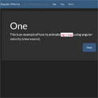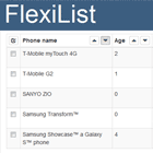
Angular Switchable Grid


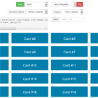
A simple grid for angular, Which can be switched between typical List view and a tile block view
Demo
https://sanuradhag.github.io/angular-switchable-grid/
Installation
Install through npm;
npm install --save angular-switchable-grid Then import GridModule and include it in your apps for module.
import { Component, NgModule } from '@angular/core'; import { GridModule } from 'angular-switchable-grid'; @NgModule({ imports: [ GridModule ] }) export class MyModule {} Then add angular-switchable-grid to your app template.
<angular-switchable-grid [data]="data" [columns]="columnTitles" [enableSelection]="true" [enableMultiSelect]="true" [filterBy]="'first_name'" [filterTerm]="filterTerm" [enableSort]="true" [isGridView]="isGridView" [noDataTemplate]="null" (getSelectedItems)="getSelectedItems($event)"> <ng-template let-item> <div>{{item.id}}</div> <div>{{item.first_name}}</div> <div>{{item.last_name}}</div> <div>{{item.email}}</div> <div>{{item.gender}}</div> <div>{{item.ip_address}}</div> </ng-template> </angular-switchable-grid> Styles
Style guide will be added soon.
Documentation
angular-switchable-grid properties.
| Property | Input/Output | Default value | Description |
|---|---|---|---|
| [data] | Input | [] - empty array | The data to be displayed in the grid. |
| [columns] | Input | [] - empty array | Titles of the columns in the grid. Type should be Array<{ property: string, displayName: string, width?: string }> |
| [enableSelection] | Input | false | Enable the selection of the rows of the grid. |
| [enableMultiSelect] | Input | false | Enable the multiple selection of the rows of the grid. |
| [filterBy] | Input | '' - empty string | Grid will be filtered by this key. |
| [filterTerm] | Input | '' - empty string | Grid will filter its's content by the filterBy and will display only the items which are similar to the this. |
| [enableSort] | Input | false | Enables sorting in the grid |
| [enablePagination] | Input | false | Enables pagination in the grid |
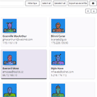
| [isGridView] | Input | false | If sets to true, Grid's view will be changed to Tile view from List view. |
| [noDataTemplate] | Input | Simple text 'No Data' | The template that will be displayed when there is no data. |
| (getSelectedItems) | Output | [] - empty array | Will emit the selected items when user is selecting items from the grid. |
And should pass a template for the row template.
<ng-template let-item> <div>{{item.id}}</div> <div>{{item.first_name}}</div> <div>{{item.last_name}}</div> <div>{{item.email}}</div> <div>{{item.gender}}</div> <div>{{item.ip_address}}</div> </ng-template> Public methods that can be used to access features of the grid.
exportAsExcelFile() - Export the grid data to a excel file. selectAll() - Select all the items in the grid. deselectAll() - Deselect all selected item in the grid. ToDo
- Grid pagination.
- Lazy loading.
Any suggestions?
Drop me a e-mail [email protected].
Or open a new issue in https://github.com/sanuradhag/angular-switchable-grid/issues
Contributors
Anuradha Gunasekara | Brion Mario |
|---|
License
This software is licensed under the MIT license