Angular Selector
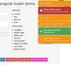
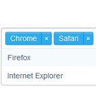
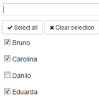
An angular (v 1.5) selector component with filter feature. Check out the demo page.
Installation
For the time being, only bower is supported. To install it, issue the following command:
bower install --save bng-selectorAfter that, you have to add bng-selector as a dependency to your angular app:
var demoApp = angular.module('demoApp', ['bng-selector']); Usage
The following list explain all available options of this component:
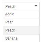
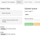
- options: the list of items available to selection
- on-select: the callback function that will be called when an item is selected
- on-unselect: the callback function that will be called when an item is unselected
- selected: the object that the selector will show as selected from start
- label: the name of the property that will be used as label (item description)
- disabled: some variable that handles if the selector is disabled or not
So, as an example, if you want to use this component with all the options, you would add it like that:
<bng-selector options="ctrl.options" on-select="ctrl.optionSelected(option)" on-unselect="ctrl.optionUnselected()" selected="ctrl.selected" label="name" disabled="ctrl.disabled"> </bng-selector>