Angular Radial Color Picker
Introduction
Great UX starts with two basic principles - ease of use and simplicity. Selecting a color should be as easy as moving a slider, clicking a checkbox or pressing a key just like other basic form elements behave.
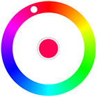
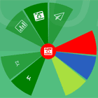
This is a flexible and elegant material design color picker. Developed with mobile devices and keyboard usage in mind. Key features:
- Small size - 5.4 KB gzipped (JS and CSS combined)
- Supports touch devices
- Responsive size
- Optimized animations
- Supports CommonJS and ES Modules
- Ease of use
- Double click anywhere to move the knob to a color
- Tab to focus the picker
- Up or Right arrow key to increase hue. Hold Ctrl to go quicker
- Bottom or Left arrow key decrease hue. Hold Ctrl to go quicker
- Enter to select a color and close the picker or to open it
- Mouse ScrollUp to increase and ScrollDown to decrease hue (Opt-in)
Quick Links
Demos
- Color Picker in a modal window - GitHub Pages
- Barebones example - Codepen
Usage
With Module Build System
Color Picker on npm
npm install -S angular-radial-color-pickerAnd in your app:
import angular from 'angular'; import colorPicker from 'angular-radial-color-picker'; import 'angular-radial-color-picker/dist/css/color-picker.scss'; angular.module('app', [colorPicker]);Depending on your build tool of choice you have to setup the appropriate Webpack loaders or Rollup plugins. The color picker was tested with the latest versions of sass-loader and rollup-plugin-postcss.
UMD version
You can also use the minified sources directly:
<head> <link href="https://unpkg.com/angular-radial-color-picker@latest/dist/css/color-picker.min.css" rel="stylesheet"> </head> <body ng-app="app"> <color-picker></color-picker> <script src="https://unpkg.com/[email protected]/angular.min.js"></script> <script src="https://unpkg.com/angular-radial-color-picker@latest/dist/color-picker.umd.min.js"></script> <script> angular.module('app', ['color.picker.core']); </script> </body>Options
<color-picker> component has several attributes, all of which are optional. See the example which uses all options.
| Options | Type | Default/Description |
|---|---|---|
color | Object | Object for initializing/changing the color of the picker. Defaults to red: {hue: 0, saturation: 100, luminosity: 50, alpha: 1}. |
on-select | Function | Callback which is triggered when a color is selected. |
on-color-change | Function | A function to invoke when color is changed (i.e. on rotation). |
mouse-scroll | Boolean | Use wheel (scroll) event to rotate. Defaults to false. |
scroll-sensitivity | Number | Amount of degrees to rotate the picker with keyboard and/or wheel. Defaults to 2 degrees. |
Events
For maximum flexibility the component utilizes the pub/sub pattern. For easier communication a set of events are provided that can even programmatically open or close the picker without interacting with the UI. All events carry the current (selected) color in the event data payload.
| Name | Description |
|---|---|
color-picker.show | Fires when the color picker is about to show and before any animation is started. |
color-picker.shown | Fires when the color picker is shown and has finished animating. |
color-picker.selected | Fires when a color is selected via the middle selector. Event is fired right before hide. |
color-picker.hide | Fires when the color picker is about to hide and before any animation is started. |
color-picker.hidden | Fires when the color picker is hidden and has finished animating. |
color-picker.open | Programatically opens the color picker if it's not already opened. |
color-picker.close | Programatically closes the color picker if it's not already closed. |
Example:
// Assign the selected color to the ViewModel and log it to the console $scope.$on('color-picker.selected', function(ev, color) { vm.selectedColor = 'hsla(' + color.hue + ', ' + color.saturation + '%, ' + color.luminosity + '%, ' + color.alpha + ')'; console.log('Selected color:', color); }); // The good'n'tested "poke-it-with-a-stick" method: $scope.$emit('color-picker.open');Styling/Sizing
The color picker has a default width/height of 280px, but can also be sized via CSS. For example:
color-picker { width: 350px; height: 350px; }If you want a percentage based size you can use this neat little trick with 1:1 aspect ratio box of 40% width of the parent element:
color-picker { height: 0; width: 40%; padding-bottom: 40%; }First Asked Questions
Color picker uses hsla(). How can I use other formats like rgba() or HEX?
There's a service you can use - ColorPickerService. It has rgbToHsl() which can be used to map a color to the hsla() type that the color picker expects. There's also hslToHex(), hslToRgb() and rgbToHex() which can be used to convert the output of the color picker to other formats.
How to select other shades of the solid colors?
We suggest to add a custom slider for saturation and luminosity or use <input type="range">.
How can I change the active color of the picker after initialization?
color-picker component uses $onChanges to detect changes of the color binding. When using <color-picker color="$ctrl.color"></color-picker> if you change a property of $ctrl.color object $onChanges is not triggered, because angular uses a shallow comparison. To properly update the color you'll have to create a new object with the new values. For example:
$ctrl.color.hue = 42; // won't work
// use the angular helper $ctrl.color = angular.extend({}, $ctrl.color, { hue: 42 }); // or create the object manually $ctrl.color = { hue: 42, luminosity: $ctrl.color.luminosity, saturation: $ctrl.color.saturation, alpha: $ctrl.color.alpha }; // or use Stage-3 Object Spread properties $ctrl.color = { ...$ctrl.color, hue: 42 }; // or use Object.assign $ctrl.color = Object.assign({}, $ctrl.color, { hue: 42 }); Why does Google Chrome throw a [Violation] Added non-passive event listener to a scroll-blocking 'touchmove' event. warning in the console?
touchmove is used with preventDefault() to block scrolling on mobile while rotating the color knob. Even the Web Incubator Community Group acknowledges that in some cases a passive event listener can't be used.
Why is the scroll-to-rotate not turned on by default?
It's another non-passive event that could potentially introduce jank on scroll. To rotate the color knob, but stay on the same scrolling position the wheel event is blocked with preventDefault(). Thus, if you really want this feature for your users you'll have to explicitly add the mouse-scroll="true" attribute.
Contribute
If you're interested in the project you can help out with feature requests, bugfixes, documentation improvements or any other helpful contributions. You can use the issue list of this repo for bug reports and feature requests and as well as for questions and support.
We are also particularly interested in projects you did with this plugin. If you have created something colorful and creative with the color picker and want to show it off send us a quick mail.
The project is using an adapted version of Angular's commit convention and commit messages should adhere to it.
