angularjs-table
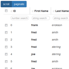
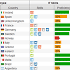
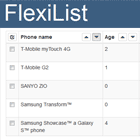
A feature-rich and performant table component for AngularJS (v1.x) projects. Great for dashboards and large datasets. Live demo
NOTE: This project was renamed from angular-mesa, so many of the component names reflect that in the code.
I have started a port for Angular (v2+) here: https://github.com/andyperlitch/ng2-super-table.
Features
- column-specific filtering
- column sorting with stacked sorting (shift-click columns)
- column resizing
- column re-ordering
- localStorage state persistance
- pagination or infinite-scrolling
- server-side interaction support
- enable/disable columns
Installation
With npm:
npm install angularjs-table With bower:
bower install angularjs-table Getting Started
- Include ap-mesa.js and ap-mesa.css in your project.
- Add the
apMesamodule to your project's angular dependencies. - Instantiate table instances with a
<ap-mesa>tag:
<ap-mesa options="options" columns="columns" rows="rows" table-class="table" selected="array_of_selected"> </ap-mesa>Running the Demo
Clone the repository and run the following:
$ npm install $ bower install $ grunt serveAttributes
The ap-mesa tag can have the following attributes:
| attribute | type | required | description |
|---|---|---|---|
| options | object | no | An object containing various options for the table. See Options Object below for details |
| columns | Array | yes | An array of column definition objects. See Column Definitions below. |
| rows | Array | yes | An array of data to be displayed. See the note on maintaining $$hashKeys in order to allow for more performant data updates |
| table-class | String | no | A string of classes to be attached to the actual <table> element that gets created |
| selected | Array | no | This should be provided when using the selector built-in format. See Row Selection. |
| track-by | String | yes | This string should be the unique key on data objects that ng-repeat should use to keep track of rows in the table |
| on-row-click | String | no | If provided, the contents of this attribute will be placed inside of an ng-click on each <tr>. Note that it will be evaluated in the row scope. See Row Scope & Cell Scope. |
| enabled-columns | any[] | no | If provided, represents the array of columns to display by their ids. See Enabling/Disabling Columns. |
Options Object
The options object should be available on the parent scope of the <ap-mesa> element. It is optional (defaults are used) and has the following keys:
| key | type | default | description |
|---|---|---|---|
| rowPadding | number | 10 | Number of pixels to pre-render before and after the viewport |
| sortClasses | Array | (see below) | |
| storage | Object | undefined | |
| storageHash | String | undefined | Non-sequential "version" hash used to identify and compare items in storage. |
| storageKey | String | undefined | Used as the key to store and retrieve items from storage, if it is specified. |
| initialSorts | Array | [] | Array of objects defining an initial sort order. Each object must have id and dir, can be "+" for ascending, "-" for descending. |
| loadingText | String | 'loading' | String to show when data is loading |
| noRowsText | String | 'no rows' | String to show when no rows are visible |
| loadingTemplateUrl | String | undefined | Path to template for td when loading |
| loadingPromise | Object | undefined | Promise object for table data loading. Used to resolve loading state when data is available. |
| loadingErrorTemplateUrl | String | undefined | Path to template for td when there is an error loading table data. |
| loadingErrorText | String | 'error loading results' | String to show when loading fails |
| noRowsTemplateUrl | String | undefined | Path to template for td when there are no rows to show. |
| scrollDebounce | number | 100 | Wait time when debouncing the scroll event. Used when updating rows. Milliseconds. |
| bgSizeMultiplier | number | 1 | The background-size css attribute of the placeholder rows is set to bgSizeMultiplier * rowHeight. |
| defaultRowHeight | number | 40 | When there are no rows to calculate the height, this number is used as the fallback |
| bodyHeight | number | 300 | The pixel height for the body of the table. Note that unless fixedHeight is set to true, this will behave as a max-height. |
| fillHeight | boolean | false | If true, the table will fill the calculated height of the parent element. Note that this overrides bodyHeight. The table will listen for 'apMesa:resize' events from the rootScope to recalculate the height. |
| fixedHeight | boolean | false | If true, the table body will always have a height of bodyHeight, regardless of whether the rows fill up the vertical space. |
| onRegisterApi | function | {} | Provides a access to select table controller methods, including selectAll, deselectAll, isSelectedAll, setLoading, etc. See Table API. |
| getter | function | {} | Customize the way to get column value. If not specified, get columen value by row[column.key] |
| expandableTemplateUrl | String | undefined | A template reference to be used for the expandable row feature. See Expandable Rows. |
| expandableTemplate | String | undefined | A template string to be used for the expandable row feature. See Expandable Rows. |
| pagingStrategy | 'PAGINATE' or 'SCROLL' or 'NONE' | 'SCROLL' | Sets the paging strategy. See Paging Strategies. |
| rowsPerPage | number | 10 | The number of rows to show per page. Only applicable when pagingStrategy is PAGINATE |
| rowsPerPageChoices | number[] | [10, 25, 50, 100] | The choices for number of rows to show per page. Only applicable when pagingStrategy is PAGINATE |
| rowsPerPageMessage | string | 'rows per page' | The label for the selection for number of rows to show per page. |
| showRowsPerPageCtrls | boolean | true | Whether or not to show the control for rows-per-page. Only applicable when pagingStrategy is PAGINATE |
| maxPageLinks | number | 8 | Number of page links to display when paginating. |
| getData | function | undefined | Specify a function which returns a promise of row data. See Server-side Interaction below. |
| showSortPriority | boolean | false | If true, will show a number indicating stacked sort priority of each column being sorted. |
| clearFilterOnColumnHide | boolean | true | If true, a column's filter state will be removed when that column is hidden. |
| clearSortOnColumnHide | boolean | true | If true, a column's sort state will be removed when that column is hidden. |
The options object is also the correct place to pass arbitrary data to table cell templates because it will be available as options in the table cell template scope. For example, if you want a click in a cell to call a function that is otherwise out of the scope of the table, you can do this:
scope.myTableOptions = { myFunction: function() { console.log('hello'); } }; scope.myTableColumns = [ { id: 'foo', key: 'foo', template: '<a href ng-click="options.myFunction()">{{ row.foo }}</a>' } ]; Loading
A common requirement for tables showing dynamically loaded data is to show loading feedback. There are several options pertaining to this: loading, loadingText, and loadingTemplateUrl. To disable loading text, a promise object from data loading can be provided, so that setLoading(false) can be attached to promise.then(). Optionally, onRegisterApi function can be specified, which provides direct access to setLoading and other table controller methods. This function specifies a single argument, which is the api object provided by the table. Example: onRegisterApi: function(api) { $scope.tableAPI = api; }.
No Visible Rows
Similar to loading state, there are two options for visual representation of when there are no rows: noRowsText and noRowsTemplateUrl.
sortClasses
Default Value: [ 'glyphicon glyphicon-sort', 'glyphicon glyphicon-chevron-up', 'glyphicon glyphicon-chevron-down' ] If a column has a sort function specified, the column header will contain a <span> element with a css class of sorting-icon. This sortClasses array contains three strings that will be appended to the <span> className, one for each state of a sorted column: [classes_for_no_sort, classes_for_ascending_sort, classes_for_descending_sort].
Storage
If defined, this requires the presence of storageKey. This object should follow a subset of the API for localStorage; specifically having the methods setItem, getItem, and removeItem. It will use storageKey as the key to set. The most common use-case for this is simply to pass localStorage to this option.
options decoration
An advantage of providing an options object is that apMesa decorates it with a few things for greater control. Below are the things apMesa adds.
options.scrollingPromise
When the user is scrolling, this property will be a promise that gets resolved when the user has stopped scrolling. If the user is not scrolling, this will have a value of null. This can be useful if the table has a lot of columns and you want to optimize performance by deferring updates to when the user stops scrolling.
Setting Default Options with apMesaProvider
A common use-case is to set default options for all tables in a given project. This can be achieved using the apMesa service provider. Add the following to a config block in your project:
angular .module('myApp') .config(function(apMesaProvider) { apMesaProvider.setDefaultOptions({ sortClasses: ['glyphicon glyphicon-sort', 'glyphicon glyphicon-sort-by-attributes', 'glyphicon glyphicon-sort-by-attributes-alt'], defaultRowHeight: 45 }); });Column Definitions
The columns should be an array of Column Definition Objects. The order in which they appear in this array dictates the order they will appear by default. Column Definition Objects have the following properties:
| property key | type | required | default value | description |
|---|---|---|---|---|
| id | string | yes | undefined | Identifies the column. |
| key | string | yes | undefined | The field on each row that this column displays or uses in its format function. |
| label | string | no | id | The column heading text. If not present, the column id is used. See Column Header. |
| labelTemplate | string | no | undefined | If specified, used as html template in column header. See Column Header. |
| labelTemplateUrl | string | no | undefined | If specified, used as url to html template in column header. See Column Header. |
| sort | function or string | no | undefined | If specified, defines row sort function this column uses. See Row Sorting. |
| filter | function or string | no | undefined | If specified, defines row filter function this column uses. See Row Filtering. |
| filterPlaceholder | string | no | 'filter' | If specified, defines the placeholder text for the filter input. See Row Filtering. |
| format | function or string | no | '' | If specified, defines cell format function. See Cell Formatting. |
| width | string or number | no | 'auto' | width of column, can include units, e.g. '30px' |
| lockWidth | boolean | no | false | If true, column will not be resizable. |
| ngFilter | string | no | undefined | Name of a registered filter to use on row[column.key] |
| template | string | no | undefined | A string template for the cell contents. Scope variables available: row, column, options, toggleRowExpand, refreshExpandedHeight, rowIsExpanded |
| templateUrl | string | no | undefined | A template url used with ng-include for cell contents |
| title | string | no | undefined | A tooltip for a column header. |
| selector | boolean | no | undefined | Marks the column as a "selector" column. See Row Selection. |
| classes | any | no | undefined | This value will get passed to the ng-class attribute of the <th> of the column. Useful for styling column headers. |
Column Header
There are several ways to control what appears in the <th>. By default, each column <th> will have the value of the id field. If the label option is specified, apMesa will use that instead.
If labelTemplate or labelTemplateUrl is specified, it will replace the default text with the provided template. The scope of this template will include the column definition object as column and the options object as options.
Row Sorting
The rows of the table can be sortable based on a column by setting the sort attribute of a Column Definition Object to a function with the following signature:
/** * Defines sort function for ascending order. * @param {Object} rowA First row being compared * @param {Object} rowB Second row being compared * @return {Number} Result of comparison. */ function MySortFunction(rowA, rowB) { // Assuming propertyKey is numeric, // this would work as a number sorter: return rowA.propertyKey - rowB.propertyKey; } The returned value should mirror how Array.prototype.sort works: If the returned value is negative, rowA will be placed above rowB in the ascending sort order. If it is negative, rowB will be placed above rowA in the ascending sort order. If it is zero, the two rows will be considered the same in terms of sorting precedence.
There are four built-in sort functions available which handle the most common use-cases: "string", "number", "stringFormatted", and "numberFormatted". To use these, simply set the sort attribute to one of these strings.
Sorting can be set by the user by clicking the headers of sortable columns, and can be stacked by holding shift and clicking. The initial sort order can be set using the initialSorts option in the Options Object, shown in the table above.
Row Filtering
If a filter function is set on a Column Definition Object, that column will contain an input field below the main column header where the user can type in a value and the rows will be filtered based on what they type and the behavior of the function. This function should have the following signature:
/** * Defines a filtering function * @param {String} term The term entered by the user into the filter field. * @param {Mixed} value The value of row[column.key] * @param {Mixed} computedValue The value of column.format(row[column.key], row). Will be the same as `value` if there is no format function for the column. * @param {Object} row The actual row of data * @return {Boolean} */ function MyFilterFunction(term, value, computedValue, row) { // Assuming row[column.key] is a string, // this would work as a simple matching filter: return value.indexOf(term) >= 0; } When there is a value provided by the user in the filter field, every row in the dataset is passed through this function. If the function returns true, the row will be included in the resulting rows that get displayed. Otherwise it is left out. To set placeholder text for the filter field, simply add a placeholder attribute directly to the filter function. To add a title/tooltip, add a title attribute, e.g.:
MyFilterFunction.placeholder = "enter text"; MyFilterFunction.title = "Perform a simple text search";There are several common filter functions that are built-in. Use them by passing one of the following strings instead of a function:
| string | description |
|---|---|
| like | Search by simple substring, eg. "foo" matches "foobar" but not "fobar". Use "!" to exclude and "=" to match exact text, e.g. "!bar" or "=baz". |
| likeFormatted | Same as "like", but looks at formatted cell value instead of raw. |
| number | Search by number, e.g. "123". Optionally use comparator expressions like ">=10" or "<1000". Use "~" for approx. int values, eg. "~3" will match "3.2". |
| numberFormatted | Same as number, but looks at formatted cell value instead of raw |
| date | Search by date. Enter a date string (RFC2822 or ISO 8601 date). You can also type "today", "yesterday", "> 2 days ago", "< 1 day 2 hours ago", etc. |
Cell Formatting
You can format the result of row[key] by specifying a format function on the column definition object. For example, perhaps you want to add a dollar sign to a column which represents an amount of money:
var columns = [ { key: 'price', format: function(price) { return '$' + price.toFixed(2); } } ]; var rows = [ { price: 12 }, { price: 14 } ];Row Selection
There is a special type of column called a selector, which will render as a checkbox that, when clicked, will populate a selected array that is provided through an attribute of the ap-mesa element. The following is an example column definition for a selector (Usually this column appears first):
$scope.myColumns = [ { id: 'selector', key: 'idKeyOfObjects', // used to populate the selected array label: '', // no label for checkbox column selector: true, width: '40px', // Fixed width of 40px lockWidth: true, // to keep it narrow selectObject: true // Optional: by default, selecting a row puts the value of // row[idKeyOfObjects] into the selected array. If this option // is set to true, the entire object will be placed into the // selected array. } ] Expandable Rows
To use the expandable rows feature, you will need to specify an expandableTemplate or expandableTemplateUrl and call toggleRowExpand() from a custom column template. For example, a column definition may look like:
$scope.tableOptions = { expandableTemplate: '<h3>Row Details:</h3> <pre>{{ row | json }}</pre>' // expandableTemplateUrl: 'path/to/panel-template.html' }; $scope.tableColumns = [ { id: 'foo', key: 'foo', template: '<a href="" ng-click="toggleRowExpand()">CLICK TO {{ rowIsExpanded ? 'COLLAPSE' : 'EXPAND' }}</a>' }, ... ];As shown above, there will also be a property on the row scope called rowIsExpanded which is a boolean indicating if the row's panel is expanded. It's also recommended to make the rowPadding option at least as large as the expected pixel height of the expanded panels.
For a complete example, please check out /app/scripts/controllers/expandable.js.
If the content of the panel is dynamic and changes height, there is a method in the row scope called refreshExpandedHeight which should be called when the height has changed.
Paging Strategies
You can specify the paging strategy as 'PAGINATE', 'SCROLL', or 'NONE'.
SCROLL (default)
The default paging strategy is a scrollable table body with height defined by the tableHeight, fillHeight, and fixedHeight options.
PAGINATE
This strategy will render the table as pages instead of an endlessly scrolling tbody. The tableHeight, fillHeight, and fixedHeight options will NOT be honored
Server-side Interaction
You have the option to specify a getData function on your table options object which will enable server-side interaction. It must implement the following function signature (see inline explanation):
function getData (offset, limit, activeFilters, activeSorts) { // offset and limit are numbers, indicating the subset of the total // result set, given the filter and sort states // activeFilters is an array of objects, each containing the string that the user has entered into the // filter text input, as well as the corresponding column definition object, e.g.: // [ // { value: 'im typing', column: [COLUMN DEF OBJECT] }, // { value: 'me too thanks', column: [COLUMN DEF OBJECT] }, // ] // Note that columns whose filter inputs are empty will not show up here. // activeSorts is an array of objects similar to activeFilters, except that instead of `value` field // there is a `direction` field that will either be 'ASC' or 'DESC'. Note that the order of this // array reflects the order that the user chose to sort columns on (stacked sorting). // This function should return a promise that resolves with an object that looks like this: // { // total: [NUMBER OF TOTAL ROWS BEFORE LIMIT], // rows: [ARRAY OF ROWS FOR GIVEN OFFSET, LIMIT, SORT, FILTERS] // } }Note that when getData is specified, angular-mesa only checks the filter and sort fields in the column definition objects for "truthiness".It does not perform any sort of sorting and filtering itself; that is left up to the server to do.
Also note that the angular-mesa.d.ts typescript definition file has a more formal signature for this function that may help if you are familiar with TS.
Row Scope & Cell Scope
Each row (<tr>) is inside of an ng-repeat, and so it is given its own scope (not isolate). It inherits properties from the table's main isolate scope plus it is endowed with several properties that are important to know about when using the on-row-click attribute, the template option on Column Definition objects, and the expandableTemplateUrl option on the main table options. Here is a breakdown (note that a more formal definition can be found in the .d.ts file in this directory):
| Property | Type | Description |
|---|---|---|
| toggleRowExpand | Function | A function that toggles whether or not a row is expanded. Only applicable when expandableTemplateUrl is used. |
| rowIsExpanded | boolean | A variable indicating whether a row is currently expanded. |
| refreshExpandedHeight | Function | A function which, when called, updates the height of the expanded panel as it is known by the table component. This should be called when the content of an expanded panel has caused the panel to change its height. |
| row | any | This is the actual row of data which pertains to this table row. |
| options | object (ITableOptions) | The table options object. |
Each cell (<td>) inherits all of the above properties, and in addition has column which is a pointer to the corresponding column definition object.
Enable/Disable Columns
You can dynamically enable/disable columns on the fly by using the enabled-columns input on the <ap-mesa> tag.
For example, say your js looks like this:
$scope.columns = [ { id: 'a', key: 'key1' }, { id: 'b', key: 'key2' }, { id: 'c', key: 'key3' }, { id: 'd', key: 'key4' } ]; $scope.enabledColumns = ['b', 'd', 'c'];And your html looks like this:
<ap-mesa columns="columns" enabled-columns="enabledColumns" rows="rows" options="options" ></ap-mesa>You can update the value of enabledColumns from the outside to manipulate the currently-showing set of columns. As with normal two-way bound inputs, this value will update as sorting is changed via drag-and-drop by the user.
Table API
When a table is instantiated, it creates an API object with several methods that allow you to programmatically control parts of the table.
There are two ways to access the API. One is to use the onRegisterApi option, e.g.:
var tableApi; $scope.tableOptions = { // other options onRegisterApi: function(api) { tableApi = api; } }The other way is to use the optional binding on the element itself, e.g.:
<ap-mesa columns="vm.columns" rows="vm.rows" api="vm.api"> </ap-mesa>Browser Support
IE 9+ Firefox 4+ Safari 5+ Chrome 5+
