Angular Joyride
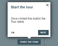
An Angular Tour (Joyride) library built entirely in Angular, without using any heavy external dependencies like Bootstrap or JQuery. From now on you can easily guide your users through your site showing them all the sections and features.
For Angular 2+ (2, 4, 5, 6, 7)
Demo
See the demo. Let's take a tour!
Install
npm install ngx-joyride --save or
yarn add ngx-joyride Usage
1. Mark your HTML elements with the joyrideStep directive
<h1 joyrideStep="firstStep" title="Page Title" text="Main title!">Text</h1> <div joyrideStep="secondStep" title="Page Title" text="Main title!">Div content</div>2. Import the JoyrideModule in your AppModule
@NgModule({ declarations: [AppComponent], imports: [ JoyrideModule.forRoot(), RouterModule.forRoot([]), BrowserModule ], providers: [], bootstrap: [AppComponent] }) export class AppModule { }3. Inject the JoyrideService in your Component and start the Tour, passing the steps order list
@Component({ selector: 'app-component', templateUrl: './app.component.html' }) export class AppComponent { constructor(private readonly joyrideService: JoyrideService) { } onClick() { this.joyrideService.startTour( { steps: ['firstStep', 'secondStep']} // Your steps order ); } } 4. En-joy 😉
API reference
Directive Inputs/Outputs
You can use the joyrideStep directive with these inputs:
| @Input | Required | Purpose | Values/Type |
|---|---|---|---|
| joyrideStep | Yes | The step name, it should be unique. | string |
| stepPosition | No | The position in which the step will be drawn. | 'top', 'right', 'bottom', 'left', 'center' |
| title | No | The step title. | string |
| text | No | The step text content. | string |
| stepContent | No | An Angular template with custom content. | TemplateRef<any> |
| stepContentParams | No | Data object to pass in with Angular template | Object |
| prevTemplate | No | An Angular template with a custom prev button. | TemplateRef<any> |
| nextTemplate | No | An Angular template with a custom next button. | TemplateRef<any> |
| doneTemplate | No | An Angular template with a custom done button. | TemplateRef<any> |
| counterTemplate | No | An Angular template with a custom counter component. | TemplateRef<any> |
| @Output | Required | Purpose |
|---|---|---|
| next | No | It fires an event when 'Next' button is clicked. |
| prev | No | It fires an event when 'Prev' button is clicked. |
| done | No | It fires an event when 'Done' button or 'Close' are clicked and the Tour is finished. |
Options
| Name | Required | Purpose | Type | Default value |
|---|---|---|---|---|
| steps | Yes | Represent the ordered list of steps name to show. e.g steps: ['step1', 'header', 'interesting-table', 'navbar']. This option is particularly useful for multi-pages navigation. If your step is not in the root path, you should indicate the route after the step name, with a @ as separator. E.g. : steps: ['firstStep', 'image@home', 'step4@about/you', 'user-avatar@user/details'] | string[] | none |
| startWith | No | The name of the step (plus the route for multi-page navigation) from which the stour should start. | string | undefined |
| waitingTime | No | The time (in milliseconds) to wait before showing the next/prev step. | number | 1 |
| stepDefaultPosition | No | Define a step default position. The stepPositon set in the directive override this value. | string | bottom |
| themeColor | No | Backdrop, buttons and title color. (Hexadecimal value) | string | #3b5560 |
| showCounter | No | Show the counter on the bottom-left. | boolean | true |
| showPrevButton | No | Show the "Prev" button. | boolean | true |
| logsEnabled | No | Enable logs to see info about the library status. Usuful to get a meaningful error message. | boolean | false |
You can change each element step css overriding the default style.
How tos
- Use Custom Content
- Use Custom Content With Dynamic Data
- Use custom buttons and/or counter
- Set the options
- Listen for events
- Multi Pages navigation
- Close programmatically the tour
Use Custom Content
If you'd like to use custom HTML content instead of simple text you can use the stepContent property instead of text. Let's see how.
<div joyrideStep="step1" [stepContent]="customContent">I'm the target element.</div> <ng-template #customContent> ... Insert whatever you'd like to ... </ng-template>Use Custom Content With Dynamic Data
If you'd like to pass params to template, use the stepContentParams property. Let's see how.
<div joyrideStep="step1" [stepContent]="customContent" [stepContentParams]="{'name': 'John'}">I'm the target element.</div> <ng-template #customContent let-person="name"> Hello {{person}} </ng-template>Use custom buttons and/or counter
If you'd like to customize the next, prev and done button or you want to use your own counter component, you can:
Important: These inputs should be used just once, in the first step of your tour.
<div joyrideStep="step1" [prevTemplate]="prevButton" [nextTemplate]="nextButton" [doneTemplate]="doneButton" [counterTemplate]="counter"> I'm the target element.</div> <ng-template #prevButton> <my-button>Go back!</my-button> </ng-template> <ng-template #nextButton> <my-button>Go ahead!</my-button> </ng-template> <ng-template #doneButton> <my-button>Complete</my-button> </ng-template> <ng-template #counter let-step="step" let-total="total"> {{ step }} of {{ total }} steps </ng-template>N.B.: The counter template has 2 parameters, step represents the current step number, total is the total number of steps.
Set the options
this.joyrideService.startTour({ steps: ['step1', 'my-step@home', 'lastStep@home'], showPrevButton: false, stepDefaultPosition: 'top', themeColor: '#212f23' });Listen for events
Mode 1: Using directive output events
@Component({ selector: 'app-component', template: `<div joyrideStep="joy1" title="title" (prev)="onPrev()" (next)="onNext()">Hello!</div> <div joyrideStep="joy2" title="title2" (done)="onDone()">Hello!</div>` }) export class AppComponent { constructor(private readonly joyrideService: JoyrideService) { } onClick() { this.joyrideService.startTour( { steps: ['joy1', 'joy2']} // Your steps order ); } onNext(){ // Do something } onPrev() { // Do something } onDone() { // Do something } }Mode 2: Subscribing to startTour
@Component({ selector: 'app-component', template: `<div joyrideStep="joy1" title="title" (prev)="onPrev()" (next)="onNext()">Hello!</div> <div joyrideStep="joy2" title="title2" (done)="onDone()">Hello!</div>` }) export class AppComponent { constructor(private readonly joyrideService: JoyrideService) { } onClick() { this.joyrideService.startTour({ steps: ['joy1', 'joy2']}).subscribe( (step) => { /*Do something*/}, (error) => { /*handle error*/}, () => { /*Tour is finished here, do something*/} ); } }N.B.: Using events is very helpful when your next target is hidden in the DOM. If a target is not visible (e.g. *ngIf='false') you should use the (next) event to make the target somehow findable in the DOM.
Get Multi Pages navigation
If your steps are scattered among different pages you can now reach them, just add their name in the steps list followed by @route/to/page.
Lets suppose you have three steps:
- navbar, located in the app root /
- user-avatar, located in /user/details
- info, located in /about
What you should do is adding your steps in this way:
... this.joyrideService.startTour({steps: ["navbar", "user-avatar@user/details", "info@about"]); ...NB: If you're using lazy modules, you should import the JoyrideModule in your AppModule using JoyrideModule.forRoot(). In your lazy loaded feature modules use JoyrideModule.forChild() instead.
Close programmatically the tour
In order to close programmatically the tour you'll just need to call the JoyrideService closeTour() method:
... this.joyrideService.closeTour(); ...Licence
MIT
