angular-data-table
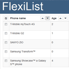
angular-data-table is a AngularJS directive for presenting large and complex data. It has all the features you would expect from any other table but in a light package with no external depedencies. The table was designed to be extremely flexible and light; it doesn't make any assumptions about your data or how you: filter, sort or page it.
It was engineered from its conception to handle thousands of rows without sacrificing performance. It was built for modern browsers using ES6, CSS3 and HTML5 and only supports Evergreen Browsers and Angular >= 1.4.x and < 1.6.0.
Sadly, this project is not Angular2 upgrade compatible. Fortunately, we have authored ngx-datatable which is the successor to this project. We are going to slowly be transitioning this project maintenance mode. We will continue to provide feedback to the community and accept PRs but we won't be doing any major new development.
See live demos here.
Features
- Handle large data sets ( Virtual DOM )
- Left and Right Column Pinning
- Column Reordering
- Column Resizing
- Intelligent Column Width Algorithms ( Force fill / Flex-grow )
- Horizontal/Vertical Scrolling
- Virtual Paging WITH linked traditional pager
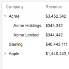
- Tree Grids
- Row Grouping
- Checkbox and Row Selection ( multi / single / keyboard / touch )
- Light codebase / No external deps
- Client-side AND Server Pagination / Sorting
- Rich header / column templates
- Fixed AND Fluid height
- Decoupled themeing with included Google Material theme
- Decoupled Cell tooltips on overflow
- Decoupled Column Add/Removing Menu
- Expressive Syntax
Using It
Download
- NPM
npm install angular-data-table - JSPM
jspm install github:swimlane/angular-data-table - BOWER
bower install angular-data-table
or Github download or clone of course!
Include
You've got 5 different options to include this in your build depending on your setup.
./release/dataTable.js- A standalone file that was compiled with Babel (UMD)./release/dataTable.min.js- A minified standalone file that was compiled with Babel (UMD)./release/dataTable.cjs.js- A standalone file that was compiled with Babel (CommonJS)./release/dataTable.es6.js- Raw ES6 Version.
All distributions include babel helpers, so they do not have to be included separately.
There is also the CSS too:
./release/dataTable.css- The base CSS, pretty much required./release/material.css- Material theme./release/icons.css- If you want to show fancy icons when sorting
Usage
Include the data-table module as a dependency:
var module = angular.module('myApp', [ 'data-table' ]);Set the data and the options in your controller:
module.controller('HomeController', function($scope){ $scope.options = { scrollbarV: false }; $scope.data = [ { name: 'Austin', gender: 'Male' }, { name: 'Marjan', gender: 'Male' } ]; });then using expressive markup in your template:
<dtable options="options" rows="data" class="material dt"> <column name="Name" width="300" flex-grow="2"></column> <column name="Gender"> <strong>{{$row.name}}</strong>: {{$cell}} </column> </dtable>and your off to the races! See live demos here.
API
The data table can be created with the following options:
checkboxSelection: Checkbox selection vs row click (default:false)columnMode: Possible values areflex,forceandstandard(default:standard)columnscanAutoResize: Whether the column can automatically resize to fill space in the table (default:true)cellDataGetter: Typefunction. Returns content for thecellRenderer. If not provided, the cell data will be collected from row data instead (default:undefined)cellRenderer: Typefunction. Returns HTML for the cell.className: CSS class for the body cell (default:undefined)comparator: Typefunction. Custom sort comparator, passfalseif you want to do server sortflexGrow: The growth factor relative to other columns (default:0)frozenLeft: Column is pinned to the left (default:false)frozenRight: Column is pinned to the right (default:false)group: Whether to group by the column (default:false)headerCheckbox: Toggles the checkbox column in the header for selecting all values given to the grid (default:false)headerClassName: CSS class for the header cell (default:undefined)headerRenderer: Typefunction. Returns HTML for the cell (default:undefined)isCheckboxColumn: Adds the checkbox selection to the column (default:false)isTreeColumn: Adds +/- button and makes a secondary call to load nested data (default:false)maxWidth: Maximum width, in pixels (default:undefined)minWidth: Minimum width, in pixels (default:100)name: Name of the columnprop: Property to use to get the dataresizable: Whether the column can be resized (default:true)sort: Default sort asecending/descending for the column (default:undefined)sortBy: Property by which to sort (default:undefined)sortable: Whether the column can be sorted (default:true)templatewidth: Width, in pixels (default:150)
emptyMessage: Message to show when array is presented but contains no values (default:'No data to display')footerHeight: Footer height in pixels. Pass afalseyvalue for no footer (default:0)headerHeight: Header height in pixels. Pass afalseyvalue for no header (default:30)loadingMessage: Loading message presented when the array is undefined (default:'Loading...')multiSelect: Whether users can select multiple items (default:false)pagingexternalPaging. Defaultfalsesize. Defaultundefinedcount. Default0offset. Default0loadingIndicator. Defaultfalse
reorderable: Whether you can reorder columns (default:true)rowHeight: Row height in pixels, necessary if using lazy rendering (default:30)scrollbarV: Enable vertical scrollbars (default:true)selectable: Whether users can select items (default:false)
Contributing
Run Demos
Ensure you have the latest NPM and JSPM installed globally. If you don't already have JSPM installed run: npm install jspm -g.
npm installjspm installgulp watch serve- Open your browser to
http://localhost:9000
Build
gulp release to build Modules, ES* via Babel and compile.
Credits
angular-data-table is a Swimlane open-source project; we believe in giving back to the open-source community by sharing some of the projects we build for our application. Swimlane is an automated cyber security operations and incident response platform that enables cyber security teams to leverage threat intelligence, speed up incident response and automate security operations.
