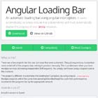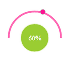
angular-circular-slider
Angular port of circular-slider which helps to slide range of values and images. It supports half(top/bottom/up/down) and full circle shapes


Install
bower install angular-circular-slider
Basic Usage
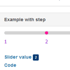
var app = angular.module('yourApp', ['angular.circular-slider']);<link rel="stylesheet" href="dist/css/angular-circular-slider.min.css" /> <script src="dist/js/angular-circular-slider.js"> </script> .. <circular-slider class='my-slider' shape='{{shape}}' touch="true" animate='true' on-slide='onSlide' on-slide-end='onSlideEnd' min="min" max="200" value="value"> {{value}} </circular-slider> Properites
radius
radiusof the circle in px.
innerCircleRatio
ratio of inner circle area(used to display current sliding value).
indicatorBallRatio
ratio of indicator ball.
min
minvalue of the slider.
max
maxvalue of the slider.
value
Initial value of the slider.
clockwise
direction of the sliding value.
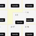
shape
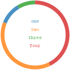
shapeof the slider. Supported shapes are:
'Circle'(default)'Half Circle''Half Circle Left''Half Circle Right''Half Circle Bottom'
touch
touchsupport. (default: true)
animate
linear
animationsupport. (dafault: true)
animateDuration
Animation duration in milliseconds. (default: 360ms)
selectable
text selection enabled or not. (default: false)
disabled
slider is disabled or not. (default: false)
handleDistRatio
Distance between handle and shape center(default: 1.0)
borderWidth
Border width(in px) of the slider(default: 1)
Callbacks
###onSlide(value)
onSlidecallback is triggered whenever there is a change in sliding value.
Parameters:
value - Current sliding value ###onSlideEnd(value)
onSlideEndcallback is triggered when the user action is done (on mouse up/touch end or click).
Parameters:
value - Current sliding value ##Default values
defaults: { min: 0, max: 359, value: 0, radius: 75, innerCircleRatio: 0.5, borderWidth: 1, indicatorBallRatio: 0.2, handleDistRatio: 1.0, clockwise: true, shape: "Circle", touch: true, animate: true, animateDuration: 360, selectable: false, disabled: false, onSlide: angular.noop, onSlideEnd: angular.noop, },Scope bindings
scope: { min: '=?', max: '=?', value: '=?', radius: '=?', innerCircleRatio: '=?', indicatorBallRatio: '=?', handleDistRatio: '=?', borderWidth: '=?', clockwise: '=?', shape: '@?', touch: '=?', animate: '=?', animateDuration: '=?', selectable: '=?', disabled: '=?' onSlide: '=', onSlideEnd: '=', },Watchers
scope: { value: '=?', disabled: '=?' }CSS classes
Use the below css classes for customization
.acs-panel- circular slider panel
.acs- Slider area
.acs-value- Inner circle area
.acs-indicator- Slide indicator ball
License
This plugin is licensed under the MIT license.
Copyright (c) 2015 Prince John Wesley