angular-bootstrap-duallistbox 
Angular directive to include Bootstrap Dual Listbox in your apps.
##Usage
###Installation
$ bower install angular-bootstrap-duallistboxThis will install AngularJS, jQuery, and the original bootstrap-duallistbox.
###Directive The directive has to be applied to an already existing select element with the multiple attribute:
<select ng-options="el in elements" multiple ng-model="selections" bs-duallistbox ></select>Set the select attributes as you would normally do for a regular multiple list, and add bs-duallistbox to enable the plugin.
####Options
The available options for the dual listbox are:
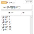
bootstrap2, iftrueenables compatibility with Bootstrap 2, otherwise it defaults to Bootstrap 3.postfix, the added selects will have the same name as the original one, concatenated with this string and1(for the non selected list, e.g.element_helper1) or2(for the selected list, e.g.element_helper2).select-min-height, the minimum height for the dual listbox.filter, iftrueit enables filtering the dual listbox, otherwise it defaults tofalse.filter-clear, the text of the "Clear filter"buttons.filter-placeholder, the placeholder text for the filterinputs.filter-values, iftrueenables filtering on values too.filter-non-selected, the variable that will be bound to the filterinputof the non-selected options.filter-selected, the variable that will be bound to the filterinputof the selected options.move-on-select, defaults totrue, determines whether to move options upon selection.preserve-selection, can be'all', for selecting both moved elements and the already selected ones in the target list'moved', for selecting moved elements onlyfalse, the default not to preserve anything
move-selected-label, is the label for the "Move Selected" button, defaults to'Move selected'.move-all-label, is the label for the "Move All" button, defaults to'Move all'.remove-selected-label, is the label for the "Remove Selected" button, defaults to'Remove selected'.remove-all-label, is the label for the "Remove All" button, defaults to'Remove all'.selected-list-label, can be astringspecifying the name of the selected list., defaults tofalse.non-selected-list-label, can be astringspecifying the name of the non selected list., defaults tofalse.info-all, defaults to'Showing all {0}', determines whichstringformat to use when all options are visible. Set this tofalseto hide this information. Remember to insert the{0}placeholder.info-filtered, defaults to'<span class="label label-warning">Filtered</span> {0} from {1}', determines which element format to use when some element is filtered. Remember to insert the{0}and{1}placeholders.info-empty, defaults to'Empty list', determines thestringto use when there are no options in the list.
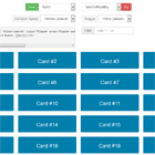
###Example The example folder shows a simple working demo of the dual list box.
##Development
###Test and build
To build the directive yourself you need to have NodeJS. Then do the following:
$ npm install -g grunt-cli bower karma $ npm install $ bower install $ grunt###Contribute
To contribute, please follow the generic AngularJS Contributing Guidelines, with the only exception to send the PR to the develop branch instead of master.
##Author
Francesco Pontillo (mailto:[email protected])
##License
Copyright 2014 Francesco Pontillo Licensed under the Apache License, Version 2.0 (the "License"); you may not use this file except in compliance with the License. You may obtain a copy of the License at http://www.apache.org/licenses/LICENSE-2.0 Unless required by applicable law or agreed to in writing, software distributed under the License is distributed on an "AS IS" BASIS, WITHOUT WARRANTIES OR CONDITIONS OF ANY KIND, either express or implied. See the License for the specific language governing permissions and limitations under the License. 