Angular Bar Rating
Minimal, light-weight Angular ratings.


Table of Contents
Installation
Install it with npm
npm install --save ngx-bar-rating
SystemJS
If you are using SystemJS, you should also adjust your configuration to point to the UMD bundle.
In your systemjs config file, map needs to tell the System loader where to look for ngx-bar-rating:
map: { 'ngx-bar-rating': 'node_modules/ngx-bar-rating/bundles/ngx-bar-rating.umd.js', } Here is a working plunkr | stackblitz
Basic usage:
Import BarRatingModule in the root module
import { BarRatingModule } from "ngx-bar-rating"; @NgModule({ imports: [ // ... BarRatingModule ] })In your template
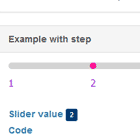
<bar-rating [(rate)]="rate" [max]="5"></bar-rating>Rating options (inputs):
-
[rate]: Current rating. Can be a decimal value like 3.14, default
undefined. -
[max]: Maximal rating that can be given using this widget, default
5 -
[readOnly]: A flag indicating if rating can be updated, default
false -
[theme]: Theme class. default
default, see available themes. -
[showText]: Display rating title if set, otherwise display rating value, default
false. -
[titles]: Titles array. array length should be equal to the
maxvalue, each index represents the rating title, default[]. -
[required]: A flag indicating if rating is required for form validation. default
false. -
[disabled]: A flag indicating if rating is disabled. works only with forms, default
false. -
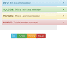
(rateChange): An event fired when a user selects a new rating.
Event's payload equals to the newly selected rating.
-
(hover): An event fired when a user is hovering over a given rating.
Event's payload equals to the rating being hovered over.
-
(leave): An event fired when a user stops hovering over a given rating.
Event's payload equals to the rating of the last item being hovered over.
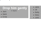
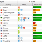
Movie rating example
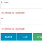
<bar-rating [(rate)]="rate" [max]="4" [theme]="'movie'" [showText]="true" [titles]="['Bad', 'Mediocre' , 'Good', 'Awesome']"></bar-rating>It can be used with angular forms and reactive forms, for example:
<form #form="ngForm"> <bar-rating name="rating" [(ngModel)]="formRating" [max]="4" required disabled></bar-rating> </form> <p>form is valid: {{ form.valid ? 'true' : 'false' }}</p> <pre>{{ formRating }}</pre>Predefined themes
Add the rating theme either in index.html
<link rel="stylesheet" href="../node_modules/ngx-bar-rating/themes/br-default-theme.css"/>Or in the global style style.scss (recommended)
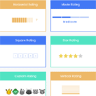
- Pure css stars (default)
[theme]="'default'"
@import '~ngx-bar-rating/themes/br-default-theme'- Bootstrap stars
[theme]="'bootstrap'"
@import '~ngx-bar-rating/themes/br-bootstrap-theme';- Fontawesome stars
[theme]="'fontawesome'"
@import '~ngx-bar-rating/themes/br-fontawesome-theme';- Fontawesome-o stars
[theme]="'fontawesome-o'"
@import '~ngx-bar-rating/themes/br-fontawesome-o-theme';- Horizontal bars
[theme]="'horizontal'"
@import '~ngx-bar-rating/themes/br-horizontal-theme';- Vertical bars
[theme]="'vertical'"
@import '~ngx-bar-rating/themes/br-vertical-theme';- Custom stars
[theme]="'stars'"
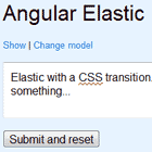
@import '~ngx-bar-rating/themes/br-stars-theme';- Movie rating
[theme]="'movie'"
@import '~ngx-bar-rating/themes/br-movie-theme';- Square rating
[theme]="'square'"
@import '~ngx-bar-rating/themes/br-square-theme';Rating style can be easily customized, check the classes used in any theme and add your own css.
You can also do the same for forms classes such as untouched, touched, dirty, invalid, valid ...etc
If you have a nice rating style you would like to share, prupose your theme and I will include it in the package.
Issues
If you identify any errors in this component, or have an idea for an improvement, please open an issue. I am excited to see what the community thinks of this project, and I would love your input!
Author
Murhaf Sousli