progresspieSVG
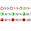
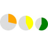
jQuery plug-in for dynamically rendering a pie or circle diagram comparable to a progress bar, depicting a progress, countdown, percent value or similar.
What is this?
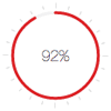
This software module contains a jQuery plug-in for drawing a partially filled circle (pie-chart with only one slice of the pie) for visualizing a single value between 0% and 100% inclusive, i.e. a kind of progress bar, but not in form of a bar but of a pie. The graphic is rendered inside a web page as SVG. In difference to e.g. the HTML canvas element, SVGs are scalable and render sharply on high resolution displays with device-pixel-ratio > 1 (e.g. Apple's “retina displays”).
As the name suggests, this component may be used to display a progress, starting at 0%, incrementing until 100% are reached. For this purpose the graphic may be dynamically updated (or, more precisely, replaced).
But just like progress bars these pies may actually be used to depict any percentual value, including static ones like e.g. percents of points achieved in a test. Mainly for this purpose, the pie may be dynamically colored based on the percentual value with colors like red hinting at a “bad” result, yellow for “mediocre” and green for “good”. There are default color schemes (always grey, green or red or dynamically calculated red/yellow/gree-shade as described above), but you may also assign any static color or your own JavaScript function mapping the value into a color.
This jQuery-Plug-in supports a wide range of options for customizability, so you may style the pie or ring charts in various ways, define value adapter functions for converting any raw value into a percent value to be displayed, even render more than one value in one chart (typically by arranging smaller rings or pies inside one outer ring). A content plug-in architecture allows for additional content to be added to a chart, like control icons, error or warning icons (e.g. if the diagram is used to depict the progress of some job which will not always terminate successfully but might produce errors or warnings), background icons, value display etc. Various content plug-ins are included (see separate example page), and you can also create your own ones.
The basic usage is to add static charts to a page already containing the values, so these get displayed graphically. If the value is not static but the user's input in a form field, the plug-in can automatically update the chart when the input's value changes.
Via JavaScript, it's also possible to dynamically updated charts (even with smooth transition/animation), e.g. for building a real progress indicator for some process running in the background (maybe even a server's progress monitored by Ajax status requests).
Examples
See the examples pages to get an impression of the looks and for different demo scenarios.
examples.html: Examples for direct usage of the plug-inexamplesAppl.html: Examples for indirect use withprogresspiesvlAppl.jsexamplesContentPlugins.html: Examples for usage of the bundled content plug-ins (control icons, check complete, value display, background images, …)examplesAnimation.html: Examples for configuring animated value transitions
You'll also find an online live view of these examples on the project's home page.
JavaScripts
This package contains several JavaScript files.
- The script files in folder
jsare the source files. Please note that—starting with version 2.4.0—these use ECMAScript-6-Syntax and are not compatible with older browsers wich only support up to ECMAScript 5! For better browser compatiblity use the following minified versions! - The folder
js/mincontains the production versions. These have been transpiled (with Babel) to ECMAScript 5 and minified (with UglifyJS), so they are smaller and may be run on more, older browsers that the source scripts.
The individual script files (file names of source versions, production versions' names end with -min.js):
jquery-progresspiesvg.js: The jQuery plug-in itself. It may be used stand-alone.jquery-progresspiesvg-controlIcons.js: A content plug-in as an addition to the jQuery plug-in above. Loading this file on top of jquery-progresspiesvg.js enables you to draw control icons (play, stop, pause) inside ring graphs using thesvgContentPluginoption of the progresspiesvg plug-in.jquery-progresspiesvg-checkComplete.js: A content plug-in which may add a check mark to a pie or ring graph for value 100%.jquery-progresspiesvg-errorIcons.js: A content plug-in for adding warning or error icons to a chart, e.g. in case a monitored progress crashes or terminates with an error or warning message.jquery-progresspiesvg-image.js: A content plug-in for adding content from external image files (preferrablySVG, but other browser-supported formats likePNGorJPEGwill also work). Images may be used in fore- or background or even be masked by the pie chart, see examples.jquery-progresspiesvg-valueDisplay.js: A content plug-in for displaying values (percent numbers or other values converted to percent, e.g. seconds of a minute) in the center of a ring graph.progresspiesvgAppl.js: This is meant to simplify the use for those who do not want to write JavaScript code to apply and configure the plug-in. This script file may be included into your HTML (in addition to jQuery and the plug-in above). If you do so, you may insert progresspie charts simply by writing HTML, inserting the percent values and assigning some predefined CSS classes ordata-Attributes.
Changes in V2.0.0, backwards compatibility
Version 2 mostly adds new features like especially:
- Rendering rewritten to produce more compact SVG markup. (Rings and pies are now only a single elliptic stroke with instead of a filled area.) This was also precondition for the next feature:
- optional SMIL animation/transition (see
examplesAnimation.html) - More features for the
inneroption (second value/pie/ring):- background circle now also supported for inner rings/pies
- “Double pies” extended to “multiple pies”: The
inneroption may itself contain aninneroption (recursive)
- CSS support:
- background circles and foreground pie or ring segments now always get a
classattribute so you can define external CSS rules to modify or enhance their formatting. - new predefined
CSSmode disables some inline formatting like colors in the generated SVG code or the inline stylevertical-alignin thesvgnode, in which case the formatting should be defined externally via CSS rules.
- background circles and foreground pie or ring segments now always get a
overlapoption- Extended content plug-in API able to suppress the output of the actual pie or ring chart, especially if the content plug-in would totally cover/occlude it. This generates more compact SVG (without needlessly rendering effectively invisible graphics) and also draws “cleaner” edges around full size filled backgrounds of content plug-ins.
But some changes have been made which could affect backwards compatibility in a few cases. This is the main reason for the major version increase (see [semantic versioning][https://docs.npmjs.com/getting-started/semantic-versioning]): When updating to V2.0.0, you should make sure the following changes don't affect your current uses, otherwise you might have to (slightly) change them.
- The
separatoroption is now ignored when inserting an SVG into a hitherto empty HTML element (e.g.<span id="pie" data-percent="50"></span>). In Versions 1.x.x, theseparator(wich actually only serves to separate the prepended or appended SVG from the content of the node) was still appended, even if there was nothing to separate. This could have had some unwanted effects, e.g. if the target element was CSS-formatted to have a background color and the SVG should be centered inside, but was not due to the space appended to it. On the other hand: If you've been relying on this separator being inserted even into empty documents, you'll now have to put it into the document by yourself. Example: If you had some markup like<span id="pie"…></span><span id="X">…</span>and relied on a space being inserted after the SVG into the#pieelement so that the pie and the content of#Xwere separated, you'd best now insert a space directly between the two span elements. - The default valueAdapter function now uses
parseFloatinstead ofparseIntfor parsing string numbers, meaning that it now supports decimal digits if the dot (.) is used as decimal separator.
Changes like having a separator only separate the newly inserted and old content and not (any more) adding a ‘separator’ that's actually not separating anything, these are more kind of a fix than a new feature. They IMHO make sense, but sadly they affect backwards compatibility. Other than that, I've strived to retain backwards compatibility as far as possible, and most users won't probably have to change anything.
Usage
Direct usage of the plug-in (without progresspiesvgAppl.js)
Basics
-
Include jQuery (tested with jQuery 1.11, but should work with jQuery 2 and 3, too) and the script file
jquery-progresspiesvg.jsinto the head of your HTML file. -
Insert the percent values into your HTML body that are to be visualized. This may be done in several ways:
- Should the number be visible and a pie in text height should be inserted before or behind the acutal number? This is the default. In this case, for each progresspie to insert, write the number (and only the up to three digits) into an HTML element like
spanand make sure this element may be selected via jQuery (e.g. by adding a classname like "percent" or "progresspie"). Example:<span class="percent">42</span> %. - Should the number / digits be invisible and only a pie is to be inserted? In this case create an empty HTML element where the pie chart is to be inserted and write the number into an attribute of this element (usually prefixed with
data-), e.g.:<span class="pie" data-percent="42"></span>.- In this case, you'll have to include an option when calling the progressPie() plug-in defining where to find the value, preferrably the
valueDataoption, alternatively thevalueAttroption.
- In this case, you'll have to include an option when calling the progressPie() plug-in defining where to find the value, preferrably the
- Should the value actually be the value of a form input element editable in the browser by the user, that's also possible.
- In this case you'll have to use the
setupProgressPie()plug-in function to setup an updateable chart (see below). ThevalueInputoption can be used to specify the value source as well as setup an event handler for automatic update of the chart when the input value changes.
- In this case you'll have to use the
- Should the number be visible and a pie in text height should be inserted before or behind the acutal number? This is the default. In this case, for each progresspie to insert, write the number (and only the up to three digits) into an HTML element like
-
Write and include some script code that gets executed after rendering the HTML (generating the DOM). This code is to select the (
span-) elements you created in the second step with a jQuery query and to apply the plug-in to the selection/query result. Example corresponding to both data elements above:<script type="text/javascript"> $(function() { $(".percent").progressPie(); //default mode $(".pie[data-percent]").progressPie({ //specifying options object valueData:"percent", color:"navy", size:30 }); }); </script> -
For each selected element, the script will try to read the number (from the element's content or from a data attribute, if the option
valueDatais given and the element provides a data attribute, prefixed withdata-, of that name or the data is set by calling jQuery'sdata()method) and render the piechart SVG, which will be inserted into the selected element. -
By default the SVG image gets prepended to the content, optionally it may also be appended. Also, a
separatorstring may be inserted between the pie and the original content (by default this is a non-breaking space: ). If the target element is empty (like in the second example with the data attribute), the SVG is simply inserted into that element without the separator. -
In case the values aren't static but should be updatable, the initialization should be done with the
setupProgressPie()method and the parameterlessprogressPie()method can be used multiple times to (re)draw die graph:<script type="text/javascript"> $(function() { $(".pie[data-percent]").setupProgressPie({ //specifying options valueData:"percent", color:"navy", size:30 }).progressPie(); //draw the pie (1st time) using the above setup. }); function demoUpdate(p) { $(".pie[data-percent]").data("percent", p).progressPie(); //update the percent data and initiate redraw. (The progressPie() //method will read the "percent" data as specified in the setup.) } </script>-
If the value should be taken from a form input element (see above), you'll not even have to write an update trigger function, the
valueInputoption will automatically register an event handler for updating the chart (by callingprogressPie()) on the input.
Example:
The HTML:<input type="text" id="inp1" name="inp" value="50"> <span id="pie1"></span>The JavaScript call:
$("#pie1").setupProgressPie({ valueInput: $("#inp1") }).progressPie();See the main examples page for more detailed examples including the additional
valueInputEventsoption.
-
Options
If you simply call progressPie(), the plug-in will be used with default options. This includes that the percent number is expected to be the (only) content of the selected element, the pie will be prependet to this content (separated with an ), it will be rendered in line-height and in a shade of grey (#888). It will only be inserted, if the element does not yet contain any SVG content: repetetive calling of the function will therefore neither insert the SVG multiple times nor will it update the graphic.
To modify the looks or behaviour, the function takes exactly one argument, which has to be a JavaScript object which defines options via its properties. The following option properties are defined:
mode: constant of enum type$.fn.progressPie.Mode. Default is$.fn.progressPie.Mode.GREY. Possible values are:$.fn.progressPie.Mode.GREY: Default Mode, pie is drawn in a shade of grey.$.fn.progressPie.Mode.RED: The pie is drawn in red color regardless of the percentual value.$.fn.progressPie.Mode.GREEN: The pie is drawn in green color regardless of the percentual value.$.fn.progressPie.Mode.COLOR: The color of the pie is depending on the percentual value (see above). The color is the same green color as in mode GREEN for a value of 100 percent, the same red color as in mode RED for a value of 0%, a yellowish mix of both for 50% and a gradient in between green and yellow for values greater than 50% resp. between red and yellow for values less than 50%.$.fn.progressPie.Mode.CSS: The colors (strokeof foreground and background andfillof background) as well as thevertical-alignstyle of the rootsvgelement are left unspecified. If this mode is chosen, you have to define the colors and vertical alignment via CSS rules (see examples)! Note: If themodeoption is set to CSS mode, anycoloroption will be ignored!$.fn.progressPie.Mode.MASK: The pie or ring chart is not added to the main, visible area of the SVG but is instead inserted as a mask which is then applied to the topmost background layer. This requires at least one background layer to be present: Any layer other than the pie layer (which is inserted in any mode but MASK or IMASK) can only be inserted by a content plug-in, i.e. this mode is only made to be combined with at least one content plug-in (see thecontentPluginoption). Since content plug-ins may insert either a foreground layer (draw on top of the chart) or a background layer, thecontentPluginoption must hold at least one plug-in drawing into the background.
As has already been said, the mask defined by the pie chart gets applied to the topmost background layer. By default that means that the output of the first content plug-in drawing into the background will only be visible in those parts of the graphic which would normally be covered by the pie chart.
In MASK mode the space around the pie or ring chart is always transparent, the pie itself is white by default. If you understand masking and wish to change that, you may alter the colors of the chart and its background (filled background inside the circle) by using using options likestrokeColor,color,backgroundColoretc., the space outside the chart's circle is always transparent in this mode.
See JSDoc for these Mode constants and the examples page on content plug-ins!$.fn.progressPie.Mode.IMASK: Inverted Mask Mode: This resembles theMASKmode above, only the mask in inverted: By default, the foreground of the pie is black and all the background (inside and outside of the chart) is white, meaning any part of the first background layer which would be visible in normal mode will still be visible, but the chart is not drawn on top of that background layer, but it's “cut out of” the background, leaving a pie-/ring-shaped transparent hole in the background layer.
In this mode, too, you may alter the default colors of the mask (defining a grade of transparency) by other options.
See JSDoc for these Mode constants and the examples page on content plug-ins!
strokeWidth: number. Default is2. Determines the stroke with of the background circle.strokeColor: string, color code. Default isundefined. If undefined, the background circle is drawn in the same color as the rest of the pie. If set to a color code like#dddorsilver, this defines the color of the background circle.strokeDashes: number or object. Default isundefined. This defines an optional dash pattern for the background circle's stroke. A number value is simply a short hand syntax for an object with only the sub-optioncount. If this is an object, it must at least contain thecountproperty. Allowed properties are as follows:count: number, mandatory. Defines into how many dashes (and gaps) the background circle is to be divided. By default dashes and gaps are equally long (circumference/(2*count)).length: number or string. Defaults toundefined. If set to a number, this defines the length of each dash in pixels. This should only be used if the total size of the graph and thus the circumference in pixels is known to be longer thanlength*count! Alternatively this may be set to a string literal containing a number followed by a percent sign, e.g.length: '10%'. This defines a relative length of each dash and is applicable independently of the graph's size. If you usecountandlength, the length of the gaps between the dashes is auto-sized in order to equally distribute the dashes around the circle.centered: boolean. Defaults toundefined. If falsy (e.g. undefined or false), the first dash will start at (end the last gap will end at) exactly the circle's top (12 o'clock position). If true (or truthy), the first dash will be horizontally centered around that position.inverted: boolean. Defaults toundefined. If true (or truthy), the pattern is inverted such that the gaps are replaced by dashes and vice versa. I.e. in inverted mode thelengthproperty will define the length of the gaps and the dashes will be auto-sized, and the first gap will start at (or, ifcenteredis set, be centered around) the 12 o'clock position.
overlap: boolean, defaults totrue. Iftrue, the foreground (pie/ring segment) is drawn full size, i.e. with the same radius as the background circle, so the foreground overlaps the background. This is usually only visible, if thestrokeColor(color of the background circle) is set and differs from the foreground's color. Set this tofalsein order to fit the foreground (pie/ring) inside the blank space of the background circle.ringWidth: number. Default isundefined. If undefined, a portion of the pie will be filled, cut out just to the center of the circle (like a partial sweep of a radar). If ringWidth is a number, only the outer rim of this piece of the pie is drawn, leaving an empty circle in the middle with diametersize-2*ringWidth. If nostrokeColoris defined (andoverlapis true)ringWidthmust be greater thanstrokeWidthin order for the (partial) ring to be visible. (See examples)ringEndsRounded: boolean. Default isfalse. Only applicable ifringWidthis defined, ignored in pie mode. If a ring is drawn, both ends of the ring are normally cut rectangularly. Enabling this option draws a semicircle cap on each end. This might look prettier especially for very large graphics with usuallystrokeWidth === 0. Note however that, the higher theringWidthvalue, the longer the ring seems, for the semicircles are added to the ring. Very high values like 99% will then look like a full 100% (for the semi circle ends overlap).ringAlign: constant of enum type$.fn.progressPie.RingAlign. Defaults to$.fn.progressPie.RingAlign.OUTER. This option is only applied ifringWidthandstrokeWidthare both defined and both greater than zero. Its meaning correlates with theoverlapoption. Possible values are:$.fn.progressPie.RingAlign.OUTER: The ring's outer edge is aligned with the background circle. Ifoverlapis true, it is drawn on top of the background circle and both circles outer edges are aligned. Ifoverlapis false, i.e. both circles don't overlap, the ring is drawn inside the background circle, the ring's outer edge touches the inner edge of the background circle.$.fn.progressPie.RingAlign.INNER: The ring's inner edge is aligned with the background circle. Ifoverlapis true, the ring is drawn on top of the background circle such that they are both aligned on the inside. Ifoverlapis false, the background circle will be drawn inside the ring, the ring outside around the background circle.$.fn.progressPie.RingAlign.CENTER: In this mode, both circles share the same radius, i.e. they are both centered on the same circle, the wider stroke will expand further to the inside as well as to the outside of that circle. (This is only applicable ifoverlapis true, without overlap, no centering is possible.)
prepend: boolean. Default istrue. If true, the pie will be inserted at the beginning of the element's content, followed by the separator string. Iffalse, the separator string followed by the pie will be appended to the element's content. If the target element is completely empty, the pie will become the sole content, this option (as well as theseparatoroption, see below, will be ignored).separator: string. Default is" ". Will separate the inserted pie from the rest of the content (usually the number), seeprepend. Ignored for empty elements.verticalAlign: string. Default is"bottom". Defines the CSS-propertyvertical-alignof the inserted SVG element and thus the vertical alignment. By default, the image is aligned with the bottom of a line. In certain circumstances (like setting aline-heightstyle greater than1em) you might want to vertically center the image by setting this option to"middle". (This option is ignored in CSS mode, see above, since in that mode no localvertical-alignstyle will be defined at all, but it's left to you to define a global CSS rule for the alignment!)update: boolean. Default isfalse. If false, the function will do nothing if the target element already contains ansvgelement. Set totrueif repeated calls are meant to update the graphic. Iftrue, the function will remove an existingsvgbefore inserting a new one. Typically only needed in combination withvalueDataorvalueAttr, see also: Dynamically updating piessize: number. Default isundefined. If undefined, the plug-in will try to draw the pie in the actual height of the parent element. Beware: If the element is empty, the browser may have calculated a height of 0! In this case, a default size will be used. Defining this option disables auto-sizing: the provided number will be used as height and width of thesvg. It has to be a number (in pixels), not a string with a unit! This is typically used on empty elements in combination withvalueData,valueAttrorvalueSelector.sizeFactor: number. Default is 1. The size (either given bysizeoption or auto-calculated, if nosizeis explicitly specified) is multiplied by this factor to get the “final” diameter before drawing the chart.scale: number. Default is 1. The already rendered SVG is finally scaled by this factor. In difference tosizeFactorthis does not simply change the diameter/radius of the chart, but scales all other aspects, such asstrokeWidth,ringWidthetc., too.valueAttr: string. Default isundefined. Name of a value attribute: If defined, the function will look for an attribute of this name inside the opening tag of the found element, and if found, it will parse this attribute's value instead of the element's content as the percent value. (If defined but not of type "string", the function will throw an exception.) For accessingdata-*attributes, the next optionvalueDatais usually preferred, usevalueAttronly if you want to read other attributes (not beginning withdata-) or if you really want to react to updates to the attribute in the DOM tree.valueData: string. Default isundefined. Mutually exclusive withvalueAttr,valueSelectorandvalueInput! Name of a jQuery data object. When parsing, jQuery will create data objects for eachdata-*attribute, e.g. for an attributedata-percent="50"in the HTML, the jQuery functiondata("percent")will return the number 50 (not a string). In this example, you may specify the optionvalueData: "percent"to access the data from thedata-percentattribute. This is nearly equivalent tovalueAttr: "data-percent", but differs in two important respects: Firstly, numbers are automatically recognized and parsed, so thevalueAdapterdoes not have to parse the string itself, secondly (and most important), value updates set by calling the jQuery functiondata(id, newValue)(e.g.$(selector).data("percent", oldvalue++)) will be recognized when updating the pies. Be aware that jQuery does not update data-attributes upon calling thedata-setter-function. Attributes and stored data objects only match initially, but updates to the data objects are not propagated to the string attributes in the DOM tree. So if you were using optionvalueAttr: "data-percent"instead ofvalueDataand wanted to dynamically update the pie, you'd have to explicitly update the data attribute via jQuery functionattr("data-percent", newValueAsString), whereas use ofvalueDataenables you to simply update the value viadata("percent", newValueAsNumber), which is simpler and more efficient. (If this option is defined but not of type "string", the function will throw an exception.)valueSelector: jQuery-Selector (string). Default isundefined. Mutually exclusive withvalueAttr,valueDataandvalueInput! If defined, the function will apply a jQuery search within the selected element to find a sub-element whose text content is to be used as a value. Usually, the whole text content of the node previously selected (to which the progresspie plug-in is applied) is interpreted as the value. If you want to have more content, maybe for CSS styling reasons, and the actual value is in a sub-element, but the pie should not be inserted into that sub-element but into the previously selected main element, then this option is for you. The examples page demonstrates an application of this option.valueInput: jQuery result set containing an input element or alternatively a jQuery-selector (string) referring to an input element. Default isundefined. Mutually exculsive withvalueAttr,valueDataandvalueSelector. If this option is defined, the value for the pie will be read from that input (from the jQuery result set passed in this option or, in case a selector string was passed, from the resultset obtained by$(selector)) via jQuery's.val()method. This option is only available in thesetupProgressPie()function and not withprogressPie({…options…})! The setup will then not only define the options for the progress pie (or ring), but it will also add an event listener to that input (via jQuery's.on()method executed on the result set), which will update the pie upon changes to the input (by simply callingprogressPie()on the associated result set). More specifically, by default the event handler listens to thechangeevent, but you can override that default with the following option:valueInputEvents: String, default is"change". Space-separated list of event names the input event listener (added bysetupProgressPie()when thevalueInputoption is given) will react to (by updating the pie). IfvalueInputis undefined, this option will be ignored.- Please note that, if you should later change the setup by a succeeding call of
setupProgressPieand change thevalueInputorvalueInputEventsoption, this will not deregister the event handlers registered by the first call! If needed, the.off()method has to be called manually!)
valueAdapter: function. Default: see below. The valueAdapter function is executed when interpreting the value, i.e. either the element's content (string), the value of the attribute denoted by thevalueAttroption (also a string) or the data object denoted by thevalueDataoption. It has to map the value (string or number) to a number within the range [0..100], which is then used to calculate the pie graphic. So if you have raw data that's not a percent value (for example an hour value out of [0..12]), you may write an own valueAdapter reading this value and returning an int in [0..100]. (See examples page.)- If you use the
valueDataoption, the type of the argument is the type of the object stored in the data model. This is usually a string or a number, but your own script code controls the type of objects stored there. - If you don't use the
valueDataoption, the type of the argument is alwaysstring. - The default valueAdapter
$.fn.progressPie.defaults.valueAdapter(which is used whenever this optionvalueAdapteris undefined) appliesparseIntto anystringargument, returns anynumberargument unchanged and returns0for an argument of any other type.
- If you use the
color: string or function. Default isundefined. If undefined, the color of the pie depends on themodeoption, see above. A valid string value of this option would be a color name likenavyor color code like#888,#FF00BC,rgb(10,20,255). If the value is a function, this function has to read one parameter of type number (0..100) and return a color code (string). If the option is neiterundefinednor a string nor a function, the plug-in will throw an exception.colorAttr: string. Default isundefined. Only evaluated ifcoloris undefined. Name of a color attribute: If defined, the function will look for an attribute of this name inside the opening tag of the found element, and if found, will try to use the attribute's content (string) to set the pie color. The attribute must contain a color name or code (seecolor).colorFunctionAttr: string. Default isundefined. Only evaluated if no color has already been set withcolororcolorAttr. Name of an attribute containing JavaScript code (as string literal) for calculating a color.animate: boolean or object. Default isundefined. May be set totruefor default animation options (defined injQuery.fn.progressPie.defaultAnimationAttributes) or to an object containing valid SMIL options (key-value-pairs likedurfor the animation duration) in order to set up a customized animation. Animation is applied for static pies when rendering the page (the animation then starts at 0% and gradually fills the chart up to the assigned percent value) and is also applied for each redraw of the chart (animating the transition from the previous to the newly set value). See separate animation examples page and jsDoc for thedefaultAnimationAttributesobject.- If you use the
inneroption (see below) to add a second or even more values, these inner options inherit theanimateoption in case they don't define it themselves. To disable an inherited animation for an inner value,inner.animatemay simply be set tofalse.
- If you use the
animateColor: boolean. Default isundefined. Effectless if theanimateoption is not set (orfalse) or if the color of the chart is constant. So let's assume you use a color function, so that a value change also may cause a change of the diagram's color:- If this option is set to
false, the chart will immediately be drawn in the final color, theanimateoption will only add a value transition. Especially when incrementing or decrementing the value and redrawing/updating the pie, the color will change abruptly even before the value change transition starts. - If this option is set to
true, in addition to the value transition also a color transition is added. Note that the easiest, ‘direct’ color transition between start and target color is used, i.e. the intermediate colors do not necessarily comply with your color function's results for the intermediate percent values! - If this option is left
undefined, a default color transition mode is used, which means: Upon the first drawing of a pie (loading the page), the pie will immediately be drawn in the final color (as withfalsevalue), only the value will be filled animatedly. Each redraw/update on the other hand will use color transition (as withtruevalue). - The latter (default mode) is the recommended setting, only define the
animateColoroption if you either want to completely disable color transitions for redraws (false) or if you explicitly want to enable color animation even for the first drawing upon page load (true).
- If this option is set to
rotation: string, boolean or object. Default isundefined. If this option is ‘truthy’ (i.e. notundefined, notfalse, not0etc.), the (outer) pie or ring fragment will be animated by rotating around its center. The default speed is one rotation per second, the default direction is clockwise. (Both are applied, if you setrotation: true.) If the option is a string, it has to be a duration definition, i.e. a number with a time unit. It will define the rotation speed by setting the duration for one full (clockwise) rotation. Legal values are numbers with units like"2s"for two seconds or"500ms"for 500 milliseconds, i.e. half a second. Therotationoption may also be assigned an object with two (sub-)properties: 1.durationdefining the duration of one turn (just like the simple string value forrotation), 2.clockwiseis a boolean defining the rotation direction. Set this tofalsefor an anti-clockwise rotation.
It's not recommended to define arotationfor pies or rings acually measuring a progress, but for usage with constant values to draw a “busy-indicator” like a rotating ring with a small gap. The constant value (like 90% for a ring with a 10% gap) may be specified by setting avalueAdapterfunction returning this constant. Seeexamples.html!globalTitle: string. Default isundefined. If defined, this string will be added as a title to the whole SVG image. What a title does, depends on the platform. A typical modern desktop web browser, for example, will usually display this title as a so called tooltip whenever the mouse cursor rests on the image for some time.title: string. Default isundefined. Similar toglobalTitle, but the title string is not applied to the (rectangular) SVG image as a whole, but only to the pie or ring (foreground pie or ring as well as background circle). Both options can be combined: If so, a desktop browser usually displays thetitlewhenever the mouse cursor rests on the pie or ring itself, and theglobalTitleif it rests on some other area of the SVG's canvas (like the empty circle inside a ring chart, the cut-out area of a pie or the areas outside the circular chart).
The main purpose, however, of the specifictitleoption is to label the values of multiple pies/rings obtained by use of theinneroption (also see examples).inner: Object. Default isundefined. This object may contain a subset of the option properties described above {mode,color,colorAttr,colorFunctionAttr,valueData,valueAttr,valueSelector,valueAdapter,size,strokeWidth,strokeColor,strokeDashes,overlap,ringWidth,ringEndsRounded,animate,animateColor,rotation,title,inner(recursive)}. Ifinneris defined, then two piecharts will be drawn: An outer, larger chart, described with all the other options, and a second, smaller, inner pie on top of the outer. The inner circle's value might be taken from a second attribute (denoted byinner.valueAttr) or might be calculated from the same value string as the outer value, just by a differentinner.valueAdaptermapping. At least one of these two options should be defined. Also, the inner pie should have a different color than the outer one, defined byinner.modeorinner.color. Ifinner.sizeis specified, the outersizeoption should also be set manually and should be larger thaninnser.size. Ifinner.sizeis left undefined, the inner pie is automatically slightly smaller than the outer one (approx. two thirds of the outer). If theinneroption contains yet anotherinneroption, than a third pie with those options is added, and so on.- CSS class name options. Individual components of the rendered SVG graphic are equipped with CSS class attributes. This enables you to apply external CSS styling rules. The following options may be added to the progressPie function call in order to override the default CSS class names:
cssClassBackgroundCircle: string. Defaults to"progresspie-background". This value get set as CSS class (via an attributeclass="progresspie-background") to the closed circle shape always drawn as background behind the actual pie or ring.cssClassForegroundPie: string. Defaults to"progresspie-foreground". Just like the option above, only this class is assigned to the actual pie or ring segment drawn on top of the background circle.cssClassOuter: string. Defaults to"progresspie-outer". In case you specify theinneroption in order to display a second (or even more) inner pies or rings, this class is assigned to both background and foreground of the outer graph. E.g. the outer background circle is equipped by default with an attributeclass="progresspie-background progresspie-outer".cssClassInner: string. Defaults to"progresspie-inner". In case you specify theinneroption, this CSS class is assigned to the second (i.e. the (first) inner) graph just like thecssClassOuteroption is to the outer graph. In case you use nestedinneroptions, starting with the third chart (the “inner inner chart”) a number (starting with 2) is appended to this class name. E.g. the foreground of the third (“inner inner”) chart will bear the attributeclass="progresspie-foreground progresspie-inner2".- Please note that these four options must be “root options” of the plug-in call. I.e. it's not supported to add these options to an
inneroption object.
optionsByPercent: function. Default isundefined. You may specify a function which takes the percent value (0..100, if a value adapter is used, this is the value returned by the adapter) and either returnsnullor an object with progresspie options from this very list, depending on the percent value. If, for some value, the function returnsnull, it has no effect. If, for some value(s) it returns an object, the options returned will override the global options passed directly to the jQuery plug-in. So, for example, you may specify a function returning null for any value > 0, but returning some other options for rendering a rotating ring for a value of still 0%. (Actually, this is a more universal version of setting acolorfunction, since it may not only override a global color based on the depicted value, but may also change other properties like size, stroke with, rotation etc.)- Note: If this function returns, in some case, an object containing an option like
valueData,valueAttr, orvalueSelector, this may retrospectively change the raw and percent value, but neitheroptionsByPercentnoroptionsByRawValuewill be called a second time.
- Note: If this function returns, in some case, an object containing an option like
optionsByRawValue: function. Default isundefined. Alternative tooptionsByPercent: While the latter is given a percent value (numer in 0..100) calculated by the value adapter (see optionvalueAdapter), this function is given the same raw value which is also fed into the value adapter function. This may be a string or a number, as explained in more detail in the description of thevalueAdapterfunction. If you don't define avalueAdapteroption, you probably won't need this option either but should stick to theoptionsByPercentfunction, wich is guaranteed to receive a number argument.- Note 1: If this function returns, in some case, an object containing an option like
valueData,valueAttr, orvalueSelector, this may retrospectively change the raw value, but this function won't be called a second time. - Note 2: Should you specify both,
optionsByRawValueandoptionsByPercent, both will be executed in this order, i.e. first theoptionsByRawValuemay extend the global opions, after which theoptionsByPercentfunction will be executed, which may, yet again, extend the global options and especially may also override global options or those returned byoptionsByRawValue.
- Note 1: If this function returns, in some case, an object containing an option like
contentPlugin: string or function or array of strings and functions. Default isundefined. Specify a content plug-in function to add content on top of a pie chart or inside of a ring chart. If you want to apply more than one content plug-in, enumerate the plug-ins in an array.
See section “SVG Content plug-ins”.contentPluginOptions: object or array of objects (same size ascontentPlugin). If thecontentPluginoption is set, this object may provide plug-in-specific options for configuring each of the content plug-ins. See section “SVG Content plug-ins”.margin: number or array of up to four numbers. Defaults to 0. With this option you may enlarge the SVG image around the actual pie chart, i.e. define the with of a transparent area (margin) around the pie. Effectively, this simply defines a largerviewBoxfor the SVG. (Normally you should not need this, it should be preferrable, if you want a margin around a pie chart in your HTML page, to just define a margin around the SVG image itself or its container element via CSS. But if you should, for some reason, really want to define a margin around the pie inside the SVG, this option is for you.) If you assign just a number, that number denotes the width of the margin on all four sides, the result will still be a square image, just a bit larger. If you assign an array of four numbers (e.g.margin: [1,2,3,4]), the first defines the top margin in pixels, the second's the right margin, the third number defines the bottom margin and the last is the left margin. I.e. the margins are enumerated clockwise starting at the top (12 o'clock), just like in CSS's short-hand margin syntax. Also analogous to CSS, if you enumerate less than four numbers in that array, the left margin will equal the right margin, if you don't list a third value, the bottom margin will equal the top margin.padding: number or array of up to four numbers. Defaults to 0. This is very similar to themarginproperty, only this is an inner border/area inserted between the margin and the pie chart. If you specify both, theviewBoxwill thus be enlarged in each direction by the sum of padding and margin. If you specify only one of both, you will normally not see a difference – at least not if you don't use certain content plug-ins: A content plug-in may draw content not only in the actual chart's area, but also into the padding. Take theimageplug-in for example, which may be used to add a background image to a chart. The image will fill the background of the actual chart plus its padding, but not its margin. See content plug-in examples page!
Dynamically updating pies
The default usage is to have some static percent values (or even other kinds of values which can be transformed to a percent value using a value adapter function, see options / examples) and to insert pie graphs visualizing those values.
But of course your values might get updated (via JavaScript). If that happens, the derived pie charts are not automatically updated too, but your script code updating the values has to trigger a pie update as well.
In fact, the existing SVG code does not really get updated (meaning: modified), but completely replaced by a newly generated SVG image.
In order to redraw a pie, you might simply use usual $(target).progressPie({options...}) call, repeating the options all over. But if you do that, pay attention to the update option: If you leave it set to false, existing graphics won't be replaced, but only missing graphics will be drawn:
- In default mode (i.e. your value is content of an HTML element and the SVG gets prepended (or appended) to this content) a dynamic value update is usually achieved by:
- overwriting the content with a new value, effectively removing the previously rendered pie, and
- re-calling the plug-in to render any missing pies. Since the content replacement has already removed the previous pie from the document, the
updateoption may stay set to false (default value).
- In
valueDataorvalueAttrmode (the number is not visible but present as an attribute to the element whose content usually—but not necessarily—consists only of the pie), an update is best achieved by:- overwriting the value data (using jQuery's
data()function) or attribute and - re-calling the plug-in with option
update: true.
- overwriting the value data (using jQuery's
But usually, the options should stay constant and only the displayed value changes. In this case, it's best not to repeat the options with each update call.
Therefore, the recommended way is to setup the options once before first drawing the pie(s) (using the setupProgressPie() function) and then to redraw it (them) by only calling the parameterless progressPie() function (see section Basics above). If you do that, you also don't have to bother thinking about the update option: When you use setupProgressPie() and don't specify the update option, it automatically defaults to true, meaning each parameterless progressPie() call will update existing pies.
Have a look at the examples page to see updates in action.
Since version 2.0.0, updates may also use transitions, such that the update triggers an animation smoothly increasing (or decreasing) the pie or ring chart's state starting from the old value (before the update) and ending with the current value. (SMIL animations are not supported by all browsers, especially neither Microsoft Internet Explorer nor Edge support them. The charts will sill be updated on those browsers, only the animation will be missing.) To use animation, simply add the animate option, maybe combined with the animateColor option, see above, to the setup.
See the separate examplesAnimation.html page for demonstration.
Overwriting default options
- You may insert a JavaScript code executed immediately when loading the document (but only after loading the jQuery plug-in) that modifies the
$.fn.progressPie.defaultsobject by either overwriting a property with a new default value other than that described above or by introducing a new property with a default value for an option that is normally undefined by default. - The default color for progresspies (
#888) is defined in the propertycolorof the default Mode enum constant:$.fn.progressPie.Mode.GREY.color. This is a string property and may be overwritten with any valid color code in order to set a different default color for the default mode (GREY). - Similarly, the default colors for modes
COLOR,GREENandREDare stored in properties of the Mode enum values:$.fn.progressPie.Mode.RED.valueis a number between 0 and 255 (inclusive), i.e. a byte, defaulting to 200.$.fn.progressPie.Mode.GREEN.valueis also a byte defaulting to 200.- The color in mode
REDis simplyrgb($.fn.progressPie.Mode.RED.value, 0, 0). - The color in mode
GREENis thusrgb(0, $.fn.progressPie.Mode.GREEN.value, 0). - The color in mode
COLORis calculated by$.fn.progressPie.colorByPercent(number)as an RGB code also based on these constants. - Thus, if you want to use these modes but want to adjust the brightness of the calculated colors, you may adjust these properties.
Writing your own color function
As described above, by simply setting the option {mode: $.fn.progressPie.Mode.COLOR}, the color of the pie get dynamically calculated based on the percent value, and the colors used for that are in some degree customizable via overwriting $.fn.progressPie.Mode.GREEN.value or …RED.value.
But if you want more flexibility in dynamically setting a color, you may provide your own JavaScript function which receives the percent value as parameter (number) and has to return a string describing the color (like #3bf or rgb(100,255,100)).
You could simply overwrite the function $.fn.progressPie.colorByPercent. This way your function would always be applied for any pie rendered in COLOR mode.
But the more flexible way is to write one or more own color functions and apply them individually to (classes of) pies instead of using the default COLOR mode, which is then still available.
Simply write your function and then set a reference to it in the options passed to the options, like in:
<script type="text/javascript"> function blueGt25(percent) { var blue = percent < 25 ? 0 : (percent-25)*3; //range from 0 to 3*75 = 225 ( = max brightness for value of 100%) return "rgb(0,0," + blue + ")"; } $(function() { $(".test.myblue").progressPie({color:blueGt25}); }); </script> The example above defines a color function which sets the pie color to black for all values of 0% to 25% inclusive. For values greater than 25% the color is blue: an rgb code with red and green values of 0 and a blue component growing brighter with the percent value up to 225 (a little darker than the brightest blue (255)).
Of course, a color function may also be embedded inline in the options object, if it's not needed elsewhere. The following example defines an inline function setting one (greenish) color for values starting at 50% and another color (reddish) for lower values:
$(".test.myfunc").progressPie({color:function(percent) { return percent >= 50 ? "#3f3" : "#f33"; }}); Last but not least you may reuse the internal color function $.fn.progressPie.colorByPercent within your own color function instead of calculating a color code all by yourself: Let's say, you want all values between 0% and 50% to be drawn in the same red and apply the default COLOR scheme only for values starting at 50% (green for 100%, yellow for 75%, red for 50%). This could be done the following way:
function colorGt50(percent) { var p = percent <= 50 ? 0 : 2 * (percent - 50); return $.fn.progressPie.colorByPercent(p); } valueAdapters and double/multiple pies
If the source value to be visualized as filled circle (pie) is not a percent value (0..100), you may write your own adapter function for mapping the actual values (any string) to a percent number (any number in [0..100], may be int or float). This mapping might be of arithmetic nature (e.g. converting a value of 0 to 60 minutes into a percent number) or of syntactic nature (e.g. extracting a percent number out of a string also containing other characters)—or both. Use the valueAdapter option (see above) to specify your adapter function. (The default value adapter is a function returning any number input unchanged, parsing any string input via parseFloat, and otherwise returning 0.)
If you want to display two values in one graphic (e.g. hours and minutes), that's also possible—not as simple to read/understand at first glance, though. Use the inner option (see above) to specify that and how a second, inner pie should be generated. By adding yet another inner options into the first inner option, you may even add a third value and so on.
The examples page examples.html contains demonstrations for both options.
Note: These features are only available with direct use of jquery-progresspiessvg.js and not via progresspiesvgAppl.js.
Simplified usage via progresspiesvgAppl.js
If you prefer not to write your own JavaScript-/jQuery-Code in order to apply the progresspie plug-in to selected elements of your choice, you may use this additional JavaScript file. It is a default application of the plug-ins to elements which must meet some conventions.
If you include this script into an HTML document, each HTML element of class progresspie is fitted with a pie chart. This requires the element (which is usually an inline element like a span) to contain a number from 0 to 100 (inclusive) as its only content or alternatively in an attribute named data-percent.
By default the pie is grey. By adding an additional class color, red or green you get a dynamically colored resp. statically red or green pie. (These classes must not be combined and activate the corresponding plug-in mode COLOR, RED or GREEN respectively.)
Adding the class vcenter activates vertical centering, otherwise the graphic is aligned with the bottom of the element.
For user-defined color you may either add an attribute data-piecolor defining a static color code or an attribute data-piecolor-function providung a string which evaluates to a function mapping a number (range 0..100) to a color code.
For adding a pie to an input element with auto-updating the pie when the inputs value changes, use the data-input attribute. Its value has to be a jQuery selector for the input which is to provide the percent value. (Note: This simple application script only supports updating on the change event, only can read plain percent numbers and does not support error messages for illegal values. For more features, you'll have to use the full-featured jQuery plug-in.)
- See JsDoc documentation of the script file (Namespace
progressPies) for a more detailed description. - See
examplesAppl.html
SVG Content plug-ins
The progresspieSVG jQuery plug-in provides a private plug-in mechanism itself, which may be used to plug additional drawing logic into the main plug-in, adding SVG content to the pie or ring chart.
To apply a content plugin, add the option contentPlugin to the argument object you pass to the jQuery plug-in. The value of this option is either a reference to a javascript function (conforming to the plug-in API as described below), or simply the name of a function as a string. In the latter case the function must be member of the namespace jQuery.fn.progressPie.contentPlugin. Only then it can be looked up by its name. This is the recommended namespace for any content plug-in.
A content plug-in may itself be configured by an object defining options. Any properties defined in an object passed to the jQuery progress pie plug-in via its option contentPluginOptions will be passed along to the content plug-in specified by contentPlugin.
You may also apply more than one content plug-in: In this case, the contentPlugin option as well as the contentPluginOptions option have to be arrays of the same size: The contentPlugin array enumerates the names of the content plug-ins to apply (in that order), and the contentPluginOptions array has to hold the options object for the plug-in with the corresponding index.
Content plug-ins may draw into the foreground or into the background. Each content plug-in's output is inserted as a new layer into the SVG image: A plug-in drawing into the foreground inserts a new layer on top of all already existing layers (i.e. if you enumerate more than one foreground-plug-in in the contentPlugin option array, the first one gets put on top of the chart, the second one on top of the first etc.). A plug-in drawing into the background inserts a new layer behind any previously existing (i.e. if you enumerate more than one background-plug-in, the first one's output will be placed directly behind the chart, the second one's behind the first one's etc.).
Should you use the MASK or IMASK mode, the pie will not be inserted as a layer (between background and foreground plug-in's layers) but will be applied as a mask to the first (topmost) background layer.
See separate examples page on content plug-ins for demonstrations.
Bundled content plug-ins
Control Icons
jquery-progresspiesvg-controlIcons.js is a script file defining three such content plug-ins play, stop and pause for drawing media control icons (a right-pointing triange, square or two parallel vertical rectangles, resp.) inside a ring graph.
By default, the play-, pause or stop icon is drawn in the same color as the pie/ring chart itself. If combined with a ring chart (i.e. option ringWidth is set, see above), it is auto-sized to fit inside the ring, otherwise it's drawn on top of the pie and auto-sized to fit into the outer circle stroke. These defaults may be overridden by the following options (defined as properties of an object assigned to the contentPluginOptions option):
color: string, color code. Defines the color for the control icon.maxSize: number. If defined, this defines a maximum constraint for the auto-sizing: For the play and stop icon,maxSizedefines the maximum width and height. The play icon is always a bit larger in height and width than the others, due to the fact that the triangle icon fills much less areas and thus looks smaller.
See the content plug-ins example page for demonstrations of the plug-in and its options.
Check if complete
jquery-progresspiesvg-checkComplete.js is a script file defining a single content plug-in (checkComplete). This plug-in will draw a check mark onto a fully filled pie or into a fully closed ring (i.e. on a graph visualizing a 100% value). It won't add any content for lower values.
See the content plug-ins example page for demonstrations of the plug-in and its options.
Error icons
Imagine you set up a pie graph for visualizing the progress of a running job of your web application. You set it up once (per setupProgressPie()) to configure the looks of the pie itself and you might add the checkComplete-Plugin described above to draw a checkmark on green ground as soon as the job is completed successfully.
But maybe the job could also terminate with an error or a warning, and in these cases you would want neither the green check mark for success nor a frozen pie chart which looks like it depicts a still running job. Instead you might want to change the graph into an error or warning icon similar to the white check on green background, e.g. a white cross or exclamation mark on red or green background.
This error icons plug-in serves exactly this purpose. In difference from checkComplete, which gets setup at the beginning to show the icon as soon as the progress value reaches 100%, an error or warning icon has to be added retrospectively by an error event handler function or similar means.
If you have loaded this plug-in script file, your event handler may show a cross or exclamation mark inside a ring or on a fully filled pie, the exclamation mark may also be rendered onto a triangle hovering on top of the pie or ring graph (or inside the ring). The icon may be drawn on a colored background (e.g. red or yellow) covering the pie or ring chart completely (just like the check mark), or it may be rendered on top of a pie (without opaque background) or inside the ring, if you want the job's progress at the time the error occurred to still be visible.
See content plug-in example page for demonstrations (and JSDoc for details on all options).
Value Display
jquery-progresspiesvg-valueDisplay.js is a script file defining content plug-ins for drawing a value inside a ring graph.
This script defines two content plug-ins: percent and rawValue. Both are designed to be combined with ring charts (i.e. usage of the progressPie plug-in with the ringWidth option set) and draw a number (value) and optionally a unit label into the ring. The percent plug-in always renders a percent value (0..100).
If the chart is defined with other than percent values and a valueAdapter function is used to convert the raw value to a percent value, then the percent plug-in will render the result of the valueAdapter function, while the rawValue plug-in will draw the unconverted, raw value. The percent plug-in always adds the label "%" to the value, while the rawVale plug-in takes a unit argument defining an optional label to append to the value.
The plug-ins accept the following options (defined via contentPluginOptions):
unit: String. Default isundefined. Only forrawValueplug-in, ignored bypercentplugin: This defines the unit label to append to the raw value, e.g. "sec."singleLine: boolean. Default isundefined. If truthy, the unit ("%" or value ofunit) will be put behind the value into the same line, otherwise (default) below the value in a second line.fontSizeFactor: Number. Default is 1.0 (or 0.9 ifsingleLineis truthy). The font-size for the value is the inner radius of the ring multiplied by this factor.unitFontSizeFactor: Number. Default is 0.35. Defines the font-size for the unit label.color: String, color code: Overrides the default color for value and unit (which is the same color as that of the pie/ring graph itself).
Instead of passing an individual options object to the progressPie plugin via its contentPluginOptions option, you may also globally alter the defaults by manipulating the object $.fn.progressPie.contentPlugin.valueDisplayDefaults.
See the content plug-ins example page for demonstrations of the plug-in and its options.
Image
jquery-progresspiesvg-image.js is a script file defining a content plug-in for inserting an external image as additional layer to the chart. The image may be used as background image or placed on top of the chart in the foreground (as do the other plug-ins above). If the image covers areas outside the actual chart's circle, it may optionally be clipped to that circle or it may be allowed to draw outside of it. In the latter case, the padding option of the chart may be used to even enlarge the area outside of the chart that may be filled with the image.
The image is automatically scaled to fit into the target area. If it is wider than the target area, then it will be horizontally centered in the higher area, leaving equally sized transparent stripes above and under the image. If the image is higher than the target area, it will be horizontally centered, leaving transparent gaps to the left and to the right.
The target area is defined as follows:
- If the chart is a pie (i.e. the
ringWidthoption is not set / undefined) or if the chart is a ring and the image plug-in'sfullSizeoption (see below) is set, then the target area is the square around the chart, optionally enlarged by thepaddingoption of the mainprogressPiefunction. - If the chart is a ring chart (
ringWidthdefined) and the image plug-in'sfullSizeis not set, the target area is the square around the blank circle inside the ring, i.e. the target area's width and heigh are the chart's diameter minus the doubleringWidth. This way, a circular image (or clipped by theclipCircleoption) will fit into the free space inside the ring. By default, the image plug-in'smarginoption (see below) will in this case default to 1, leaving a 1px free space between the ring and the image.
The plug-in accepts the following options (via contentPluginOptions):
href: String, mandatory. URL specifying the image file to load.clipCircle: boolean, defaults tofalse. If true, the target area (square) is reduced to a circle. The image is clipped by this circle, i.e. all areas of the image outside the circle will be invisible.fullSize: boolean, defaults tofalse. Only affects drawing on a ring chart (i.e. with optionringWidthset). In this case, the valuetruecauses the image to cover the whole ring graph (plus optional padding) instead of just the free space inside the ring.inBackground: boolean, defaults totrue.truemeans the image is inserted as background layer (with the chart on top of the image),falseinserts a foreground layer overlapping the chart. This only makes a difference if chart and image overlap or if theMASKmode is used (since the mask refers to the topmost background layer).margin: number, defaults toundefined: Defines the margin in pixels left free around the image inside its target area (see above). For a progress pie or if thefullSizeoption is truthy, this value (if the property is not set) defaults to zero. For a progress ring withoutfullSizeoption, the default margin value (if the property is not set) is 1.
Some use cases
- Insert an image into the free space of a progress ring (similar to the other plug-ins).
- Add a background image to be drawn behind the chart.
- Define an image to fill the chart such that the pie or ring is not filled by a soldid color but with the image. Use the
MASKmode with a background image to achieve this, see examples.
Background Rectangle
Adds a background layer to the chart filled with a rectangle. You may define a stroke and / or filling for the rectangle, so this may be used to add a rectangular border around the chart or the background may be filled with a solid or semi-transparent color. Yet this is primarily meant to be combined with background images, for example you might add a semi-transparent rectangular layer on top of a background image layer and the chart may be used as a mask for this rectangle. See examples page for demonstration.
The rectangle covers a target area which is exactly the same as the image plug-in's target area, see above.
The plug-in accepts the following options (via contentPluginOptions):
stroke: string defining the stroke of the rectangle (a color code ornone)fill: string defining the filling of the rectangle (a color code ornone)strokeWidth: number, optional: Width of the stroke in pixels.
At least on of the options stroke or fill has to be specified.
Writing your own content plug-ins (API)
You may create you own content plug-in:
With the older version of this API (of ProgressPieSVG V1.x), a content plug-in is simply a single function for drawing the content. Sine V2.0.0, ProgressPieSVG supports an extended API where your plug-in is an object consisting of a draw method for drawing the content and optional further methods for controlling whether the content should be drawn into the foreground (on top of the chart, default) or in the background (with the chart on top), or even whether the chart should be drawn at all in case the content plug-in is full sized.
The plug-in function resp. object should be in the namespace jQuery.fn.progressPie.contentPlugin. If it is, the user may simply state the its name as a string literal in the contentPlugin option. Otherwise the options needs to hold a JavaScript reference to the content plug-in (function or object).
Just like when writing jQuery plug-ins, you may locally bind the $ sybol to jQuery in an immediately invoked function expression like (old API):
( function($) { $.fn.progressPie.contentPlugin.yourPlugin = function(args) { … } } (jQuery)); A plug-in using the new API could look something like this:
( function($) { $.fn.progressPie.contentPlugin.yourPlugin = { draw: function(args) { … }, hidesChartIfFullSize: function(args) { … } } (jQuery)); The draw method
The draw function of your object (new API) resp. your plug-in function (old API) has to take exactly one argument (let's assume you call the formal parameter args like in the examples above). When the draw function gets called by ProgressPieSVG, this parameter will hold an object with at least the following methods and properties:
Methods of the parameter object
-
newSvgElement: function(name). Your plug-in may call this function to insert a new SVG node directly into the pie graph SVG. The argumentnamedefines the element/tag name for the new element. The function returns a reference to the newly created node which you need in order to adding attributes or child elements. You don't have to worry about inserting that node into the SVG's DOM tree, on the other hand: All nodes one content plug-in produces via this method are automatically grouped, and the group gets automatically added to the SVG's DOM—either in the foreground (i.e. on top of the chart produced by the progressPie jQuery plug-in itself and the output of any previously called content plug-in that drew into the foreground) or in the background (as a new background layer behind the chart and the outputs of any previously executed content plug-ins), depending on the return value of the implementation of your content plug-in'sinBackgroundmethod, see below. -
newSvgSubelement: function(parent, name). If you want to add child elements to an SVG element, use this function. The first argument takes a reference to parent element you want to add a child node to, the second argument takes the tag name like innewSvgElement. -
newDefElement: function(name). Works similar tonewSvgElement, only this method appends a new child node to the<defs>…</defs>element of the SVG and returns a reference to the newly created node. Use this whenever you need to create a definition (e.g. amaskorclipPath) that you want to reference from a content node. In order to be able to reference it, you will usually have to add an ID to the newly created node, using thecreateIdmethod described below:var cp = args.newDefElement("clipPath"); var id = args.createId("clipcircle"); cp.setAttribute("id", id); -
createId: function(prefix). Takes the string argument and adds a string suffix in order to guarantee that repeated calls of this method return different strings. This ensures that if your plug-in gets called for more than one chart in a web page, for each of these a new, unique ID will be generated. (Keep in mind the uniqueness is only 'relative' to the prefix, the createId method does not make sure that the target HTML does not already contain elements with this ID that have not been created with this method. So choose a rather "unique" prefix and this method makes sure, the plug-in may be applied to more than one chart without losing the uniqueness.) -
isFullSize: function(). Returnsfalseif the content should typically be fitted into a ring diagram, that is in ring mode without a truthyfullSizeoption (in thecontentPluginOptions). Returnstrueif thecontentPluginOptionscontain an option namedfullSizewich istrue(or at least truthy) or in pie mode, i.e. if progressPie'sringWithoption is undefined. -
isCssMode: function(). Returnstrueif two conditions are met: a) The progress pie is drawn in CSS mode (modeoption is set to$.fn.progressPie.Mode-CSS) and b) thecontentPluginOptionsdo not specify acoloroption. In this case, thecolorproperty (see below) is not of type string (but typically undefined). Your content plug-in should in these cases (i.e. ifcoloris not of type string or this method returns true) react by firstly not accessing thecolorproperty and secondly enabling the user to define the content colors via CSS (e.g. add CSS classes for easy CSS selection and either completely omit styles likestrokeandfillor apply default styles in SVG attributes only (and not as inline CSS styles in astyleattribute), as inline CSS styles have higher priority than external CSS styles while SVG attributes likefillandstrokehave a lower priority than any CSS styles and are thus easily overridable by stylesheets wihtout the need for an!importantdeclaration). -
getBackgroundRadius: function(ignoreMargin). This may be used to calculate a radius for a potentially filled background circle for your content based on some standard content plug-in options: If your plug-in is combined with a pie (i.e. the optionringWidthof theprogressPieparameter object is not defined) or if it's combined with a ring chart and thecontentPluginOptionsinclude a truthyfullSizeproperty (in other words: if theisFullSize()method returnstrue), then this will return thetotalRadiusproperty (see below).
If your content plug-in gets combined with a ring graph without afullSizeoption (isFullsSize() === false), then this will return theradiusproperty (see below), i.e. the radius of the free space inside the ring.
If the parameterignoreMarginis truthy, thetotalRadiusresp.radiuswill be returned unchanged. Otherwise (especially if no parameter is given), the function will search for amarginproperty in thecontentPluginOptionsobject and it will subtract this margin from the radius. If nomarginproperty is found, a default margin will be subtracted. In pie mode or withfullSizeoption set, the default margin is zero (0), in ring mode withoutfullSizeoption, the default margin is one (1), i.e. the default radius for a filled circle to be fitted inside a ring graph will leave a margin/gap of 1 pixel between the content background and the ring graph.
Actually, these two default margins are defined via:$.fn.progressPie.defaults.defaultContentPluginBackgroundMarginFullSize: 0$.fn.progressPie.defaults.defaultContentPluginBackgroundMarginInsideRing: 1I.e. you may override these defaults by overwriting those properties of the defaults object.
Usage hint: If you always want to draw a colored background, you may simply callgetBackgroundRadius()without parameters. If, on the other hand, your content plug-in defines an optional property for the background color (let's assume, it's calledbackgroundColor) and if your plug-in won't draw a filled background for its content, but draw the content directly onto the pie or ring chart if that option is not set, then you might want to ignore the margin option as long asbackgroundColoris not set by calling:
getBackgroundRadius(!opts.backgroundColor);or similar. The content plug-inscheckCompleteanderrorIcons, for example, make use of this feature, since the main icon already leaves a free margin to the edge of the filled background and a second margin between the latter and the ring, but without a filled background, these double margins would yield unnecessarily small icons.
-
addBackground: function(radius, cssClassName): If you want to draw something onto a circular filled background, call this method. It takes at least a number as argument and draws a filled circle with that argument taken as radius. The center of the circle is always the center of the pie. Optionally, you may also pass a string as second parameter. If you do that, the background circle will be equipped with aclassattribute of that value. The color for the filled circle has to be defined in the propertythis.backgroundColor. If this option is falsy (e.g. undefined) and nocssClassNameargument has been provided (or the argument is not a string), the method will not draw anything. Ifthis.backgroundColoris undefined, butcssClassNameis defined, then the background circle will be added withoutfillstyle, but the circle may then be filled by an external CSS stylesheet (using thecssClassNamein the selector of the CSS rule).
This method is typically combined withgetBackgroundRadius(), i.e. you would usually pass the result ofgetBackgroundRadius()as argument to this method.
See the source code oferrorIcons.jsorcheckComplete.jsfor example usages. -
addBackgroundRect: function(stroke, fill, strokeWidth): Similar toaddBackground, but this method does not draw an autosized filled circle but instead an autosized rectangle with an optional outline (defined by the argumentsstrokeandstrokeWidth) and optionally filled (fillargument). The rectangle is inserted into the group holding your content plug-in's output “on root level” (it's appended bynewSvgElement('rect')) and it's autosized to fill the whole chart area plus its padding. If you set astrokeWidth, the size of the rectangle is calculated such that the whole stroke fits into this target area (chart's area with padding) and is not centered on that area's border. The arguments:strokemay be a color code defining the color for the outline ornonefor no outline at all,fillanalogously defines the fill color (or no filling at all).strokeWidthhas to be a number (ifstroke !== 'none') defining the width of the outline in pixels. See the examples for thebackgroundRectcontent plug-in (in the content plug-ins examples page) for a demonstration. -
getContentPlugin: function. This function takes a validcontentPluginoption, i.e. either a function or object reference to another content plug-in, or a string whose name has to be the name of a content plug-in function or object in the namespacejQuery.fn.progressPie.contentPlugin. It then returns a reference to the function (resp. object), i.e. if the argument is a function reference or a reference to an object containing a method nameddraw, it gets returned unchanged, if the argument is a string, the plug-in in the namespace gets looked up and the reference is returned. Throws exception if the argument is neither string nor function nor object withdrawmethod, or if the string is invalid, i.e. no function (or object withdrawmethod) of that name was found in said namespace. Normally content plug-ins won't need to call this function, except if they support adding secondary content plug-ins (seecheckCompleteplug-in).
Properties of the parameter object
radius: number. If the progressPie plug-in draws a simple pie chart (i.e. optionringWidthis undefined), this is the radius of the pie minus thestrokeWidthof the surrounding circle. IfringWidthis set, this is the pie radius minusringWidth, i.e. the radius of the free space inside the ring. Your content plug-in should base the size of the content it draws on this value.totalRadius: number. This is the overall radius of the whole pie or ring graph including the outer circle stroke. This equals half the width and height of the generated SVG.color: string (color code). By default this is exaclty the color of the pie/ring chart, unless thecontentPluginOptionsobject overrides this.
Please Note: In CSS mode (Mode.CSS), this may beundefined: The default color is undefined in CSS mode, and if the caller does not add acoloroption to thecontentPluginOptions, it will be left undefined. This case can be queries via theisCssMode()method (see above): It returns true, if (and only if)typeof color !== 'string'.
Your content plug-in should support a CSS mode: If color is undefined (orisCssMode()), then it should avoid adding color styles (likestrokeorfill) or only add them as SVG attributes, but not as inline CSS inside astyleattribute. At least in this case (or better always) it should add a CSSclassattribute to the generated content, enabling the user to easily define colors (and even more) in an external CSS stylesheet, just like the original ProgressPieSVG plug-in does (seeexamples.html's section on the CSS mode).precentValue: number. The value in 0..100 depicted by the progressPie chart.rawValue: string. The raw string defining the value of the pie chart. This may be a percent number or any other value which gets converted into a percent value by avalueAdapterfunction, see above.pieOpts: object. A reference to the original options object the user passed to the progressPie plug-in. Inside this object you can find, for example, theringWidthor thestrokeWidthoption for the outer circle of the pie chart, in case your content plug-in wishes to adapt its own content to some of these pie styles.
Methods ofpieOpts:getPadding: function({0..3}): The method evaluates thepaddingproperty ofpieOpts, which can be a number (default 0) or an array of up to four numbers. This method retrieves all four paddings—top, right, bottom and left—from that property, in that order. That means:getPadding(0)returns the setting for the top padding in pixels,getPadding(1)returns the right padding,getPadding(2)the bottom padding andgetPadding(3)the setting for the left padding in pixels.
Your content plug-in may evaluate these paddings if it does not only draw content into a ring or onto a pie but if it draws content even into the padding (see bundledimageandbackgroundRectplug-ins).getMargin: function({0..3}): Analogous togetPadding(), only this method is retrieving the settings for the margins instead of the padding.
Normally, a content plug-in should not draw content into the padding, thus you normally should not need this method.
In addition to these properties, the args object will hold any property the user added to the contentPluginOptions object. If your plug-in should define its own properties (such as the fontSizeFactor option of the Value Display content plug-in described above), simply document these and the user of your content plug-in may insert these options into the contentPluginOptions.
After evaluating these arguments, your draw function may now insert SVG elements (using the newSvgElement function and maybe also newSvgSubelement). For positioning these elements, you need to know the origin of the coordinate system: The point (0, 0) refers to the center of the circle!
As a very simple example, the following function describes a content plug-in which simply draws a filled square inside the ring graph (or on top of a pie graph) in the same color and with a side length which equals the radius of the circle. So, since (0, 0) is the circle's center and the square should be circled and radius is the width and height of the square, its top left corner has to be located at the coordinates (-radius/2, -radius/2):
( function($) { $.fn.progressPie.contentPlugin.mySquare = { draw: function(args) { var square = args.newSvgElement("rect"); var topleft = - args.radius / 2; square.setAttribute("x", topleft); square.setAttribute("y", topleft); square.setAttribute("width", args.radius); square.setAttribute("height", args.radius); square.setAttribute("style", "fill: " + args.color + "; stroke: none"); } } } (jQuery)); Have a look at the source code of the included content plug-ins for more examples.
The inBackground method (or field)
The content plug-in object may contain a property named inBackground which must be either a boolean field or a boolean method (function which returns a boolean). If it's a method, it gets the same parameter object as the draw method does and can return true or false dependent on this parameter.
If the function returns true (resp. the field is constantly true), the output of your content plug-in will be drawn in the background of the SVG, e.g. the generated pie or ring chart will be drawn on top of your plug-in's content. Otherwise (which is the default, also if you don't implement this method/field at all), your plug-in's output will be drawn in the foreground, on top of the rendered chart.
The hidesChartIfFullSize method
With the new API, your plug-in may optionally implement a second method (function property) called hidesChartIfFullSize, also taking one argument object as parameter.
If you implement this, it gets called before the actual progressPie chart is drawn (and before the draw method is called).
It gets called only under the following circumstances:
- the
progressPie()jQuery plug-in is used in pie mode, i.e. optionringWidthisundefinedor - the
contentPluginOptionsinclude the optionfullsize(with a truthy value).
I.e. if the user wants to draw a progress ring, to use your content plug-in without a fullsize option, it is assumed that your content plug-in always fits its content into the ring, thus the hidesChartIfFullSize method is never applied.
(See also the isFullSize() function of the draw method's arguments object: The latter will return true under the exact same conditions.)
If the above preconditions are met (typeof ringWidth === 'undefined' || contentPluginOptions.fullsize) and your content plug-in's hidesChartIfFullSize() method returns true (or any truthy value), then and only then the actual progress pie or ring will not be rendered at all, the content plug-in's draw() method will be called and will be the only code generating SVG content.
So what is this good for?
A typical application of suppressing the rendering of the actual chart is any case where the content plug-in's output would completely cover/occlude the chart anyway (typically by calling args.addBackgound(args.getBackgroundRadius()) with the aforementioned fullsize option or in pie mode). In this case, this mainly keeps the generated SVG slimmer (why render output that will always stay invisible?). But there is also another effect: Assume your pie chart would be drawn in a rather dark color (black, navy, …) and a content plug-in (e.g. the exclamationMark plug-in) adds a rather light (e.g. yellow) filled circle on top of that, then this light disc should cover the dark pie completely—theoretically. But practically, probably due to anti-aliasing of the circle's outlines, most browsers would actually show a slight dark edge around the light disc, a sort of unwanted halo effect. This was visible with Version 1 of the progressPie plug-in and its included checkComplete-, error- and exclamationMark content plug-ins and was addressed by adapting these content plug-ins to this new API.
How should the method be implemented?
Usually you should make sure to only return true (and thus eliminate the actual chart completely) if you are absolutely certain, your draw method would otherwise completely occlude the chart anyway (except for the potential 'halo'). Have a look at the content plug-ins error and exclamationMark in jquery-progresspiesvg-errorIcons.js: These check, that the user really configured a background color and that the color code does not start with rgba (in which case it would probably draw a semi-transparent background not completely occluding the chart). Also they check that no margin option is set which would reduce the size of the configured background and leave some of the chart visible.
Note: If you implement the inBackground method, you should also make sure that not both (inBackground and hidesChartIfFullSize) return true simultaneously for the same options. At least it would not make much sense to explicitly put your output into the background of a chart that will not be drawn at all. That's why the error icons plug-ins, for example, make sure that hidesChartIfFullSize will never return true if inBackground returns true, i.e. that a chart can only be hidden by an icon in its foreground, not by its background.
The warning content plug-in in the same file is a different example: The triangular warning sign will never completely occlude a circular chart, but this plug-in explicitly introduces an option for the user to configure whether he wants his warning sign to be a layer on top of the chart or whether he wants the warning sign alone, without a chart in the background.
Properties of the parameter object
The hidesChartIfFullSize method also takes a parameter argument with information probably needed to decide whether to answer with true or false.
Since this method is called earlier in the whole process than the draw method is, it gets only a subset of the information (properties), also the methods of the draw method's parameter are neither available nor needed here.
The following properties are passed to the hidesChartIfFullSize method (as properties of its sole parameter):
colorpercentValuerawValuepieOpts- plus every option defined by the user in
contentPluginOptions.
The semantics of these properties are the same as in the draw methods argument, see above.
License: BSD 2-clause
Copyright (c) 2015, Immo Schulz-Gerlach, www.isg-software.de
All rights reserved.
Redistribution and use in source and binary forms, with or without modification, are permitted provided that the following conditions are met:
-
Redistributions of source code must retain the above copyright notice, this list of conditions and the following disclaimer.
-
Redistributions in binary form must reproduce the above copyright notice, this list of conditions and the following disclaimer in the documentation and/or other materials provided with the distribution.
THIS SOFTWARE IS PROVIDED BY THE COPYRIGHT HOLDERS AND CONTRIBUTORS "AS IS" AND ANY EXPRESS OR IMPLIED WARRANTIES, INCLUDING, BUT NOT LIMITED TO, THE IMPLIED WARRANTIES OF MERCHANTABILITY AND FITNESS FOR A PARTICULAR PURPOSE ARE DISCLAIMED. IN NO EVENT SHALL THE COPYRIGHT HOLDER OR CONTRIBUTORS BE LIABLE FOR ANY DIRECT, INDIRECT, INCIDENTAL, SPECIAL, EXEMPLARY, OR CONSEQUENTIAL DAMAGES (INCLUDING, BUT NOT LIMITED TO, PROCUREMENT OF SUBSTITUTE GOODS OR SERVICES; LOSS OF USE, DATA, OR PROFITS; OR BUSINESS INTERRUPTION) HOWEVER CAUSED AND ON ANY THEORY OF LIABILITY, WHETHER IN CONTRACT, STRICT LIABILITY, OR TORT (INCLUDING NEGLIGENCE OR OTHERWISE) ARISING IN ANY WAY OUT OF THE USE OF THIS SOFTWARE, EVEN IF ADVISED OF THE POSSIBILITY OF SUCH DAMAGE.
