CSS3 Responisve Image loading plugin
Simple plugin for loading different sizes( or quality ) of a image depending on the screen size, by only using CSS3 media queries.
The plugin has 4 predefined screen sizes inspired by Twitter Bootstrap See: http://getbootstrap.com/css/#responsive-utilities
Demo & usage docs
By default, the plugin adds a Dom Ready eventlistener and init's all elements with the 'data-toggle="responsive"' attribute.
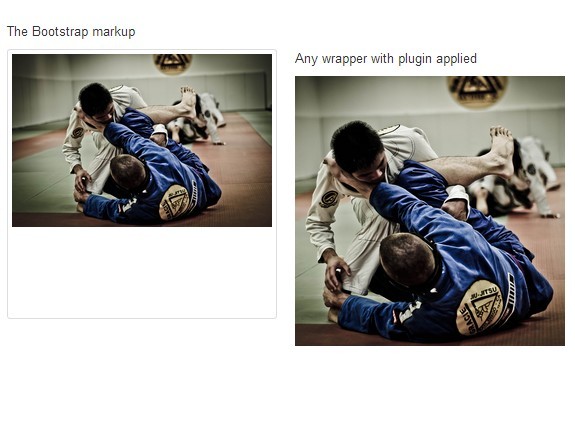
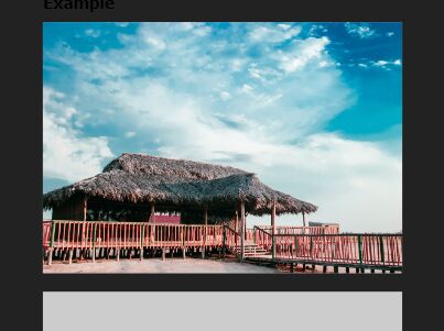
Markup Example
Create a placeholder Image with the
<img class="round" src="../img/loading.gif" data-toggle="responsive" data-aspect="16x9" data-xs="../img/katzen_xs.jpg" data-sm="../img/katzen_sm.jpg" data-md="../img/katzen_md.jpg" data-lg="../img/katzen_lg.jpg"> Markup Options
| Attribute | Description |
|---|---|
data-aspect | Image aspect ratio, is needed to keep the height of the image correct when resizing the screen.Predefined values: 1x1, 2x3, 3x2, 4x3, 16x9 |
data-xs | Image path for Extra small devices eg. Phones (<768px) |
data-sm | Image path for Small devices eg. Tablets (≥768px) |
data-md | Image path for Medium devices eg. Desktops (≥992px) |
data-lg | Image path for Large devices eg. Desktops (≥1200px) |