jquery-fillcontainer
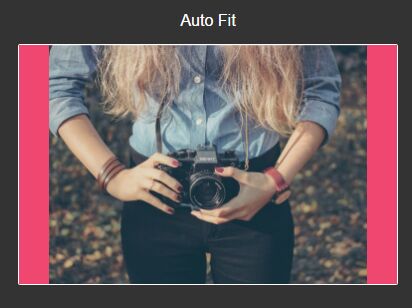
Make a child element fill its container. Works with images, video, or any other element.
Options
| Option | Type | Default | Description |
|---|---|---|---|
| aspectRatio | int | null | Element aspect ratio is automatically computed from element size, but you can override this with this option. |
| parent | string | null | Parent element to conform to. Default is direct parent. |
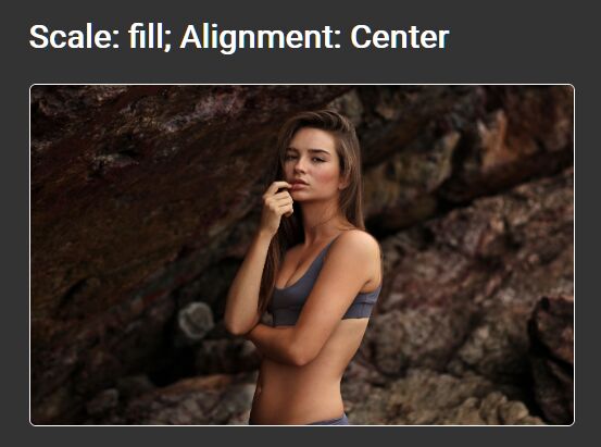
| fillMode | string | 'fill' | Choose between 'fill' and 'fit' mode. Fill mode will totally cover the parent element but child element will be cropped. Fit mode keeps child element entirely visible. |
| continous | bool | true | if true, child element will keep filling its parent after window resize events. usefull for responsive websites. |
| offset | int array | [0, 0] | By default the child element will be centered inside the parent, but you can apply an offset. |
| debounceDelay | int | 100 | delay to debounce the window resize event. Set 0 to disable. |
Usage
Simple
$(<selector>).fillContainer(); With options
$(<selector>).fillContainer({ aspectRatio : 1.5, parent : '.parent-class' }); Make sure the child element already have a computable size (i.e. image is loaded).
You can use libraries like jquery.imgpreload or imagesloaded or you can also specify the child element ratio as an option or data attribute (aspectRatio option) if you know it.
License
MIT