jquery-resize-image-to-parent
jQuery script to fill a parent container with an image without whitespace.
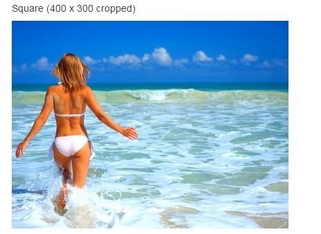
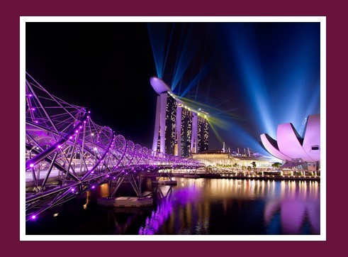
This plugin emulates the background-size: cover; css property, using an img tag instead. Check out the demo to see it in action.
Usage
The image needs to be positioned relatively or absolutely inside a wrapper element which has the overflow: hidden css property set. For example:
<div style="overflow: hidden;"> <img class="my-image" style="position: relative;" src="cats.jpg"> </div> The above code just for demonstrative purposes - you should use classes and not inline styles. If you're still unsure, check the demo source.
Then, simply call .resizeToParent() on the image(s) you want resized, like so:
$('.my-image').resizeToParent(); If you want to target a specific parent to resize to, use the parent parameter:
$('.my-image').resizeToParent({parent: '.parent-container'}); The images will automatically be resized on window resize. By default, the event will not fire more than once every 100 milliseconds to prevent lag on older machines and browsers that spam the resize event. If you want to adjust the resize delay, use the delay parameter:
$('.my-image').resizeToParent({delay: 10});