image-cover.js
Lightweight jQuery plugin to emulate background-size: cover for img's
Usage
Simply include jQuery and image-cover
<script src="https://ajax.googleapis.com/ajax/libs/jquery/2.2.4/jquery.min.js"></script> <script type="text/javascript" src="js/image-cover.min.js"></script> And initialize the plugin on the image container inside of $(document).ready
$(document).ready(function() { $('.container').cover(); });Options
- target - change the target element to resize
- delay -ms to delay after window resize - has no effect if the browser supports object-fit
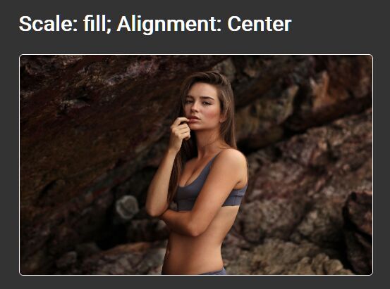
- scale ( fill, fillHeight, fillWidth, stretch )
- align - object containing two properties: h ( center, left, right ), v ( bottom, center, top )
- breakpoints - responsive breakpoints
$('.container').cover({ target: 'div.not-image' delay: 50, scale: 'fill', align: { h: 'center', v: 'center' }, breakpoints: { 767: { delay: 10, scale: 'fillWidth', align: { h: 'left', v: 'bottom' }, }, 1199: { delay: 0, scale: 'stretch' } } });