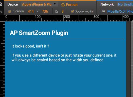
Smartzoom
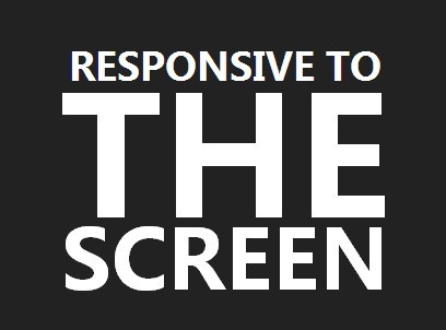
Scale your layout on smartphone based on a specific width
Requirements
jQuery. Should work without Zepto or ender.js
This plugin just scales your layout by:
- Modifying the html document through the zoom property. To do so you need to be shure user won't mess it by disabling the scalability option.
To achieve this, you can use this meta tag:
<meta name="viewport" content="width=device-width,initial-scale=1.0,maximum-scale=1.0,user-scalable=no"> - Adjusting the font size from the body to keep the ratio intact for the text elements.
To achieve this you have to use relative units in your stylesheet for every text related properties. Em is recommended. For example:
body { font-size: 62.5%; } #wrap { width: 320px; } h1 { margin: 0 16px 48px 16px; font-size: 2em; /* 20px */ } The ui-landscape / ui-portrait classnames will also be automatically added to the body.
Methods
Initialize
When the dom is ready, just trigger the function like this:
$.smartzoom.initialize(); See below for more options.
Terminate
If need be you can stop it:
$.smartzoom.terminate(); This will reset the document zoom property to 100% and the font size to its initial state. All events handlers will also be destroyed.
Initialize Options
Integer width
The default based width is 320 pixels. To change it, just pass it as an argument like this:
ap.smartzoom.initialize({ width: 640 }); Percent fontSize
The default based font size is 62.5%. (It means 1em is 10px) To change it, just pass it as an argument like this:
ap.smartzoom.initialize({ fontSize: 100 // 100% 1em = 16px for most of the browsers });