responsiveimage.js
In some situation you might need to swap an image with an image catered just for mobile. This class helps you to swap image as the browser window resizes, and save on bandwidth, as you don't need to load both images at once.
Installation
jQuery is required for this script to work.
<script src="https://ajax.googleapis.com/ajax/libs/jquery/2.1.0/jquery.min.js"></script>Basic Usage
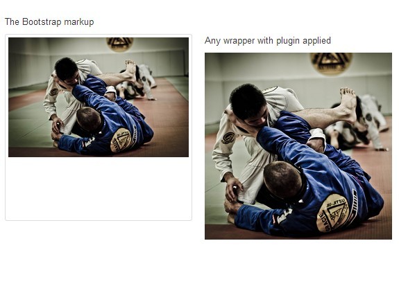
give the image a class of for-mob and use rimg tag
<rimg src="sample.jpg" class="for-mob"> <script> var RI = new ResponsiveImage(); RI.run(); </script>or you can specify different options to suit your needs
<script> var RI = new ResponsiveImage({ jQuery: $, classSelector: '.for-mob', toAppend: '_mobile', minScreenSize: 768 }); RI.run(); </script>Standard Options
jQuery- Required. This is required if you're using it for wordpress to fix jQuery conflict issues.classSelector- The script will look for all object with the class specified here.toAppend- The string that will be append to the name of the image for mobile, please make sure that all the images are named accordingly.minScreenSize- The minimum screen size where the image will be swapped.