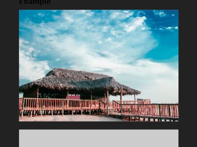
Responsive Image Resizer
Responsive Image Resizer is a jQuery plugin for responsive image.
Usage
$('img').ResponsiveImageResizer({ width: '768, 992, 1200' });for my-image.png, my-image-1200.png, my-image-992.png, my-image-768.png
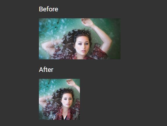
You don't need use css for this anymore:
img { background-size: 100% 100%; background-repeat: no-repeat; background-image: url(img/my-image.png); } @media screen and (max-width: 1200px) { img { background-image: url(my-image-1200.png); } } @media screen and (max-width: 992px) { img { background-image: url(my-image-992.png); } } @media screen and (max-width: 768px) { img { background-image: url(my-image-768.png); } }Demo
Check the example here: http://nickbrit.github.io/ResponsiveImageResizer/