responsImg
jQuery plugin written in CoffeeScript to make images load the smallest possible version of itself required for the current viewport size. See it as media queries for img tags.
Requirements
This plugin requires jQuery 1.7 or up.
Information
Current version: 1.5.0
- Different image sources are set as data attributes in the
<img>tag itself. - (NEW!) Will work on background images if not set on any tag besides an
<img>tag (if you need dynamic responsive background images). - You can specify @2x image sources. If specified, they will be used if the user has a retina display. Retina sizes must have a matching non-retina size in order to work. To set a retina image, add a comma and a space after the first source in a data atribute ("image.jpg, [email protected]").
- Breakpoints are determined by the name of the data attribute. All of them must start with
data-responsimgfollowed by the pixel value of the breakpoint (ex:data-responsimg960) or by a-plus the name of the breakpoint (ex:data-responsimg-smalltablet). You must define thebreakpointsparameter if you want to use named breakpoints. - The
srcattribute is considered like a 0px breakpoint. - I recommend using the smallest size as the default image (the actual
srcattribute), or else search engines won't see your image.
Parameters
allowDownsize
(boolean) default: false - By default, if a bigger image is already loaded, responsImg will not try to load a smaller one. To override this behavior, set to true.
elementQuery
(boolean) default: false - By default, the sizes specified in the data attributes are related to the size of the viewport. If elementQuery is set to true, the sizes specified in the attributes will be related to the size of the image itself.
delay
(integer) default: 200 - Delay between the window resize action and the image change. Be careful, as a low number means a more demanding process for the browser.
breakpoints
(object) default: null - The names of the breakpoints with their respective sizes (int format).
breakpoints: { foo: 480, bar: 768, baz: 960 } considerDevice
(boolean) default: false - Set to true if you want images loaded in the smallest size necessary to fit the number of pixels needed when the browser is zoomed out. Perfect for websites that want to keep mobile loading to a minimum and that don't have the meta viewport tag set to device-width.
Methods
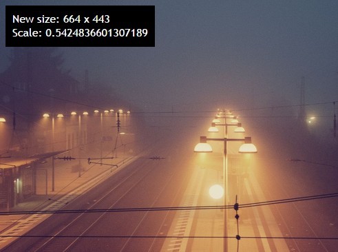
recheck()
Ask responsImg to check the width again and trigger a src change if necessary
$('.responsive-image').data('responsImg').recheck() Usage
Here is an example using all parameters. Keep in mind that they are all optional.
JavaScript
$('.responsive-image').responsImg({ allowDownsize: true, elementQuery: true, delay: 250, breakpoints: { mobile: 320, desktop: 960 } }); CoffeeScript
$('.responsive-image').responsImg allowDownsize: true elementQuery: true delay: 250 breakpoints: mobile: 320 desktop: 960 HTML
<img src="default-image.png" class="responsive-image" data-responsimg-mobile="image-320.png, [email protected]" data-responsimg480="image-480.png" data-responsimg-desktop="blue-car.png" /> In this example, the default image is default-image.png. This image is always loaded… make sure it's pretty small. You could always remove the src attribute completely if you really wanted to.
The image image-320.png is loaded and displayed if the window reaches a width of 320 pixels. If the screen used is retina, the image used will only be [email protected]. If the window reaches 480 pixels wide, image-480.png will be loaded and displayed. Even if you have a retina display, this image will override the previous one. If the window reaches 960 pixels wide, blue-car.png will be loaded and displayed.
Important - Please keep in mind that if the elementQuery is set to true, the breakpoints won't be defined by the width of the window but instead by the width of the image itself.
Thanks
Special thanks to Léon Talbot and Bernard Chhun for the suggestions and support.


![[email protected]](http://github.com/etiennetalbot/mailto:image@2x.jpg)