jquery-responsive-image
The jQuery plugin for allowing you to switch images based on screen size using data-attributes.
Usage
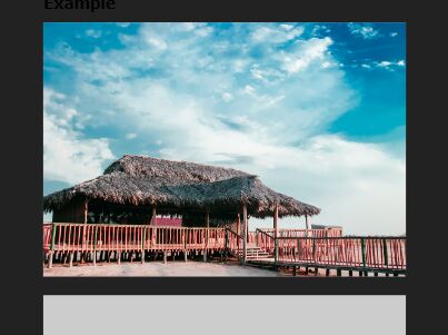
<img src="images/mobile.png" data-mobile="images/mobile.png" data-phablet="images/phablet.png" data-tablet="images/tablet.png" data-desktop="images/desktop.png"/> <script src="//code.jquery.com/jquery-1.11.2.min.js"></script> <script src="../jquery.responsive-image.js"></script> <script type="text/javascript"> $("body").responsiveImage({ mobile : 400, phablet: 550, tablet : 750, desktop: 1000, }); </script> License
MIT License