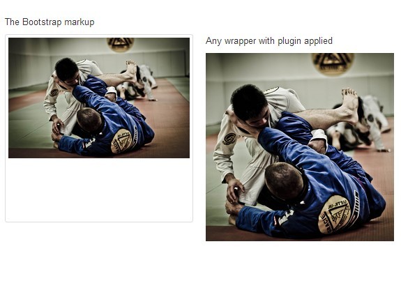
Center image inside any tag (inline or block)
- First off all, I would like to say that anyone can use this code for free.
- Clone the ripo OR download and extract it.
How to use??
- Put an img tag inside any block(div) or inline(span) tag.
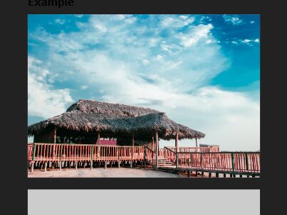
<div> <img src="https://www.xyz.com/my-image.jpg" alt="my image" /> </div>A quick note: The image inside the the tag will contain the whole tag.
- Give it class asdh-center_image_inside_me
<div class="asdh-center_image_inside_me"> <img src="https://www.xyz.com/my-image.jpg" alt="my image" /> </div>- Done. It's that simple.
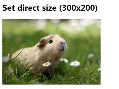
Default dimentions
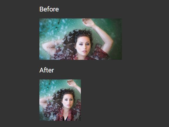
- By default, width and height are assigned to be 200px each, which can be modified as per your need. I have even included an example in the code itself.