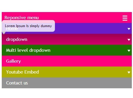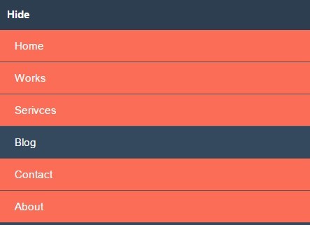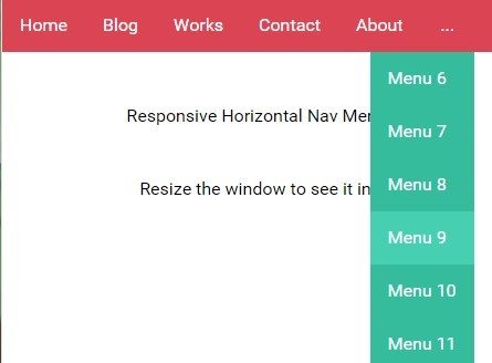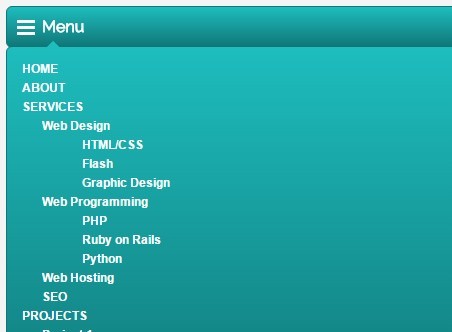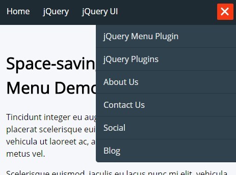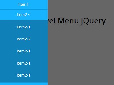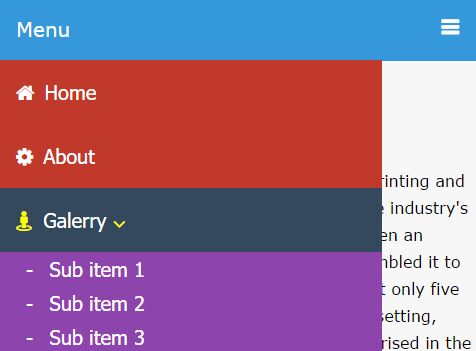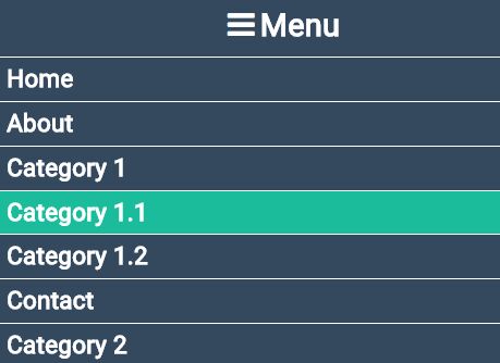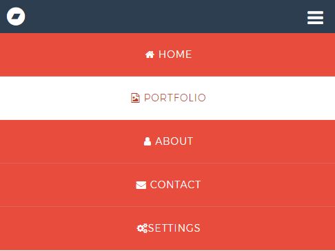
Responsive jQuery Fixed Drop Down Menu by Fabian Lins
This is the first dummy version of my Responsive jQuery Fixed Drop Down Menu by Fabian Lins.
To use this navigation bar, you have to do a few things:
Instruction
- Link the "responsive_menu_style.css" file.
- Link the current jQuery library (in this case: "jquery-3.3.1.min.js"). NOTE: Always check for a later version on https://jquery.com/download/
- Link the "responsive_menu_code.js" file.
- Copy the lines between the two comments in the HTML file and paste them into your HTML file.
- Adjust HTML the lines to your desires (but keep in mind that you have to keep the structure as it is).
- Adjust the CSS variables.
- Adjust the JS variables in the "responsive_menu_code.js" file.
From here everything is optional but I suggest following this instruction. This will make sure you have support for older browsers.
- Use [CTRL+F] to replace the variables within the CSS file.
- Delete everything in ":root{}" (INCLUDING the ":root" name and brackets).
License
You are free to use this menu in commercial projects without giving credit. But you are not allowed to claim this menu as your own menu. If you edit the code and change the plugin you are allowed to upload your version as long as you give credit to this project.
If you have any questions feel free to write me an e-Mail: [email protected]
Thanks for your attention.