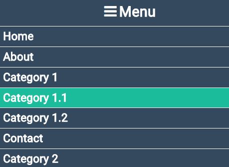
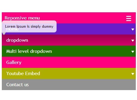
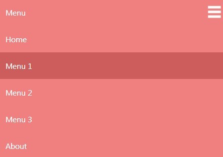
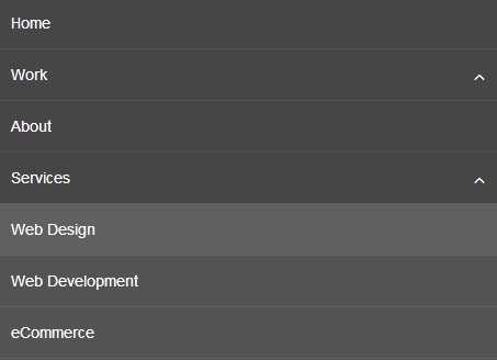
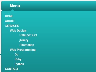
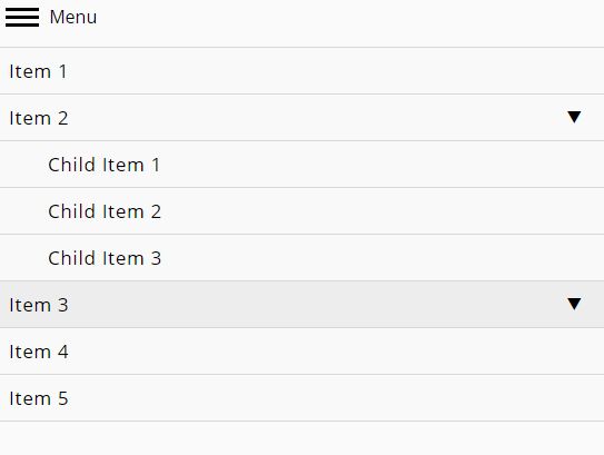
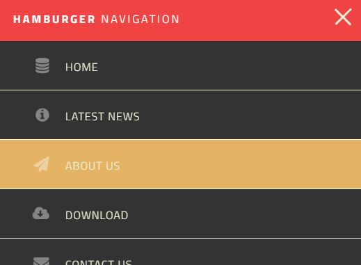
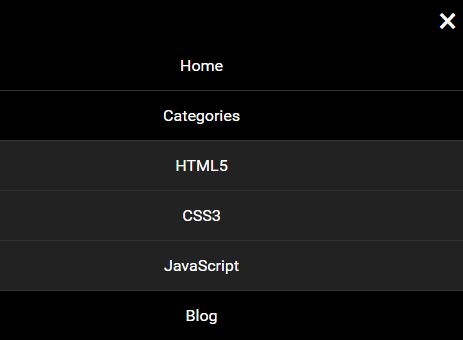
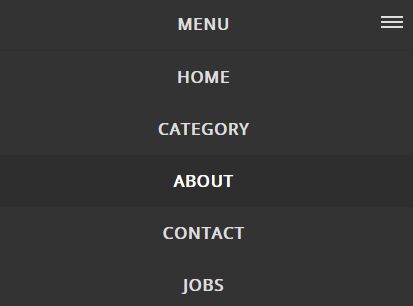
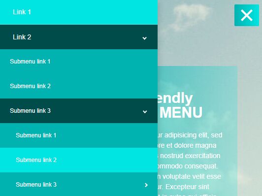
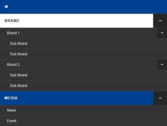
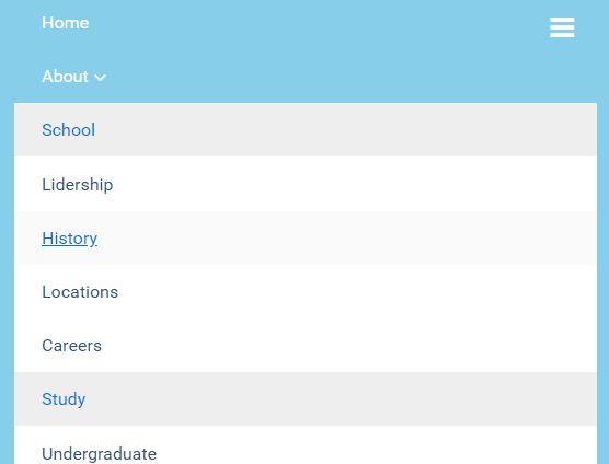
To create an navigation menu, you need to do the following:
Add the “menu” class to your
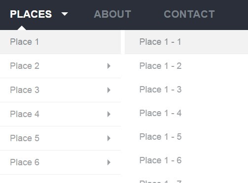
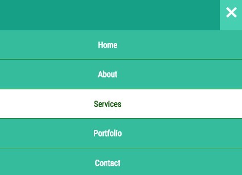
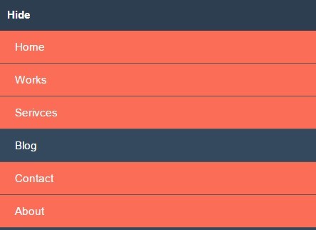
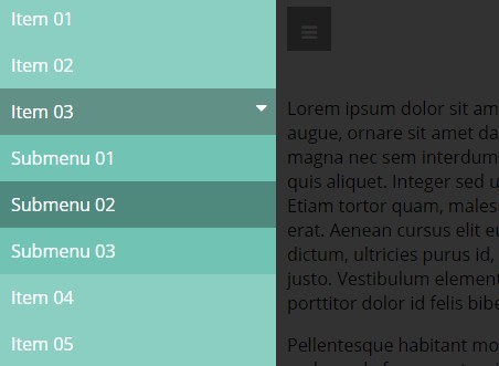
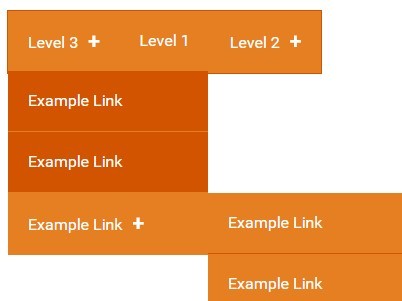
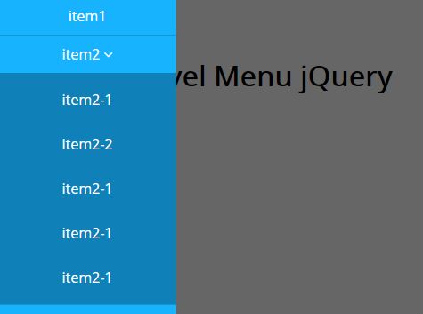
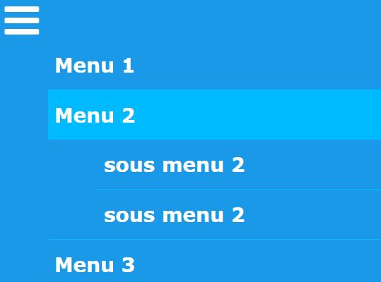
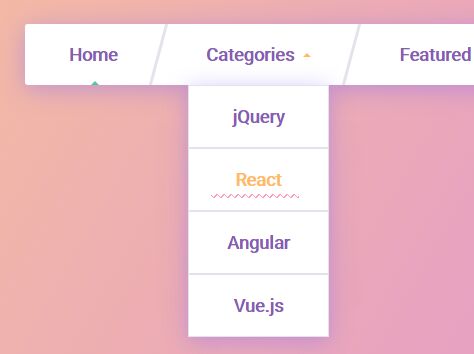
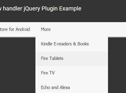
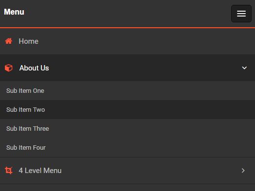
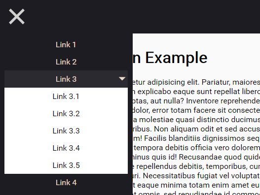
tag (or div) The “menu-header” class must then be added to the first child (or other block tag). This will be the hamburger menu for cellphone and tablets The “main-menu” class needs to be attached to the first (parent) tag All tags must also include the “list-unstyled” class If you have a submenu, add this code to the parent of the submenu:class=“subMenu" data-trigger = "submenu” data-trigger = "submenu” and the class "table-unstyled" must be added to each child of the submenu. The custom caret for a dropdown menu is: . This is an optional icon and can be substituted with a standard caret. If the caret is wrapped in a tag, the formatting will still be applied, the “fa” class is for the icon only. Classes:
menu menu-header fa (icon) submenu Data
data-trigger = "submenu"
Options
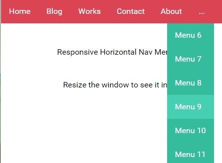
settings.backgroundColor - Background color of the menu plugin settings.highlightColor - Highlight color for hover state on computer screens settings.submenuColor - Color of submenu on mobile and tablets in profile mode settings.toggleSpeed - Speed in milliseconds of how fast the menu slides. A “0” value will deactivate the slide animation and the submenu will just appear. settings.menuNumber - The number of top menu links. This will ensure there is no wrapping on screens where the menu items are inline. THIS NUMBER MUST BE THE EXACT NUMBER OF ITEMS IN THE TOP MENU! Code Example
Code Example
<nav class="menu"> <div class="menu-header"> <span class="fa"></span>Menu </div> <ul class="main-menu"> <li> <a href="#">Item 1 </a> </li> <li> <a href="#">Item 2 </a> </li> <li class="subMenu" data-trigger="submenu"> <a href="#">Item 3 <span class="fa"> </span> </a> <ul> <li data-trigger="submenu"> <a href="#">SubItem 1 </a> </li> <li data-trigger="submenu"> <a href="#">SubItem 2 </a> </li> </ul> </li> <li> <a href="#">Item 4 </a> </li> <li class="subMenu" data-trigger="submenu"> <a href="">Item 5<span class="fa"> </span> </a> <ul> <li data-trigger="submenu"> <a href="#">SubItem 1 </a> </li> <li data-trigger="submenu"> <a href="#">SubItem 2 </a> </li> </ul> </li> </ul> </nav>


