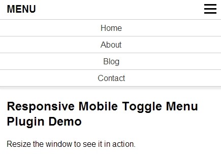
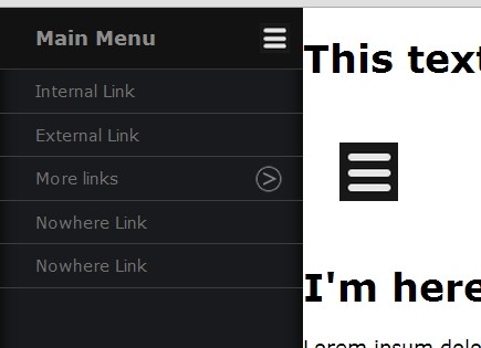
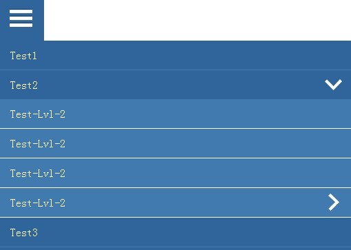
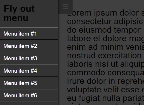
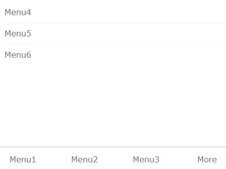
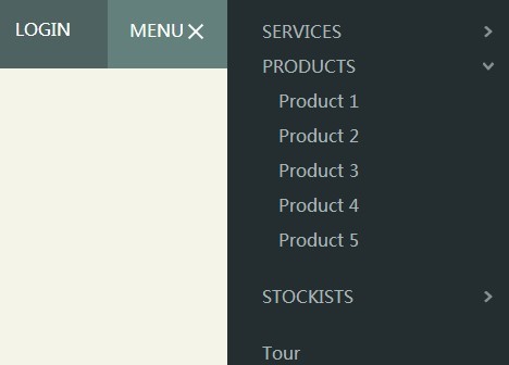
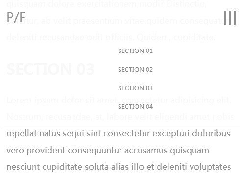
Ace Responsive Menu
Ace responsive menu is a lightweight jQuery plugin to create responsive multi-level navigation menus with multi device support. Ace responsive menu comes with 3 variants like horizontal, vertical and accordion menu. It gives complete responsive menu solution for any kind of websites or admin templates. The plugin has clean and well commented valid code, easy to Integrate and modify.
Features
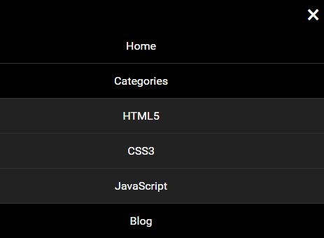
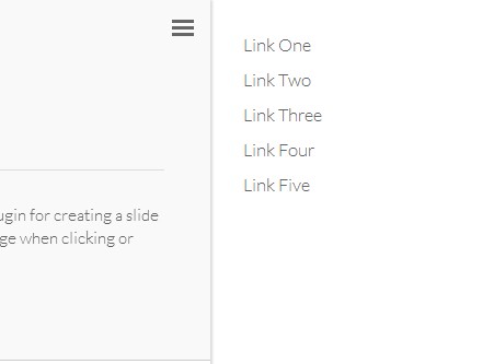
- Fully Responsive multi-level Menu
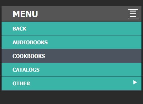
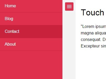
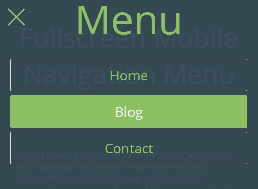
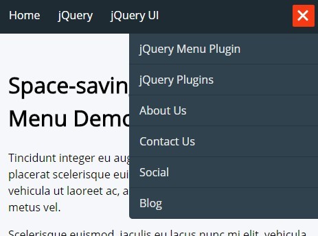
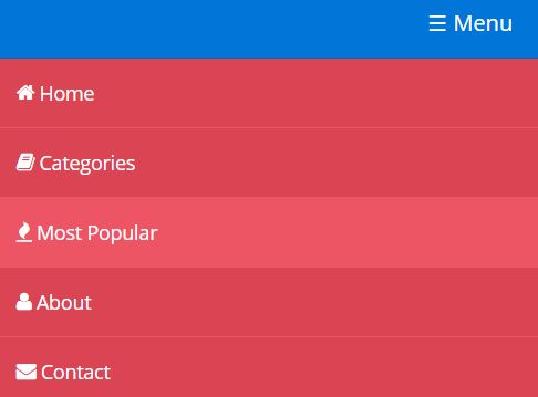
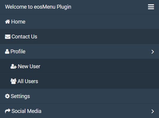
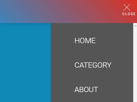
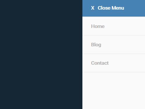
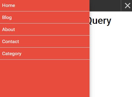
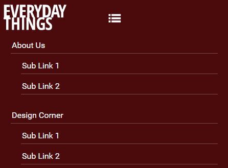
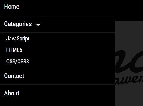
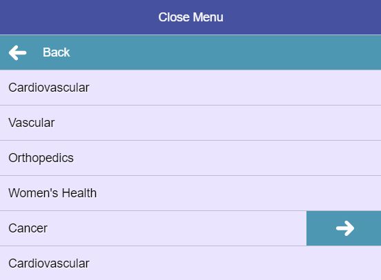
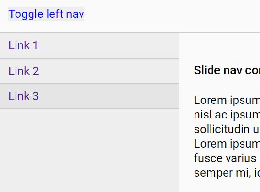
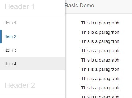
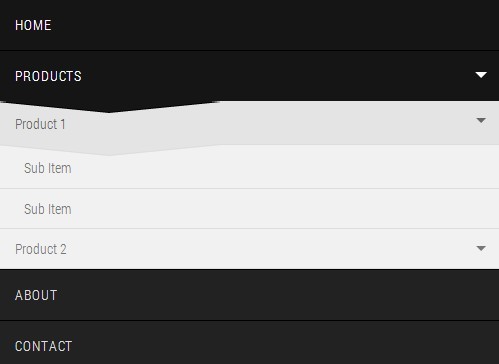
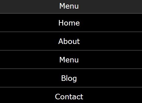
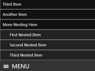
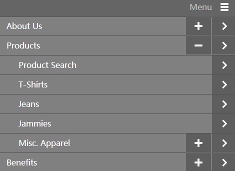
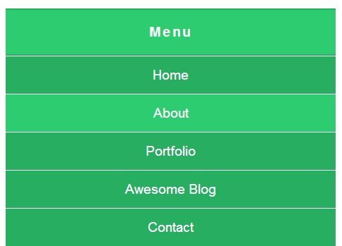
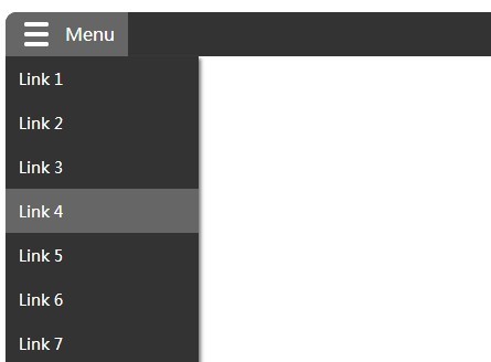
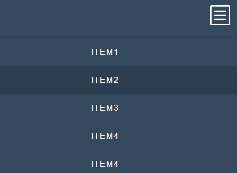
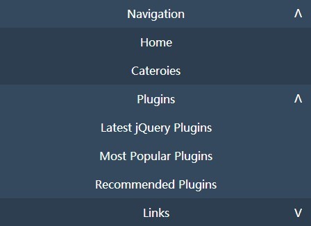
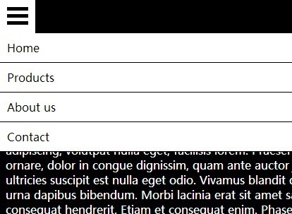
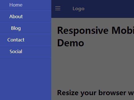
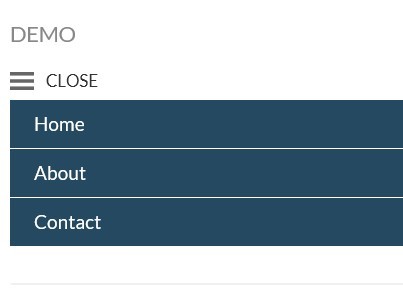
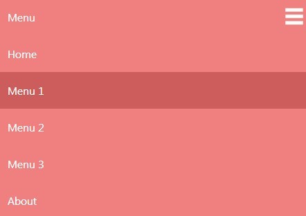
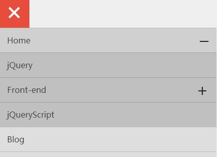
- Menu Styles: Horizontal, Vertical and Accordion menu
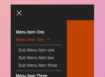
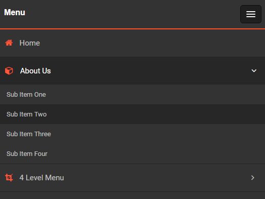
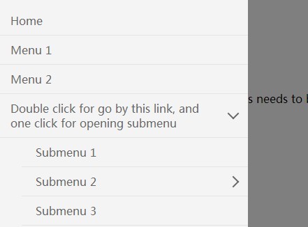
- 4-Level Menu support
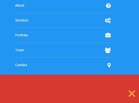
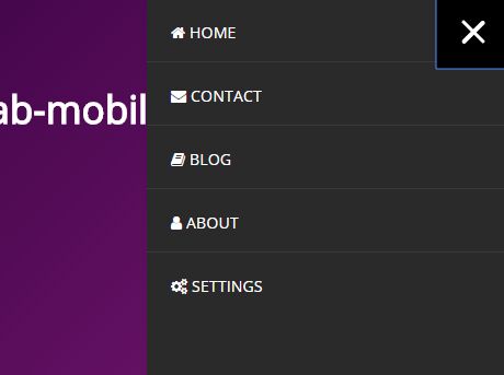
- Icon Support [Integrated with FontAwesome]
- Click / Hover Events
- Lightweight jQuery script
- Valid HTML5 and CSS3
- Bootstrap Compatible
- Easy to Integrate & customize
- Cross-browser support
- Clean and well commented code
- Help documentation
Demo
https://webthemez.com/demo/ace-responsive-menu/index.html
Events
- Mouse Click
- Mouse Hover
- Mouse Click (“Toggle”)
Compatible Browsers
This menu has been tested and works with all the following browsers:
- Internet Explorer 7+
- Firefox 3+
- Chrome 4+
- Safari 4+
- Opera 10+
How to use
=> Add jQuery file before closing body tag = <script src="js/jquery-1.10.1.min.js" type="text/javascript"></script>
=> Included aceResponsiveMenu.js after jQuery = <script src="js/ace-responsive-menu.js" type="text/javascript"></script>
=> Include “ace-responsive-menu.css” to the head of your document =
=> Here is the Markup for Responsive Menu structure:
<nav> <div class="menu-toggle"> <h3>Menu</h3> <button type="button" id="menu-btn"> <span class="icon-bar"></span> <span class="icon-bar"></span> <span class="icon-bar"></span> </button> </div> <ul id="demoMenu" class="ace-responsive-menu" data-menu-style="horizontal"> <li><a href="">Item one </a></li> <li><a href="">Item two </a> <ul> <li><a href="">sub Item one </a></li> <li><a href="">sub Item two </a></li> <li><a href="">sub Item Three </a></li> </ul> </li> <li><a href="">Item three </a></li> <li><a href="">Item four </a></li> </ul> </nav> => Change default style of the Menu (data-menu-style=””) to horizontal/Vertical/accordion
<script type="text/javascript"> $("#demoMenu").aceResponsiveMenu({ resizeWidth: '768', // Set the breakpoint same in Media query animationSpeed: 'fast', //slow, medium, fast accoridonExpAll: false //Expands all the accordion menu on click }); </script> For any support
Samson Email: [email protected]


